

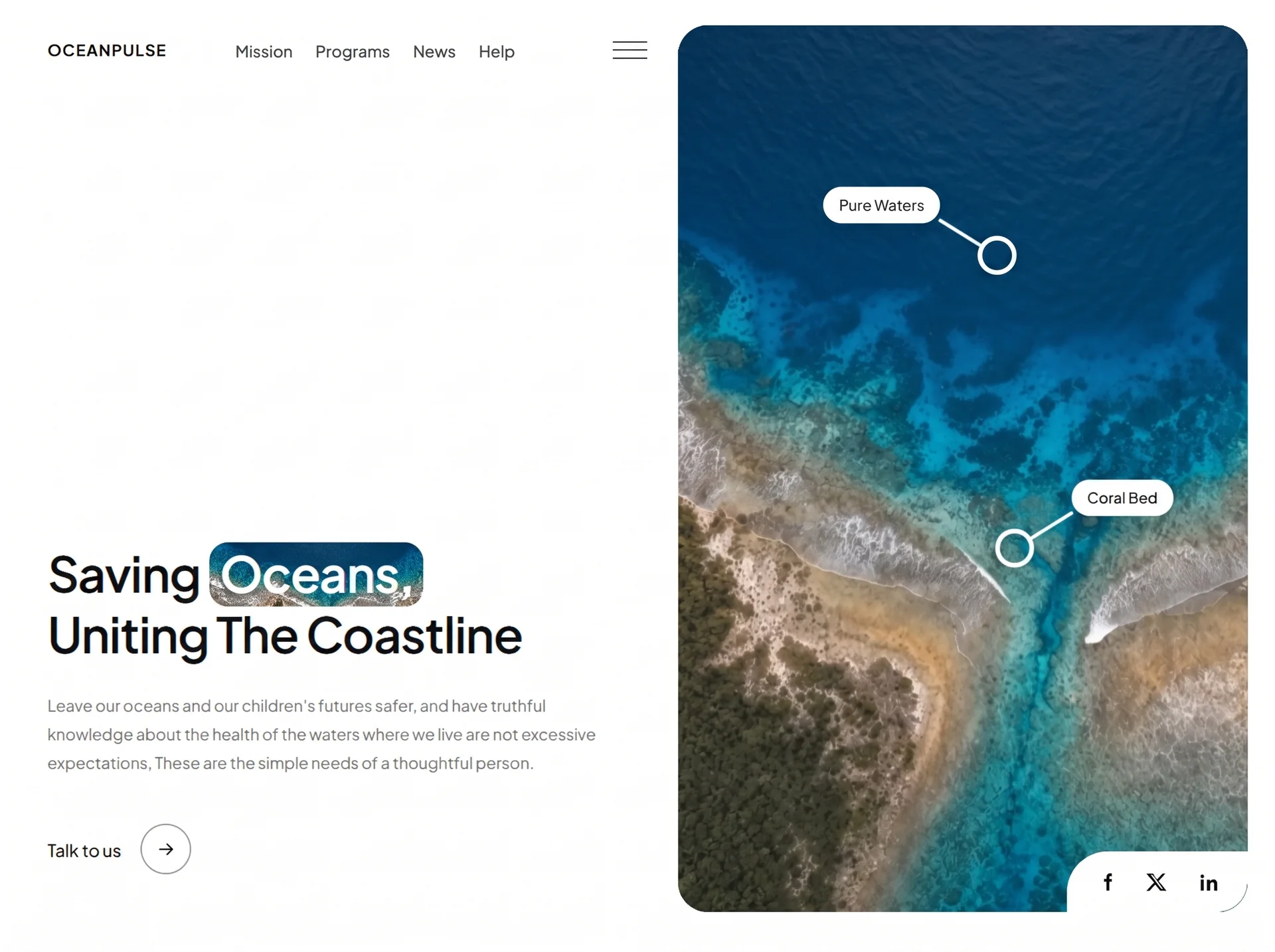
面向现代品牌的网页首屏效果,以3D 空间、玻璃拟态、鼠标跟随组织视觉层次;适合用于网页原型、品牌展示与交互动效参考。
真实地球环保首屏
效果案例
READY TO USE
直接开始使用
这条提示词无需补充变量,可查看并复制完整提示词。
复制后粘贴到任意 AI 平台即可直接使用
更新于 2026.10.14 · 持续复测
面向现代品牌的网页首屏效果,以3D 空间、玻璃拟态、鼠标跟随组织视觉层次;适合用于网页原型、品牌展示与交互动效参考。
以“从稳妥、平衡、突破三个方向并行推演”处理试用注册 CTA,输出语义明确、有信任支撑的行动号召区域;包含输入澄
以“先产出草案,再从事实、逻辑、语气和风险四层审校”处理试用注册 CTA,输出语义明确、有信任支撑的行动号召区域
以“建立评价量表,对初稿评分并针对最低分项定向重写”处理试用注册 CTA,输出语义明确、有信任支撑的行动号召区域
以“将任务拆成输入、决策、执行、验收和交接五个环节”处理试用注册 CTA,输出语义明确、有信任支撑的行动号召区域
以“先澄清目标与边界,再按优先级完成单一最佳方案”处理预约演示 CTA,输出语义明确、有信任支撑的行动号召区域;
以“从稳妥、平衡、突破三个方向并行推演”处理预约演示 CTA,输出语义明确、有信任支撑的行动号召区域;包含输入澄
查看完整提示词,复制后粘贴到任意 AI 平台使用。
Build a single, self-contained HTML file (one file: inline <style> and inline <script>, no
build step, no frameworks, no external JS/CSS libraries) containing ONE full-viewport hero
section for an ocean-conservation nonprofit called "OceanPulse".
=====================================================================
1. GLOBAL SETUP
=====================================================================
- <!DOCTYPE html>, lang="en".
- <meta name="viewport" content="width=device-width, initial-scale=1, viewport-fit=cover">
- <title>OceanPulse — Saving Oceans, Uniting The Coastline</title>
- Font: Plus Jakarta Sans from Google Fonts, weights 400;500;600;700, with preconnect to
fonts.googleapis.com and fonts.gstatic.com (crossorigin):
https://fonts.googleapis.com/css2?family=Plus+Jakarta+Sans:wght@400;500;600;700&display=swap
Body stack: "Plus Jakarta Sans", -apple-system, BlinkMacSystemFont, "Segoe UI", Roboto,
Helvetica, Arial, sans-serif.
-webkit-font-smoothing:antialiased; img,video { display:block; max-width:100% }.
- body.nav-open { overflow:hidden } (scroll lock while the menu is open).
CSS custom properties on :root:
--ink:#111417
--muted:#6b7178
--bg:#ffffff
--radius-card:26px
--pad:clamp(20px, 2.2vw, 34px)
--ease-out:cubic-bezier(.16,1,.3,1)
--ease-in:cubic-bezier(.7,0,.84,0)
--stagger:72ms
--nature-img:url("https://images.higgs.ai/?default=1&output=webp&url=https%3A%2F%2Fd8j0ntlcm91z4.cloudfront.net%2Fuser_38xzZboKViGWJOttwIXH07lWA1P%2Fhf_20260831_224622_4eeb9d43-9e46-4483-9530-1eb4ef4c942d.png&w=1920&q=85")
=====================================================================
2. EXACT ASSET URLS (use verbatim, do not substitute or download)
=====================================================================
Background video (MP4, 10s, 1080p, 16:9, silent, aerial reef footage):
https://d8j0ntlcm91z4.cloudfront.net/user_38xzZboKViGWJOttwIXH07lWA1P/hf_20260831_231820_baf1d009-9cc2-4f94-a720-b04a94a8eab4.mp4
Poster image AND the background image behind the highlighted headline word — same URL.
In HTML attributes escape the ampersands as &; in CSS use raw &:
https://images.higgs.ai/?default=1&output=webp&url=https%3A%2F%2Fd8j0ntlcm91z4.cloudfront.net%2Fuser_38xzZboKViGWJOttwIXH07lWA1P%2Fhf_20260831_224622_4eeb9d43-9e46-4483-9530-1eb4ef4c942d.png&w=1920&q=85
=====================================================================
3. LAYOUT SHELL
=====================================================================
<section class="hero"> is a CSS grid:
position:relative; height:100vh; then height:100svh (svh overrides as fallback pair);
min-height:600px; width:100%;
display:grid; grid-template-columns:minmax(0,1fr) minmax(0,0.92fr);
gap:clamp(16px,2.4vw,40px);
padding:var(--pad);
padding-left:max(var(--pad), env(safe-area-inset-left));
padding-right:max(var(--pad), env(safe-area-inset-right));
overflow:hidden;
CRITICAL DOM ORDER: put .hero__media FIRST in the DOM and .hero__left SECOND, then restore
the visual order with .hero__left{order:1} and .hero__media{order:2}. Reason: the left
column must paint above the media WITHOUT a z-index, so .hero__left never forms a stacking
context — that is what lets the burger button (z-index:70) rise above the fixed nav sheet
(z-index:60). Do not add z-index to .hero__left.
.hero__left: position:relative; order:1; display:flex; flex-direction:column;
min-width:0; padding-left:clamp(4px,1.6vw,28px).
=====================================================================
4. LEFT COLUMN
=====================================================================
4a. NAV ROW (<nav class="nav" aria-label="Primary">)
display:flex; align-items:center; gap:clamp(20px,3.4vw,58px);
padding-top:clamp(4px,0.6vw,10px).
Brand: <a class="brand" href="#"> containing ONLY a text wordmark
<span class="brand__name">OceanPulse</span>. There is NO logo icon/SVG mark.
.brand: display:flex; align-items:center; text-decoration:none; color:inherit;
flex:0 0 auto; min-width:0.
.brand__name: font-weight:700; letter-spacing:.06em;
font-size:clamp(14px,1.15vw,19px); text-transform:uppercase; white-space:nowrap.
Links: <ul class="nav__links"> with Mission, Programs, News, Help.
ul: display:flex; align-items:center; gap:clamp(16px,2.3vw,42px);
margin:0 auto 0 clamp(10px,2vw,44px); padding:0; list-style:none.
a: no underline; color:var(--ink); font-size:clamp(14px,1.02vw,17px); font-weight:500;
opacity:.88; transition:opacity .2s ease; hover opacity:1.
Burger: <button class="burger" id="navToggle" type="button" aria-label="Open menu"
aria-expanded="false" aria-controls="navSheet"> with exactly three empty <span>.
.burger: appearance:none; border:0; background:transparent; color:inherit;
padding:8px 0 8px 8px; cursor:pointer; display:flex; flex-direction:column;
justify-content:center; gap:6px; flex:0 0 auto; margin-left:auto;
position:relative; z-index:70; height:30px; transition:color .35s ease.
.burger span: display:block; width:30px; height:2.5px; border-radius:2px;
background:currentColor; transform-origin:center;
transition:transform .55s var(--ease-out), opacity .25s ease, width .45s var(--ease-out).
.burger:focus-visible: outline:2px solid currentColor; outline-offset:6px; border-radius:4px.
4b. CONTENT BLOCK (<div class="hero__content">)
margin-top:auto (pushes the block to the bottom of the flex column);
padding:clamp(24px,4vh,60px) 0; max-width:820px.
Headline <h1 class="hero__title"> holding TWO <span class="hero__line"> blocks
(.hero__line{display:block}):
Line 1: Saving <span class="hl">Oceans,</span>
Line 2: Uniting The Coastline
.hero__title: margin:0; font-weight:600; letter-spacing:-.022em; line-height:1.1;
font-size:clamp(2.15rem,3.85vw,4.1rem).
.hl (image-filled highlight box around the word "Oceans,"):
display:inline-block; color:#fff; padding:.06em .2em .14em; margin:0 .04em;
border-radius:16px; background-image:var(--nature-img); background-size:cover;
background-position:56% 14%; background-repeat:no-repeat;
-webkit-box-decoration-break:clone; box-decoration-break:clone.
(The 56% 14% crop is deliberate — it lands on the deep-blue water, not the brown land.)
Paragraph <p class="hero__text"> with this exact copy (use ’ for the apostrophe):
"Leave our oceans and our children’s futures safer, and have truthful knowledge about the
health of the waters where we live are not excessive expectations, These are the
simple needs of a thoughtful person."
Style: margin:clamp(22px,3.2vh,42px) 0 0; max-width:47ch; color:var(--muted);
font-size:clamp(14px,1.02vw,17px); line-height:1.95.
CTA <a class="cta" href="#contact">:
display:inline-flex; align-items:center; gap:clamp(14px,1.5vw,24px);
margin-top:clamp(28px,5vh,66px); text-decoration:none; color:inherit.
.cta__label "Talk to us": font-size:clamp(15px,1.1vw,19px); font-weight:500.
.cta__icon (circle): width/height clamp(44px,3.6vw,58px); border-radius:50%;
border:1.5px solid rgba(17,20,23,.55); display:grid; place-items:center; flex:0 0 auto;
transition:background .25s ease,color .25s ease,transform .25s ease.
Contains an arrow SVG (viewBox 0 0 24 24, fill:none, stroke:currentColor,
stroke-width:1.8, round caps/joins, path "M5 12h14M13 6l6 6-6 6"), sized width/height 44%.
Hover: .cta:hover .cta__icon { background:var(--ink); color:#fff; transform:translateX(4px) }.
Mobile social row: <div class="socials socials--mobile"> with Facebook, X, LinkedIn links
(inline SVGs, aria-labels). Hidden by default via .socials--mobile{display:none}; only
shown in the <=768px block.
=====================================================================
5. RIGHT COLUMN — MEDIA CARD
=====================================================================
.hero__media: position:relative; order:2; isolation:isolate;
border-radius:var(--radius-card); overflow:hidden; background:#0b2a3a; min-width:0.
(isolation:isolate keeps the marker z-indexes contained inside the card.)
Video: <video class="hero__video" autoplay muted loop playsinline preload="auto"
poster="[poster URL]"> with a single <source type="video/mp4"> pointing at the CloudFront
MP4 above. CSS: position:absolute; inset:0; width:100%; height:100%; object-fit:cover.
Top scrim: .hero__media::after { content:""; position:absolute; inset:0;
background:linear-gradient(180deg,rgba(0,0,0,.12),rgba(0,0,0,0) 38%); pointer-events:none }.
TWO CALLOUT MARKERS. Each is <div class="marker ..."> containing, in this order:
<span class="marker__line">, <span class="marker__dot">, <span class="marker__label">.
Marker 1: class "marker marker--water", label text "Pure Waters", positioned left:56% top:26%.
Marker 2: class "marker marker--reef marker--right", label "Coral Bed", left:59% top:59%.
.marker { position:absolute; z-index:3; --dot-r:17px }
.marker__dot { position:absolute; left:calc(var(--dot-r) * -1); top:calc(var(--dot-r) * -1);
width:calc(var(--dot-r) * 2); height:calc(var(--dot-r) * 2); border:4px solid #fff;
border-radius:50%; box-shadow:0 2px 12px rgba(0,0,0,.28) }
.marker__line { position:absolute; left:0; top:-1.5px; width:60px; height:3px;
background:#fff; border-radius:2px; transform-origin:0 50%; transform:rotate(212deg);
clip-path:inset(0 0 0 var(--dot-r)) }
— the clip-path makes the connector start at the ring's outer edge so the stroke does
not run through the middle of the circle.
.marker__label { position:absolute; right:50px; bottom:28px; white-space:nowrap;
background:#fff; color:var(--ink); font-size:clamp(13px,.95vw,16px); font-weight:500;
padding:.62em 1.05em; border-radius:999px; box-shadow:0 6px 20px rgba(0,0,0,.16) }
.marker--right .marker__line { transform:rotate(-32deg) } (line points up-RIGHT)
.marker--right .marker__label { right:auto; left:50px }
SOCIAL PILL notched into the card's bottom-right corner: <div class="socials"> with
Facebook, X and LinkedIn inline SVG links.
position:absolute; right:0; bottom:0; z-index:3; display:flex; align-items:center;
gap:clamp(18px,2.2vw,38px); background:#fff;
padding:clamp(14px,1.5vw,24px) clamp(20px,2.2vw,38px);
border-top-left-radius:36px; border-bottom-right-radius:var(--radius-card).
a: color:var(--ink); display:grid; place-items:center;
transition:opacity .2s ease,transform .2s ease; hover opacity:.65 + translateY(-2px).
svg: width/height clamp(20px,1.5vw,26px).
=====================================================================
6. SLIDE-IN NAV SHEET (sibling of .hero, direct child of <body>)
=====================================================================
Markup: <div class="navsheet" id="navSheet" inert> containing
<div class="navsheet__scrim" data-nav-close></div>
<nav class="navsheet__panel" aria-label="Menu">
<ul class="navsheet__list"> with four <li> carrying inline style="--i:0" .. "--i:3",
each holding <a class="navsheet__link"> = Mission / Programs / News / Help, and each
link ending with the same 24x24 arrow SVG (stroke-width 2).
<div class="navsheet__foot"> holding <a class="navsheet__cta" href="#contact">Talk to us
+ arrow SVG</a> and <div class="navsheet__socials"> with the three social links.
Container: .navsheet { position:fixed; inset:0; z-index:60; visibility:hidden;
transition:visibility 0s linear .46s }
.navsheet.is-open { visibility:visible; transition:visibility 0s linear 0s }
(Delayed visibility so the closing animation is fully visible; visibility:hidden also
keeps the links untabbable in browsers without inert support.)
Scrim: background:rgba(5,17,24,.45); opacity:0; backdrop-filter:blur(0px) (+ -webkit- prefix);
transition:opacity .32s ease, backdrop-filter .32s ease, -webkit-backdrop-filter .32s ease.
Open state: opacity:1; backdrop-filter:blur(6px);
transition:opacity .5s ease, backdrop-filter .6s ease, -webkit-backdrop-filter .6s ease.
Panel: position:absolute; top:0; right:0; bottom:0; width:min(100%,460px);
display:flex; flex-direction:column;
padding:calc(var(--pad) + 78px) clamp(24px,6vw,52px) calc(var(--pad) + 12px);
padding-bottom:max(calc(var(--pad) + 12px), env(safe-area-inset-bottom));
background:rgba(6,22,31,.9);
backdrop-filter:blur(26px) saturate(150%) (+ -webkit- prefix);
border-left:1px solid rgba(255,255,255,.08);
box-shadow:-30px 0 80px rgba(0,0,0,.35);
color:#fff; overflow-y:auto; -webkit-overflow-scrolling:touch;
transform:translateX(100%); transition:transform .44s var(--ease-in);
Open state: transform:translateX(0); transition:transform .68s var(--ease-out).
(Asymmetric on purpose: 680ms expo-out entering, 440ms expo-in leaving — the close must
be faster and differently eased, never the entrance played backwards.)
List rows: li { border-top:1px solid rgba(255,255,255,.13) },
li:last-child { border-bottom:1px solid rgba(255,255,255,.13) }.
Links: .navsheet__link { display:flex; align-items:center; justify-content:space-between;
gap:16px; padding:clamp(15px,2.4vh,22px) 2px; text-decoration:none; color:#fff;
font-size:clamp(1.6rem,7vw,2.35rem); font-weight:600; letter-spacing:-.02em;
line-height:1.1; opacity:0; transform:translateY(22px);
transition:opacity .16s ease, transform .16s ease, color .25s ease }
Open state: opacity:1; transform:translateY(0);
transition:opacity .6s var(--ease-out), transform .6s var(--ease-out), color .25s ease;
transition-delay:calc(.16s + var(--i) * .062s), calc(.16s + var(--i) * .062s), 0s;
(Staggered reveal on open; on close the base .16s transition with no delay applies, so
the links snap out fast instead of un-staggering.)
Link arrow SVG: width/height 22px; flex:0 0 auto; opacity:0; transform:translateX(-10px);
transition:opacity .35s var(--ease-out), transform .35s var(--ease-out).
Hover/focus-visible on link: color:#7fd7f2, and its SVG becomes opacity:1 translateX(0).
Link :focus-visible: outline:none; text-decoration:underline; text-underline-offset:8px.
Foot: margin-top:auto; padding-top:clamp(26px,5vh,48px); opacity:0; transform:translateY(22px);
transition:opacity .16s ease, transform .16s ease.
Open: opacity:1; transform:translateY(0);
transition:opacity .6s var(--ease-out), transform .6s var(--ease-out);
transition-delay:.42s.
Sheet CTA pill: display:inline-flex; align-items:center; gap:12px; padding:14px 24px;
border-radius:999px; background:#fff; color:#0a1a24; font-weight:600; font-size:16px;
transition:transform .25s var(--ease-out), background .25s ease;
hover: translateY(-2px) + background #e8f6fc. Its SVG is 16x16.
Sheet socials: display:flex; align-items:center; gap:26px; margin-top:clamp(22px,4vh,34px);
a color rgba(255,255,255,.72) -> #fff on hover with translateY(-2px); svg 22x22.
BURGER -> X MORPH (bars rotate in place; the button stays put and doubles as the close control):
.burger:hover span:nth-child(2) { width:22px }
.burger.is-active span:nth-child(1) { transform:translateY(8.5px) rotate(45deg) }
.burger.is-active span:nth-child(2) { opacity:0; transform:scaleX(.2) }
.burger.is-active span:nth-child(3) { transform:translateY(-8.5px) rotate(-45deg) }
.burger.is-active:hover span:nth-child(2) { width:30px }
.burger.is-active { color:var(--ink) }
.burger.is-active.burger--on-panel { color:#fff }
=====================================================================
7. PAGE ENTRANCE ANIMATION
=====================================================================
Keyframes (transform + opacity only, never layout properties):
fade-up: opacity 0 / translate3d(0,18px,0) -> opacity 1 / translate3d(0,0,0)
media-in: opacity 0 / translate3d(28px,0,0) -> opacity 1 / translate3d(0,0,0)
video-in: opacity 0 / scale(1.06) -> opacity 1 / scale(1)
pop-in: opacity 0 / scale(.72) -> opacity 1 / scale(1)
draw-line: opacity 0 / rotate(212deg) scaleX(0) -> opacity 1 / rotate(212deg) scaleX(1)
draw-line-right: opacity 0 / rotate(-32deg) scaleX(0) -> opacity 1 / rotate(-32deg) scaleX(1)
Base utility class:
.anim { animation:fade-up .82s var(--ease-out) backwards;
animation-delay:calc(var(--d, 0) * var(--stagger)) }
Overrides:
.hero__media.anim { animation-name:media-in; animation-duration:1.05s }
.hero__video.anim { animation-name:video-in; animation-duration:1.35s }
.marker__dot.anim { animation-name:pop-in; animation-duration:.62s }
.marker__label.anim{ animation-duration:.7s }
.marker__line.anim { animation-name:draw-line; animation-duration:.55s }
.marker--right .marker__line.anim { animation-name:draw-line-right }
Apply class="anim" plus an inline style="--d:N" with EXACTLY these stagger indices:
.hero__media 0 | .hero__video 1 | .brand__name 2
nav <li> items 4, 5, 6, 7 | .burger 8
headline line 1 = 9 | headline line 2 = 10 | .hero__text 11
.cta__label 12 | .cta__icon 13
marker--water: dot 13, line 14, label 15
marker--reef: dot 16, line 17, label 18
.socials (card pill) 19
.socials--mobile links 14, 15, 16
(Index 3 is intentionally unused. The markers' connector lines draw outward from their
rings, then the labels land.)
=====================================================================
8. RESPONSIVE BEHAVIOUR (must verify at 320, 375, 740x360, 768, 1024, 1440)
=====================================================================
@media (max-width:1180px)
.nav__links { gap:20px; margin-left:22px } .hero__text { line-height:1.8 }
@media (max-width:1024px) — nav links collapse to the burger only
.hero { grid-template-columns:minmax(0,1fr) minmax(0,0.78fr) }
.nav__links { display:none }
.marker--water { left:46%; top:24% } .marker--reef { left:50%; top:60% }
.marker__line { width:44px } .marker { --dot-r:13px } .marker__dot { border-width:3px }
.marker__label { font-size:12px; right:36px; bottom:22px }
.marker--right .marker__label { right:auto; left:36px }
@media (max-width:900px) — tablet portrait, more room for the copy
.hero { grid-template-columns:minmax(0,1fr) minmax(0,0.62fr) }
.hero__text { max-width:42ch }
.marker--water { left:40%; top:22% } .marker--reef { left:44%; top:62% }
@media (max-width:768px) — PHONE: the video becomes the full-bleed hero background
:root { --pad:20px }
.hero { display:block; padding:0; color:#fff }
.hero__media { position:absolute; inset:0; border-radius:0 }
.hero__media::after { background:linear-gradient(180deg,rgba(4,18,28,.74) 0%,
rgba(4,18,28,.5) 42%, rgba(4,18,28,.88) 100%) } (dark scrim for text legibility)
.marker, .socials { display:none }
.hero__left { height:100%; padding:var(--pad);
padding-top:max(var(--pad), env(safe-area-inset-top));
padding-bottom:max(var(--pad), env(safe-area-inset-bottom)); color:#fff }
.hero__content { padding:clamp(20px,3vh,40px) 0 }
.hero__title { font-size:clamp(2rem,9.2vw,3rem); line-height:1.14 }
.hl { border-radius:12px }
.hero__text { color:rgba(255,255,255,.82); max-width:38ch; line-height:1.75; font-size:15px }
.cta { color:#fff; margin-top:32px } .cta__icon { border-color:rgba(255,255,255,.6) }
.cta:hover .cta__icon { background:#fff; color:var(--ink) }
.socials--mobile { display:flex; position:static; background:transparent; padding:0;
margin-top:34px; gap:26px; border-radius:0; z-index:auto }
.socials--mobile a { color:#fff } .socials--mobile svg { width:22px; height:22px }
@media (max-width:420px)
.hero__title { font-size:clamp(1.8rem,8.6vw,2.4rem) }
.hero__text { font-size:14px; line-height:1.7 }
.cta { margin-top:26px } .socials--mobile { margin-top:26px }
@media (max-width:360px) — 320px-class phones
:root { --pad:16px }
.brand__name { font-size:13px; letter-spacing:.05em }
.burger span { width:26px } .hero__text { max-width:none }
@media (max-height:620px) — short viewports of ANY width must never force a scrollbar
.hero { min-height:0 }
(This is essential: the base min-height:600px would otherwise overflow a landscape phone.)
@media (max-width:1024px) and (orientation:landscape) and (max-height:540px)
.hero__content { padding:10px 0; margin-top:auto }
.hero__title { font-size:clamp(1.5rem,6.2vh,2.1rem); line-height:1.12 } (vh-based!)
.hero__text { font-size:13px; line-height:1.6; max-width:56ch; margin-top:12px }
.cta { margin-top:16px; gap:12px } .cta__icon { width:38px; height:38px }
.cta__label { font-size:14px }
.socials--mobile { margin-top:16px; gap:22px }
.socials--mobile svg { width:18px; height:18px }
.navsheet__panel { padding-top:calc(var(--pad) + 64px) }
.navsheet__link { font-size:clamp(1.15rem,4.6vh,1.5rem); padding:10px 2px }
.navsheet__foot { padding-top:18px } .navsheet__socials { margin-top:14px }
@media (prefers-reduced-motion:reduce)
*, *::before, *::after { animation-duration:.01ms !important;
transition-duration:.01ms !important; transition-delay:0s !important }
.anim { animation:none !important; opacity:1 !important }
.navsheet__link, .navsheet__foot { transform:none }
Requirement: at every tested width there must be NO horizontal scroll and no vertical
scroll (document.scrollHeight must equal innerHeight).
=====================================================================
9. JAVASCRIPT (vanilla, in one IIFE at the end of <body>)
=====================================================================
Grab #navToggle, #navSheet and the sheet's .navsheet__panel; bail out if missing.
Track a boolean isOpen.
syncBurgerContrast(): the panel is right-anchored and capped at 460px, so on wide screens it
can stop SHORT of the burger — meaning a white icon would be invisible on the white page.
Do not guess a breakpoint. Measure:
var panelLeft = window.innerWidth - panel.getBoundingClientRect().width;
var onPanel = btn.getBoundingClientRect().right > panelLeft + 4;
btn.classList.toggle('burger--on-panel', onPanel);
setOpen(next): no-op if unchanged; call syncBurgerContrast() first when opening; toggle
'is-open' on the sheet, 'is-active' on the button, 'nav-open' on body; set aria-expanded to
"true"/"false" and aria-label to "Close menu"/"Open menu"; remove the inert attribute when
open and re-add it when closed.
Wiring:
- button click toggles.
- a click listener on the sheet closes when e.target has the data-nav-close attribute
(the scrim) or when e.target.closest('a') matches (any menu link).
- keydown: Escape / Esc while open closes and returns focus to the button.
- window resize: re-run syncBurgerContrast() while open.
=====================================================================
10. ACCEPTANCE CHECKS
=====================================================================
- Desktop >=1025px matches the two-column reference: wordmark left, four nav links, burger at
the right edge of the LEFT column (not the viewport edge), image-filled "Oceans," highlight,
paragraph, CTA, and the rounded video card on the right with both markers and the corner
social pill.
- The burger's X is legible whether it lands on the white page or on the dark panel.
- The menu opens/closes smoothly, closes via scrim, link, and Escape, and locks page scroll.
- 740x360 landscape shows the entire hero with no scrolling.
- The video autoplays muted and loops, with the poster image visible before it decodes.
提示词已复制,选择一个常用平台继续。
