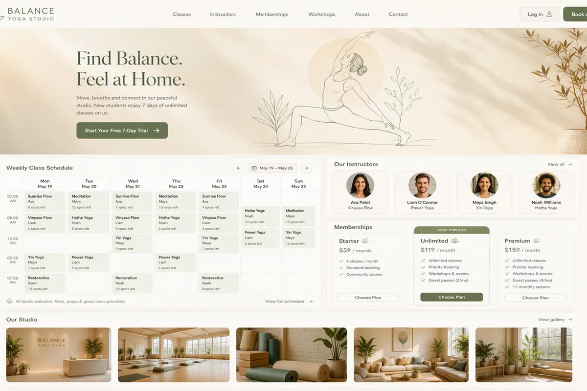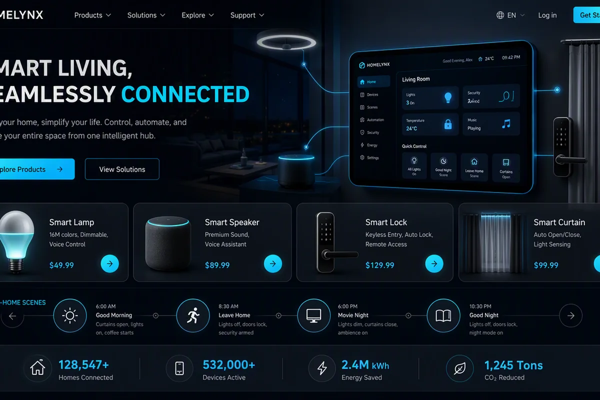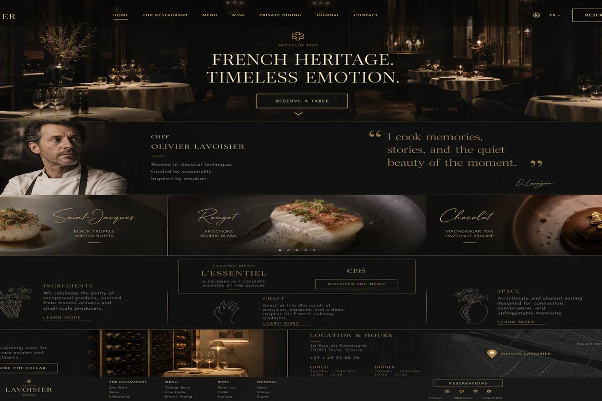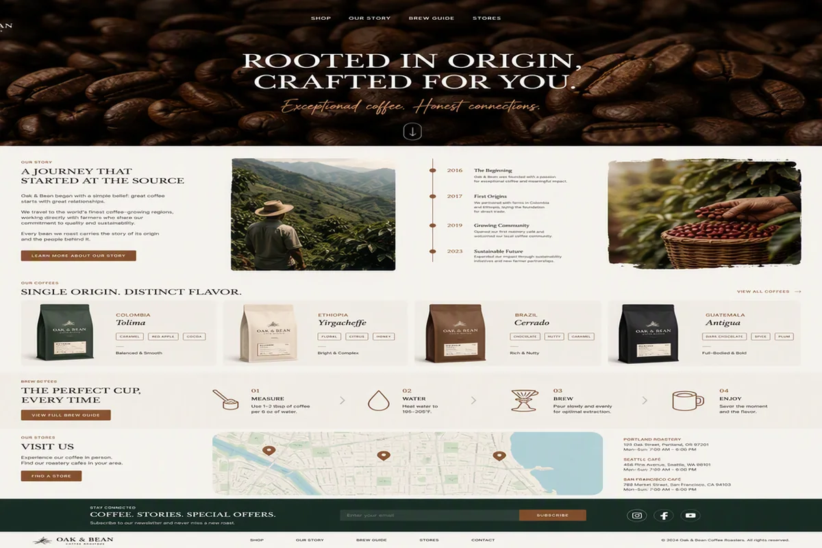

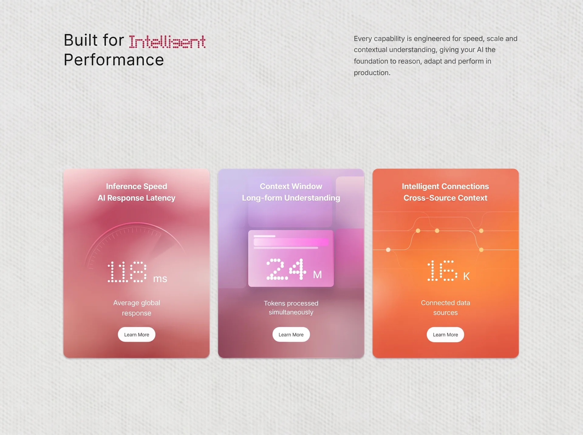
面向SaaS 产品的网页首屏效果,以3D 空间、玻璃拟态、悬停反馈组织视觉层次;适合用于网页原型、品牌展示与交互动效参考。
智能性能平台
效果案例
READY TO USE
直接开始使用
这条提示词无需补充变量,可查看并复制完整提示词。
复制后粘贴到任意 AI 平台即可直接使用
更新于 2026.10.14 · 持续复测
面向SaaS 产品的网页首屏效果,以3D 空间、玻璃拟态、悬停反馈组织视觉层次;适合用于网页原型、品牌展示与交互动效参考。
查看完整提示词,复制后粘贴到任意 AI 平台使用。
Build ONE standalone file: index.html (no frameworks, no build step, no extra files). Recreate this landing section PIXEL-FOR-PIXEL. Do not invent copy, colors, URLs, radii, timings, or layout rules. If a value is specified, use it exactly.

GOAL
A full-viewport marketing stage titled “Built for Intelligent Performance”: paper-gray page, looping CloudFront background videos, Inter type, a two-line masthead with LED-dot “Intelligent”, and three glass metric cards that scale as rigid 429×554 units. Desktop never scrolls. Mobile stacks and scrolls.

==================================================
EXACT ASSETS (use these URLs only)
==================================================

FONTS
<link rel="preconnect" href="https://fonts.googleapis.com">
<link rel="preconnect" href="https://fonts.gstatic.com" crossorigin>
<link rel="stylesheet" href="https://fonts.googleapis.com/css2?family=Inter:wght@400;500;600;700&display=swap">
Body font-family: "Inter", -apple-system, BlinkMacSystemFont, "Segoe UI", Roboto, Helvetica, Arial, sans-serif
font-optical-sizing: auto; -webkit-font-smoothing: antialiased; text-rendering: geometricPrecision;

STAGE BACKGROUND VIDEO — DESKTOP / WIDE (≥768px)
<video class="stage-motion stage-motion--wide" autoplay muted loop playsinline preload="auto" aria-hidden="true"
  poster="https://d2ol7oe51mr4n9.cloudfront.net/user_38xzZboKViGWJOttwIXH07lWA1P/5c3ec08f-2dbf-4c0a-8588-f6106a789443.webp"
  src="https://d8j0ntlcm91z4.cloudfront.net/user_38xzZboKViGWJOttwIXH07lWA1P/hf_20260826_125226_45cb4f38-aa7e-47e1-885d-ae0b69745369.mp4"></video>
CSS fallback still (same poster):
url("https://d2ol7oe51mr4n9.cloudfront.net/user_38xzZboKViGWJOttwIXH07lWA1P/5c3ec08f-2dbf-4c0a-8588-f6106a789443.webp") center / cover no-repeat
Stage overlay: linear-gradient(rgba(236,236,234,.10), rgba(236,236,234,.10)) over that image, then #ececeb.

STAGE BACKGROUND VIDEO — MOBILE / NARROW (max-width: 767px)
<video class="stage-motion stage-motion--narrow" autoplay muted loop playsinline preload="none" aria-hidden="true"
  poster="https://d2ol7oe51mr4n9.cloudfront.net/user_38xzZboKViGWJOttwIXH07lWA1P/0f4926a4-e660-4df2-9195-2bfb3e341bdd.webp"
  src="https://d8j0ntlcm91z4.cloudfront.net/user_38xzZboKViGWJOttwIXH07lWA1P/hf_20260826_125242_daae1570-386d-4bd5-8896-80499e2371e0.mp4"></video>
Show only --narrow below 768px; hide --wide. Mobile stage background:
linear-gradient(rgba(236,236,234,.08), rgba(236,236,234,.08)),
url("https://d2ol7oe51mr4n9.cloudfront.net/user_38xzZboKViGWJOttwIXH07lWA1P/0f4926a4-e660-4df2-9195-2bfb3e341bdd.webp") center top / 100% 100% no-repeat,
#e8e8e8
@media (prefers-reduced-motion: reduce) { .stage-motion { display: none; } }

CARD 1 video (speed)
poster: https://d2ol7oe51mr4n9.cloudfront.net/user_38xzZboKViGWJOttwIXH07lWA1P/167977c6-8539-46b1-9a15-8dba566f50b8.png
src:    https://d8j0ntlcm91z4.cloudfront.net/user_38xzZboKViGWJOttwIXH07lWA1P/hf_20260826_130045_1a612b69-4854-4b34-8043-ccb91f2c60af.mp4

CARD 2 video (context)
poster: https://d2ol7oe51mr4n9.cloudfront.net/user_38xzZboKViGWJOttwIXH07lWA1P/0446d1d5-e65e-4db5-8090-3e30d09afc43.png
src:    https://d8j0ntlcm91z4.cloudfront.net/user_38xzZboKViGWJOttwIXH07lWA1P/hf_20260826_130054_dd005674-d693-4d81-80a5-357f7f10b3a3.mp4

CARD 3 video (connections)
poster: https://d2ol7oe51mr4n9.cloudfront.net/user_38xzZboKViGWJOttwIXH07lWA1P/da8d0242-4dee-4f6d-813f-a5887e86ad77.png
src:    https://d8j0ntlcm91z4.cloudfront.net/user_38xzZboKViGWJOttwIXH07lWA1P/hf_20260826_130103_7550f407-f14b-40a6-9616-7a26d7a8bd9f.mp4

All card videos: class="card__media" autoplay muted loop playsinline preload="auto" aria-hidden="true"
position:absolute; inset:0; z-index:0; width/height 100%; object-fit: FILL (not cover); pointer-events:none
Hide .card__media when prefers-reduced-motion: reduce.

==================================================
DOCUMENT / TOKENS
==================================================
<!doctype html><html lang="en">
<meta charset="utf-8">
<meta name="viewport" content="width=device-width, initial-scale=1, viewport-fit=cover">
<meta name="theme-color" content="#ececeb">
<title>Built for Intelligent Performance</title>

:root {
  --paper: #ececeb;
  --ink: #222222;
  --copy: #4a4a4a;
  --glass-line: rgba(255,255,255,.36);
  --card-ref-w: 429;
  --card-ref-h: 554;
  --card-radius: 17;
  --card-count: 3;
  --gap: clamp(8px, 1.5vw, 23px);
  --gutter: clamp(14px, 3.6vw, 54px);
  --content-max: calc(var(--card-count) * var(--card-ref-w) * 1px + (var(--card-count) - 1) * var(--gap));
  --pad-top: clamp(20px, 9.6vh, 94px);
  --pad-bottom: clamp(16px, 3vh, 52px);
  --masthead-gap: clamp(16px, 3vw, 40px);
  --cards-offset: clamp(14px, 9.4vh, 92px);
}
* { box-sizing: border-box; }
html, body { margin: 0; min-width: 100%; height: 100%; overflow: hidden; }
body { color: var(--ink); background: var(--paper); }
button, a { font: inherit; }

IN-HEAD SCRIPT (before paint):
document.documentElement.classList.add("entrance-active");
window.__entranceFailsafe = setTimeout(() => document.documentElement.classList.remove("entrance-active"), 3200);

==================================================
LAYOUT
==================================================
<main class="stage"> is relative, isolation:isolate, flex column, height:100svh, overflow:hidden,
padding: var(--pad-top) var(--gutter) var(--pad-bottom).
.stage-motion absolute inset 0, z-index:-2, object-fit:cover, pointer-events:none.
.paper-texture absolute z-index:-1 inset 0 display:none (keep in DOM).
.filter-defs svg absolute 0×0 overflow hidden.

.masthead and .cards: width: min(100%, var(--content-max)); margin-inline: auto;

MASTHEAD
display:grid; grid-template-columns: minmax(0,1fr) minmax(0, clamp(260px, 32vw, 483px));
gap: var(--masthead-gap); align-items:start; z-index:2; flex:0 0 auto.

H1.headline
Two lines via .headline__line (flex, nowrap, align center):
  Line 1: “Built for ” then <span class="dot-word" data-dots="Intelligent" aria-label="Intelligent"></span>
  Line 2: “Performance”
margin:0; max-width:100%; color:#202020;
font-size: clamp(24px, min(3.1vw, 5.9vh), 47px);
font-weight:400; letter-spacing:.015em; line-height:1.223;

.dot-word: inline-block; flex:0 0 auto; width:4.851em; height:.766em; margin-left:.319em; color:#ad314d; transform:translateY(.085em);
.dot-svg: display:block; overflow:visible; color:inherit;

P.intro
container-type:inline-size; width:100%; margin:.34em 0 0; color:var(--copy);
font-size: clamp(13px, min(1.36vw, 2.6vh), 20.6px);
font-weight:400; letter-spacing:-.017em; line-height:1.62;
EXACT copy with desktop-only breaks:
Every capability is engineered for speed, scale and<br class="desktop-break"> contextual understanding, giving your AI the foundation<br class="desktop-break"> to reason, adapt and perform in production.
.desktop-break { display:none; }
@container (min-width: 26.5em) { .desktop-break { display:inline; } }

CARDS ROW
section.cards aria-label="Performance capabilities"
flex:1 1 auto; container-type:size; display:flex; justify-content:space-between; align-items:center;
gap:var(--gap); min-height:0; margin-top:var(--cards-offset);
--card-w: min(
  (100cqw - (var(--card-count)-1)*var(--gap)) / var(--card-count),
  100cqh * var(--card-ref-w) / var(--card-ref-h),
  var(--card-ref-w) * 1px
);

.card
container-type:inline-size; position:relative; flex:0 0 auto; overflow:hidden;
width: var(--card-w); aspect-ratio: 429/554;
border: 1px solid var(--glass-line);
border-radius: calc(var(--card-w) * 17 / 429);
background-origin:border-box; color:#fff;
--u: calc(100cqw / 429);   /* 1 unit = 1px at 429px card width; descendants use --u, never 100cqw */
box-shadow: 0 2px 4px rgba(50,28,39,.30), inset 0 1px 0 rgba(255,255,255,.24);

CRITICAL: cards NEVER re-layout internally. Only how many cards share a row changes.
After each card--* background shorthand, re-assert background-origin:border-box so the 1px glass rim does not show a dark hairline.

.card::before sheen: absolute inset 0 z-index 1; mix-blend-mode:screen; pointer-events:none
default: linear-gradient(102deg, rgba(255,255,255,.10), transparent 28%, rgba(255,255,255,.08) 62%, transparent 88%),
radial-gradient(ellipse 85% 34% at 54% 7%, rgba(255,255,255,.24), transparent 72%);

.card__grain: absolute z-index 2; inset:-8%; width:116%; height:116%; opacity:.46; mix-blend-mode:soft-light
SVG viewBox 0 0 429 554, rect filtered with #cardNoise:
filter cardNoise: feTurbulence fractalNoise baseFrequency=".54" numOctaves="3" seed="27" stitchTiles="stitch"
feColorMatrix saturate 0
feFuncR/G/B linear slope 1.8 intercept -.25
feFuncA tableValues "0 .52"

==================================================
CARD 1 — .card--speed
==================================================
Title: Inference Speed<br>AI Response Latency
Metric: data-dots="118" + unit “ms”
Caption: Average global<br>response
Button: Learn More

Background (exact stack):
radial-gradient(ellipse 34% 24% at 50% 2%, rgba(255,220,211,.10) 0%, transparent 76%),
radial-gradient(ellipse 44% 34% at 106% 20%, rgba(255,222,211,.10) 0%, transparent 74%),
radial-gradient(ellipse 40% 27% at 50% 82%, rgba(255,214,208,.08) 0%, transparent 74%),
radial-gradient(ellipse 43% 31% at -7% 61%, rgba(127,31,53,.06) 0%, transparent 74%),
radial-gradient(ellipse 47% 34% at 107% 82%, rgba(119,29,49,.07) 0%, transparent 74%),
linear-gradient(180deg, rgba(255,246,241,.43) 0%, rgba(255,237,235,.19) 9%, transparent 22%),
radial-gradient(ellipse 44% 34% at 50% 111%, rgba(55,0,20,.16) 0%, transparent 74%),
radial-gradient(ellipse 105% 32% at 50% 80%, rgba(255,218,204,.20) 0%, rgba(255,205,196,.10) 48%, transparent 78%),
radial-gradient(ellipse 55% 22% at -5% 39%, rgba(240,250,200,.15) 0%, transparent 76%),
radial-gradient(ellipse 64% 49% at -8% 106%, rgba(255,222,199,.48) 0%, rgba(255,204,192,.25) 49%, transparent 78%),
radial-gradient(ellipse 64% 49% at 108% 106%, rgba(255,222,199,.43) 0%, rgba(255,204,192,.22) 49%, transparent 78%),
radial-gradient(ellipse 52% 54% at -8% 44%, rgba(255,216,207,.20) 0%, transparent 77%),
radial-gradient(ellipse 68% 45% at -4% -3%, rgba(255,235,232,.73) 0%, rgba(255,226,226,.41) 46%, transparent 77%),
radial-gradient(ellipse 70% 45% at 104% -4%, rgba(255,238,233,.78) 0%, rgba(255,226,226,.42) 48%, transparent 78%),
radial-gradient(ellipse 93% 47% at 106% 58%, rgba(245,247,241,.73) 0%, rgba(246,231,229,.42) 48%, transparent 76%),
radial-gradient(ellipse 74% 40% at -8% 73%, rgba(255,210,190,.48) 0%, rgba(255,194,181,.25) 48%, transparent 77%),
radial-gradient(ellipse 77% 36% at 57% 58%, rgba(255,226,218,.30) 0%, rgba(255,206,207,.15) 50%, transparent 78%),
radial-gradient(ellipse 54% 30% at 50% 17%, rgba(106,8,51,.22) 0%, transparent 78%),
linear-gradient(180deg, #bd4468 0%, #ad355b 38%, #a63b50 72%, #8c1320 100%);

::before:
linear-gradient(103deg, rgba(255,255,255,.08), transparent 31%, rgba(255,255,255,.055) 63%, transparent 88%),
radial-gradient(ellipse 92% 19% at 51% 0%, rgba(255,255,255,.08), transparent 78%);
.card--speed .card__grain { opacity:.54; }
.card--speed .card__title { top:6.3%; color:#fff; font-size: calc(22.7 * var(--u)); }

GAUGE svg.gauge viewBox="0 0 326 326"  (z-index 2; top:27.63%; left:10.5%; width:79%; height:59%; overflow:visible)
Gradients:
#gaugeArc userSpaceOnUse x1=7 y1=136 x2=312 y2=109
  0:#ff9ab7 .06; .08:#ff8caf .44; .34:#ff6796 .94; .58:#ff6796 1; .82:#ffe7ed .74; .94:#fff8fa .28; 1:#fff 0
#gaugeShadow userSpaceOnUse x1=11 y1=136 x2=308 y2=110
  0:#6e1639 .04; .09:#6e1639 .17; .52:#72163d .18; .78:#7b1a43 .1; 1:#7b1a43 0
#radarBeam radial cx=163 cy=163 r=145
  .3:#650f35 0; .45 .025; .7 .065; .9 .08; 1 .05
#radarBeamEdge linear x1=238 y1=33 x2=190.5 y2=115.4
  0:#ffe7ef .19; .48:#ffd1df .11; .82:#ffc6d7 .045; 1:#ffc6d7 0
filters: radarSoft blur 1.35; radarHalo blur 5.2; gaugeBlur blur 11

Paths (exact):
arc-shadow: d="M11.34 136.26A154 154 0 0 1 307.71 110.33" fill none stroke-width 3.2 round, stroke url(#gaugeShadow)
outer-ring: d="M6.91 135.48A158.5 158.5 0 0 1 311.94 108.79" fill none stroke-width 2.2 round, stroke url(#gaugeArc)
fine-ring:  d="M19.22 137.65A146 146 0 0 1 236 36.56" fill none stroke-width 1.15, stroke rgba(255,166,194,.31)
halo wedge: d="M238 33.1A150 150 0 0 1 277.9 66.6L199.8 119.5A55 55 0 0 0 190.5 115.4Z" fill #6a1238 opacity .022 filter radarHalo
radar-sweep: same d, fill url(#radarBeam) filter radarSoft
edge line:  d="M238 33.1L190.5 115.4" stroke url(#radarBeamEdge) width 1.25 round filter radarSoft
<g id="gaugeTicks"></g>
ellipse cx=225 cy=166 rx=92 ry=76 fill #fff opacity .055 filter gaugeBlur
.tick stroke: rgba(255,188,210,.34)

JS ticks: i=0..22; angle=(190 + i*5)*PI/180; outer=142; inner = i%5===0 ? 129 : 133; center 163,163; stroke-width 1.5 vs 1

METRIC speed: top 48.6%; .dot-number width 31.2%;
.dot-svg transform translate(4u, 2u) scale(.925, 1.018) origin left top; circles r=2.05 fill-opacity 1
.metric__unit: margin-left 1%; font-size calc(30.6 * var(--u)); translateY(5u)
.caption top 64.75%; font-size calc(20.33 * var(--u))
.learn-more top 83.9%; width 111u; height 44u

==================================================
CARD 2 — .card--context
==================================================
Title: Context Window<br>Long-form Understanding
Metric: data-dots="2.4" + unit “M”
Caption: Tokens processed<br>simultaneously
Button: Learn More

Background:
radial-gradient(ellipse 118% 66% at 48% -8%, rgba(221,232,255,.065), transparent 74%),
radial-gradient(ellipse 106% 52% at 48% 112%, rgba(255,155,139,.075), transparent 73%),
radial-gradient(ellipse 82% 15% at 50% 29%, rgba(240,204,244,.24), transparent 81%),
radial-gradient(ellipse 64% 18% at 50% 61%, rgba(239,177,208,.17), transparent 81%),
radial-gradient(ellipse 43% 42% at -5% 30%, rgba(228,220,255,.53), transparent 78%),
radial-gradient(ellipse 43% 42% at 105% 30%, rgba(245,200,210,.54), transparent 78%),
radial-gradient(ellipse 70% 48% at 70% 110%, rgba(238,204,201,.62), transparent 77%),
radial-gradient(ellipse 70% 23% at 78% 1%, rgba(251,208,226,.56), transparent 78%),
radial-gradient(ellipse 78% 25% at 15% 8%, rgba(218,211,255,.54), transparent 79%),
radial-gradient(ellipse 38% 31% at 80% 90%, rgba(230,190,191,.38), transparent 74%),
radial-gradient(ellipse 45% 26% at 47% 78%, rgba(236,184,183,.45), transparent 73%),
linear-gradient(164deg, #c9b5e1 0%, #ad80ca 29%, #9d4f72 64%, #793246 100%);

.card--context .card__title { font-size: calc(23 * var(--u)); line-height:1.48; }
.card__grain opacity .68
::before mix-blend-mode:multiply; opacity:.54
  radial-gradient(ellipse 18% 23% at 20% 32%, rgba(103,41,148,.24), transparent 76%),
  radial-gradient(ellipse 20% 24% at 81% 30%, rgba(121,34,113,.22), transparent 76%),
  radial-gradient(ellipse 66% 9% at 50% 30%, rgba(103,33,125,.26), transparent 82%),
  radial-gradient(ellipse 68% 8% at 50% 69%, rgba(86,27,64,.23), transparent 83%),
  linear-gradient(103deg, rgba(255,255,255,.08), transparent 31%, rgba(255,255,255,.05) 63%, transparent 88%);

.context-glow absolute inset 0 z-index 0 pointer-events none
.context-backdrop svg viewBox 0 0 429 554 preserveAspectRatio none
mask: linear-gradient(180deg, #000 0%, #000 54%, rgba(0,0,0,.72) 58%, rgba(0,0,0,.18) 62%, transparent 65%)

TILE WALL (must match): 3 top / 3 middle / 1 deep bottom, rx=15, tileSoft blur 3.4, groutSoft blur 6.5
Top row:
  TL: x=-24 y=22 w=106 h=149 fill tTLf (#d4b0ee.05 → #c6bbff.18)
  TC: x=88 y=22 w=247 h=150 fill tTCf (#d5c2ff.22 → #e0bdff.26 → #f2a0ee.32 → #ff96da.34) + tTCshade mask + sheen h=46
  TR: x=346 y=22 w=111 h=147 fill tTRf (#ffe8da.56 → #f9c6d0.26 → #eba4bf.08) + sheen
Middle:
  ML: x=-24 y=177 w=108 h=174 fill tMLf + tMLx + sheen h=52
  MC: x=88 y=177 w=247 h=174 fill tMCf
  MR: x=344 y=175 w=113 h=176 fill tMRf (#e858b8.52 → #e6459c.46 → #de74ba.16) + mrLShade
Deep band: rect x=-24 y=384 w=480 h=170 fill deepX (maroon→coral→pink→blue) under mask deepM
Grout: v-rect 81,30 8×150 gV1; v-rect 338,30 8×322 gV2; h-rect 0,167 429×12 gH1; extra plum/magenta blobs
Ellipses: hazeTR 352,86 140×108; jxLight 75,150 82×54; mlDim 8,334 76×58; mlViolet 56,215 56×62
Noise layers: wallNoiseF opacity .34 soft-light masked; deepNoiseF .22 at y=400; wallNoiseF2 .3 on left/right middle tiles
Keep all gradient IDs, masks (wallM, tileRowsM, noiseM, tTCshadeM, tB3m, deepM), and filter seeds as specified in the source (seeds 71,57,29,13).

.context-window  z-index 3; top:32.4%; left:20.4%; width:59%; height:30.1%; overflow:hidden; border:none;
border-radius: calc(10 * var(--u));
background:
  linear-gradient(0deg, rgba(255,255,255,.30) 0%, rgba(255,255,255,.15) 45%, rgba(255,255,255,0) 80%),
  linear-gradient(270deg, rgba(213,62,152,.62) 0px, rgba(213,62,152,0) calc(5 * var(--u))),
  radial-gradient(ellipse 118% 70% at 60% 8%, rgba(255,203,252,.34), transparent 74%),
  linear-gradient(105deg, rgba(250,232,250,.72) 0%, rgba(238,120,214,.68) 51%, rgba(222,86,177,.82) 100%);
box-shadow: 0 13u 25u rgba(70,17,69,.31), inset 0 1px 0 rgba(255,255,255,.12);
backdrop-filter: blur(9u) saturate(1.08);
grain svg viewBox 0 0 252 166 filter #panelNoiseF opacity .24 mix-blend-mode soft-light
.window-lines: top 9% left 6.7% width 87% height 24%
  span1: h=6u r=2.5u bg rgba(255,255,255,.72) width 29% mb 3u
  span2: width 100% h=22u r=6u linear-gradient(90deg, rgba(255,240,253,.72), rgba(255,170,242,.75) 42%, rgba(255,108,235,.78))
  span3: width 86% mt 3u opacity .64

.metric--context top 48.0%; transform translateX(2.1cqw); .dot-number width 30.5%;
.dot-svg translate(-1u, -.5u) scale(.96, 1.02) origin center; dotRadius 2.32
.caption top 65.72%; color rgba(255,255,255,.84); font-size 19.1u; letter-spacing -.28u; line-height 1.38
.learn-more top 83.9%; height 44u

==================================================
CARD 3 — .card--connections
==================================================
Title: Intelligent Connections<br>Cross-Source Context
Metric: data-dots="16" + unit “K”
Caption: Connected data<br>sources
Button: Learn More

Background:
radial-gradient(ellipse 54% 14% at 56% 0%, rgba(255,206,190,.16), transparent 76%),
radial-gradient(ellipse 38% 24% at 102% 8%, rgba(255,190,164,.24), transparent 75%),
radial-gradient(ellipse 28% 24% at -5% 66%, rgba(255,192,174,.30), transparent 74%),
radial-gradient(ellipse 46% 30% at 104% 32%, rgba(255,146,52,.42), transparent 74%),
radial-gradient(ellipse 80% 36% at 62% 57%, rgba(255,141,36,.62), transparent 72%),
radial-gradient(ellipse 58% 30% at 6% 103%, rgba(199,49,45,.38), transparent 76%),
radial-gradient(ellipse 60% 32% at 97% 101%, rgba(190,40,44,.42), transparent 76%),
linear-gradient(177deg, #d84736 0%, #dd523c 24%, #e8703d 52%, #de5641 78%, #d34239 100%);
grain opacity .58
::before:
linear-gradient(102deg, rgba(255,255,255,.07), transparent 30%, rgba(255,255,255,.05) 62%, transparent 88%),
radial-gradient(ellipse 84% 26% at 54% 4%, rgba(255,255,255,.11), transparent 74%);

.connections-map svg viewBox 0 0 429 238 preserveAspectRatio none
absolute z-index 2; top 21.7%; left 0; width 100%; height 43%; opacity .78
mask: linear-gradient(180deg, #000 0%, #000 50%, rgba(0,0,0,.46) 67%, rgba(0,0,0,.15) 83%, transparent 96%)
White strokes width 1, fill none:
  opacity .20 d="M0 5H128c27 0 36 7 39 26 2 16 9 22 24 22h106c16 0 23-8 25-25 2-16 10-23 31-23h76"
  .30 d="M0 117h46c15 0 22 8 26 25 5 23 12 31 31 31h174c18 0 25-8 30-31 4-17 11-25 26-25h96"
  .34 d="M0 173h87c15 0 22 7 27 25 4 15 11 22 28 22h140c17 0 25-7 29-22 5-18 12-25 28-25h90"
  .16 d="M0 228h120c17 0 25-5 28-18 4-15 10-20 28-20h81c18 0 25 6 28 20 4 13 11 18 28 18h116"
  .26 d="M0 5H429M0 61H429M0 117H429"
  .09 d="M0 173H429"
Warm strokes #fff8dd width 1.15:
  .52 d="M0 61h95c14 0 22-6 27-20 4-13 12-20 27-20h115c15 0 23 6 27 20 5 14 13 20 28 20h110"
  .94 d="M0 117h88c15 0 22-8 25-25 4-24 12-31 31-31h129c20 0 27 7 31 31 3 17 10 25 26 25h99"
Nodes r=6.5:
  (45,117) #fff; (133,61) #fff4a7; (189,61) #fff1a4; (319,61) #fff4a6; (319,117) #fff2a0

.metric--connections top 48.5%; translateX(2.1cqw); .dot-number width 23%
.metric__unit default: ml 1.3%; font-size 30.46u; weight 400; line-height 1; letter-spacing -.8u

==================================================
SHARED CARD TYPE / CONTROLS
==================================================
.card__title: absolute z 4; top 6.1%; left 5%; width 90%; margin 0; color rgba(255,255,255,.96);
font-size 22.95u; weight 600; letter-spacing 0; line-height 1.48; text-align center;
text-shadow: 0 1px 1px rgba(72,28,48,.14);

.metric: absolute z 5; left 0; width 100%; flex align flex-end justify center; color rgba(255,255,255,.97);
filter drop-shadow(0 1px 1px rgba(104,27,54,.08));
.caption: absolute z 5; top 65.1%; left 10%; width 80%; color rgba(255,255,255,.87);
font-size 19.95u; weight 400; letter-spacing -.36u; line-height 1.45; text-align center;
text-shadow 0 1px 2px rgba(60,21,35,.16);

.learn-more button type=button
absolute z 6; top 83.75%; left 50%; width 111u; height 45u; transform translateX(-50%);
border 0; border-radius 999px; color #2d2d2d; background rgba(255,255,255,.97);
box-shadow: 0 1px 0 rgba(255,255,255,.50) inset, 0 1px 3px rgba(58,25,39,.08);
font-size 14u; weight 400; letter-spacing -.25u;
transition: transform .18s ease, box-shadow .18s ease;
hover: translateX(-50%) translateY(-2u); box-shadow 0 8px 20px rgba(58,25,39,.16)
focus-visible: outline 3px solid rgba(255,255,255,.78); outline-offset 3px
label exactly “Learn More”

==================================================
RESPONSIVE
==================================================
PORTRAIT TABLET: @media (min-width:768px) and (max-width:1180px) and (max-aspect-ratio:6/7)
.cards display:grid; grid-template-columns: repeat(2, max-content); justify-content:center; align-content:center;
--card-w: min( (100cqw - var(--gap))/2 , (100cqh - var(--gap))/2 * 429/554 , 429px );
.card:last-child { grid-column:1/-1; justify-self:center; }

MOBILE: @media (max-width:767px)
html,body { height:auto; overflow:visible; }
.stage { height:auto; min-height:100svh; overflow:visible; } + mobile background/video swap above
.masthead { grid-template-columns: minmax(0,1fr); }
.cards { container-type:inline-size; flex:0 0 auto; flex-direction:column; align-items:center;
  --card-w: min(100cqw, 429px); }

==================================================
ENTRANCE ANIMATIONS (one-shot, then class removed)
==================================================
html.entrance-active on: .headline__line, .intro, .card, .card__title, .gauge, .context-window, .connections-map, .metric, .caption, .learn-more
will-change: opacity, translate, scale, clip-path, filter

headline-reveal .84s cubic-bezier(.16,1,.3,1) both
  line1 delay .08s; line2 delay .17s
  from { opacity:0; translate:0 .52em; clip-path:inset(0 0 56% 0); }
  to   { opacity:1; translate:none; clip-path:inset(-8% -2% -8% -2%); }

intro support-reveal .72s cubic-bezier(.22,1,.36,1) .25s both
  from { opacity:0; translate:0 8px; } to { opacity:1; translate:none; }

.card --entrance-delay: .46s / card2 .58s / card3 .70s
card-establish .76s cubic-bezier(.16,1,.3,1) var(--entrance-delay) both
  from { opacity:.52; translate:0 10px; scale:.985; } to { opacity:1; translate:none; scale:none; }
On mobile, ALL cards --entrance-delay: .40s (first card is the opening composition; others still present, no scroll-wait)

card children except .card__grain inherit the same --entrance-delay as their card.

card-title-reveal .62s cubic-bezier(.22,1,.36,1) delay+( .14s)
  from { opacity:0; translate:0 8u; clip-path:inset(0 0 48% 0); }
  to   { opacity:1; translate:none; clip-path:inset(-8% -2% -8% -2%); }

.gauge / .context-window / .connections-map: duration .82s cubic-bezier(.16,1,.3,1) delay+.30s both
gauge-resolve: from { opacity:0; translate:0 9u; scale:.972; clip-path:inset(0 7% 18% 7%); } to { opacity:1; translate:none; scale:none; clip-path:inset(-3%); }
panel-resolve: from { opacity:0; translate:0 10u; scale:.972; clip-path:inset(8% 4% 8% 4%); } to { opacity:1; translate:none; scale:none; clip-path:inset(-3%); }
network-resolve: from { opacity:0; translate:0 6u; clip-path:inset(45% 0 45% 0); } to { opacity:.78; translate:none; clip-path:inset(0); }

metric-resolve .66s cubic-bezier(.16,1,.3,1) delay+.48s
  from { opacity:0; translate:0 7u; scale:.985; filter:blur(2.5px); } to { opacity:1; translate:none; scale:none; filter:none; }

caption support-reveal .54s cubic-bezier(.22,1,.36,1) delay+.64s
learn-more control-settle .52s cubic-bezier(.16,1,.3,1) delay+.80s
  from { opacity:0; translate:0 6u; scale:.975; } to { opacity:1; translate:none; scale:none; }

JS: if prefers-reduced-motion, immediately remove entrance-active.
Else listen animationend once on:
  mobile: .card--speed .learn-more
  else: .card--connections .learn-more
then clear failsafe and remove .entrance-active.
Reduced-motion CSS: disable those animations; transition-duration .01ms.

==================================================
LED DOT TYPE (vanilla JS, required)
==================================================
Replace every [data-dots] with an SVG of filled circles using 7-row bitmap glyphs.
pitchX = 4 for .dot-word else 5; pitchY=4; gap=1
dotRadius = 1.8 for .dot-word; 2.32 if closest .metric--context; else 1.55
circle positions: x + col*pitchX + 1.55, y*pitchY + 1.55
viewBox `0 0 ${x} 28`; class dot-svg; fill currentColor

Glyphs (strings of 0/1, 7 rows):
"0": 01110 10001 10011 10101 11001 10001 01110
"1": 010 110 010 010 010 010 111
"2": 01110 10001 00001 00010 00100 01000 11111
"3": 11110 00001 00001 01110 00001 00001 11110
"4": 00010 00110 01010 10010 11111 00010 00010
"5": 11111 10000 10000 11110 00001 00001 11110
"6": 01110 10000 10000 11110 10001 10001 01110
"7": 11111 00001 00010 00100 01000 01000 01000
"8": 01110 10001 10001 01110 10001 10001 01110
"9": 01110 10001 10001 01111 00001 00001 01110
".": 0 0 0 0 0 0 1
"I": 111 010 010 010 010 010 111
"a": 00000 00000 01110 00001 01111 10001 01111
"e": 00000 00000 01110 10001 11111 10000 01110
"g": 00000 00000 01111 10001 01111 00001 01110
"i": 1 0 1 1 1 1 1
"l": 10 10 10 10 10 10 01
"n": 00000 00000 11110 10001 10001 10001 10001
"t": 010 010 111 010 010 010 001
"r": 00000 00000 10110 11001 10000 10000 10000

Also include hidden paper-texture SVG (display:none) with paperNoise seed 8 and paperFiber pattern rotate 17.

==================================================
OUTPUT RULES
==================================================
- Single self-contained index.html with embedded <style> and <script>.
- Match class names above so the animation selectors work.
- Do not add extra UI (nav, footer, logos, extra cards).
- Do not swap video hosts. The CloudFront mp4s above are mandatory.
- Cards must scale uniformly via --u; never change internal layout per breakpoint.
- Desktop ≥768px: no page scroll (overflow hidden, 100svh stage).
- Mobile <768px: stack cards, page scrolls, mobile video + poster.
提示词已复制,选择一个常用平台继续。