

以全幅旅行影像、目的地索引与清晰行动入口组织收尾体验,适合旅行品牌和探索类内容网站。
远行指南视频页脚
效果案例
READY TO USE
直接开始使用
这条提示词无需补充变量,可查看并复制完整提示词。
复制后粘贴到任意 AI 平台即可直接使用
更新于 2026.10.14 · 持续复测
以全幅旅行影像、目的地索引与清晰行动入口组织收尾体验,适合旅行品牌和探索类内容网站。
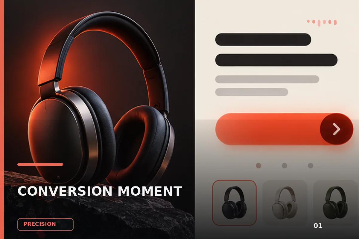
面向现代品牌的行动号召效果,以鼠标跟随、悬停反馈、动态渐变组织视觉层次;适合用于网页原型、品牌展示与交互动效参考
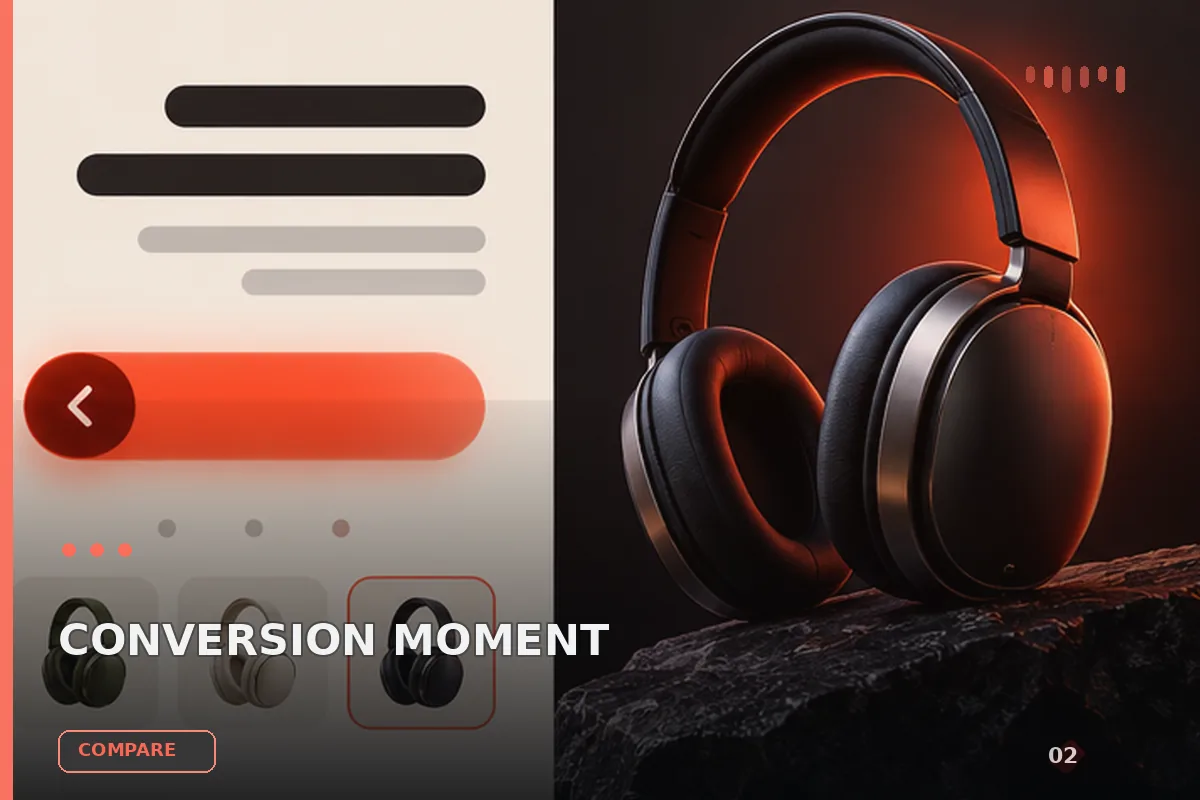
面向现代品牌的行动号召效果,以玻璃拟态、视差滚动、滚动触发组织视觉层次;适合用于网页原型、品牌展示与交互动效参考
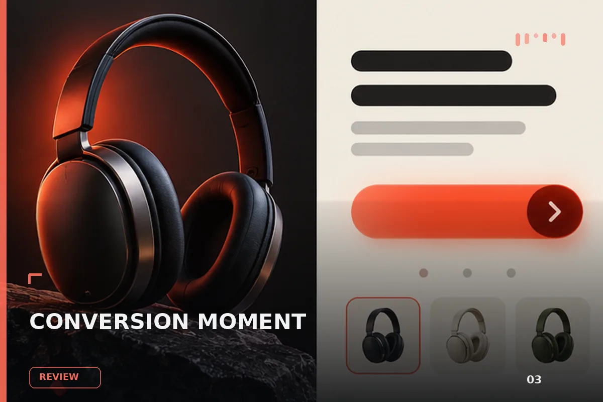
面向现代品牌的行动号召效果,以玻璃拟态、悬停反馈、沉浸式视频组织视觉层次;适合用于网页原型、品牌展示与交互动效参
以“先澄清目标与边界,再按优先级完成单一最佳方案”处理试用注册 CTA,输出语义明确、有信任支撑的行动号召区域;
以“从稳妥、平衡、突破三个方向并行推演”处理试用注册 CTA,输出语义明确、有信任支撑的行动号召区域;包含输入澄
以“先产出草案,再从事实、逻辑、语气和风险四层审校”处理试用注册 CTA,输出语义明确、有信任支撑的行动号召区域
查看完整提示词,复制后粘贴到任意 AI 平台使用。
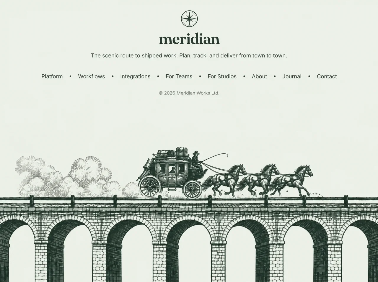
Build a single, self-contained index.html file (all HTML, CSS and JS inline — no external files except Google Fonts and the video URL below) for a full-viewport website FOOTER section called "meridian". Reproduce every detail below exactly.

═══════════════════════════════════════
1. OVERALL CONCEPT
═══════════════════════════════════════
A calm, vintage, engraved-illustration footer. The page contains ONLY the footer (no other sections, no demo spacer). The footer is exactly one viewport tall, with NO vertical or horizontal scroll at any screen size. The text block (compass logo, wordmark, tagline, nav, copyright) is centred at the top. A background video fills the footer: a pen-and-ink engraving of a long stone arched viaduct bridge in dark green ink; after about a second a stagecoach pulled by three trotting horses enters from the left, crosses the whole bridge, and exits right, trailing dust. The camera is static. The video's pure-white background must blend invisibly into the pale sage page colour using mix-blend-mode: multiply, so the video and page read as one seamless illustration.

═══════════════════════════════════════
2. HEAD
═══════════════════════════════════════
- <html lang="en">, meta charset UTF-8, meta viewport "width=device-width, initial-scale=1.0"
- <title>Meridian — Footer</title>
- meta description: "The scenic route to shipped work. Plan, track, and deliver from town to town."
- Preconnect to https://fonts.googleapis.com and https://fonts.gstatic.com (crossorigin)
- Google Fonts stylesheet exactly:
  https://fonts.googleapis.com/css2?family=Fraunces:opsz,wght@9..144,600&family=Inter:wght@400;500&display=swap

═══════════════════════════════════════
3. DESIGN TOKENS (:root)
═══════════════════════════════════════
--paper: #ebeee7;     (pale sage page background)
--ink: #2b3a30;       (engraving dark green — logo, wordmark, nav, dots)
--ink-soft: #3d4a41;  (tagline)
--muted: #6b746c;     (copyright)
--serif: "Fraunces", Georgia, "Times New Roman", serif;
--sans: "Inter", system-ui, -apple-system, "Segoe UI", Roboto, sans-serif;

Global:
- *, *::before, *::after { box-sizing: border-box }

- body: background var(--paper); color var(--ink); font-family var(--sans); -webkit-font-smoothing: antialiased; overflow-x: hidden.

═══════════════════════════════════════
4. FOOTER CONTAINER  (<footer class="footer">)
═══════════════════════════════════════
position: relative; width: 100%;
height: 100vh; then height: 100svh (declare both, svh second as the override);
NO min-height (so it never causes scroll);
display: flex; flex-direction: column;
overflow: hidden; background: var(--paper); isolation: isolate.

Inside the footer, the <video> comes FIRST in the DOM and the content div SECOND, but visual order is reversed with CSS order (content order:1 on top, video order:2 below).

═══════════════════════════════════════
5. BACKGROUND VIDEO  (<video class="footer__video">)
═══════════════════════════════════════
Attributes: autoplay muted loop playsinline preload="auto" aria-hidden="true" tabindex="-1" disablepictureinpicture
Single <source> with type="video/mp4" and this exact src:
https://d8j0ntlcm91z4.cloudfront.net/user_38xzZboKViGWJOttwIXH07lWA1P/hf_20260928_144832_2b6b23aa-4416-4fcb-9df4-132349c59edc.mp4

CSS:
order: 2;
flex: 1 1 0;            (fills all remaining height under the text)
min-height: 0;
display: block;
width: 100%;
height: auto;
margin-top: -12vh; then margin-top: -12svh;   (tucks the video's empty white sky up under the text block so it reads as one continuous full-height scene, while the coach always passes BELOW the copyright line)
object-fit: cover;
object-position: 50% 35%;   (on ultra-wide screens it crops mostly sky, keeping the coach clear of the text)
mix-blend-mode: multiply;   (white video bg → becomes #ebeee7; green ink stays crisp)
position: relative; z-index: 0;
pointer-events: none; user-select: none.

═══════════════════════════════════════
6. CONTENT BLOCK  (<div class="footer__content">)
═══════════════════════════════════════
order: 1; flex: none; position: relative; z-index: 1;
display: flex; flex-direction: column; align-items: center; text-align: center;
padding: clamp(28px, 2.8vw, 36px) 16px 0;

Children in this order:

(a) COMPASS LOGO — inline SVG, class "footer__mark", viewBox="0 0 64 64", role="img", aria-label="Meridian compass".
CSS: width clamp(44px, 4.1vw, 54px); height auto; color var(--ink); display block.
Exact SVG contents:
  <circle cx="32" cy="32" r="30" fill="none" stroke="currentColor" stroke-width="2.2" />
  <circle cx="32" cy="32" r="25.5" fill="none" stroke="currentColor" stroke-width=".8" opacity=".5" />
  <g fill="currentColor" opacity=".85">
    <path d="M32 32 L46 18 L35.2 34.4 Z" />
    <path d="M32 32 L46 46 L29.6 35.2 Z" />
    <path d="M32 32 L18 46 L28.8 29.6 Z" />
    <path d="M32 32 L18 18 L34.4 28.8 Z" />
  </g>
  <g stroke="currentColor" stroke-width="1" stroke-linejoin="round">
    <path d="M32 8 L35.5 28.5 L32 32 Z" fill="currentColor" />
    <path d="M32 8 L28.5 28.5 L32 32 Z" fill="none" />
    <path d="M56 32 L35.5 35.5 L32 32 Z" fill="currentColor" />
    <path d="M56 32 L35.5 28.5 L32 32 Z" fill="none" />
    <path d="M32 56 L28.5 35.5 L32 32 Z" fill="currentColor" />
    <path d="M32 56 L35.5 35.5 L32 32 Z" fill="none" />
    <path d="M8 32 L28.5 28.5 L32 32 Z" fill="currentColor" />
    <path d="M8 32 L28.5 35.5 L32 32 Z" fill="none" />
  </g>
  <circle cx="32" cy="32" r="1.8" fill="var(--paper)" stroke="currentColor" stroke-width="1" />
(An 8-point compass rose inside a double ring: 4 diagonal filled points at 85% opacity, 4 cardinal points each split half-filled / half-outlined for an engraved look, tiny paper-coloured centre dot.)

(b) WORDMARK — <p class="footer__brand"><a href="#" aria-label="Meridian home">meridian</a></p>  (all lowercase)
CSS: margin clamp(6px, .9vw, 12px) 0 0; font-family var(--serif) (Fraunces); font-weight 600; font-variation-settings "opsz" 72; font-size clamp(40px, 3.6vw, 48px); line-height 1; letter-spacing -0.015em; color var(--ink). Link: color inherit; no underline.

(c) TAGLINE — <p class="footer__tagline">The scenic route to shipped work. Plan, track, and deliver from town to town.</p>
CSS: margin clamp(14px, 1.4vw, 18px) 0 0; font-size clamp(14px, 1.1vw, 15px); line-height 1.5; color var(--ink-soft); max-width 44em (fits on ONE line on desktop).

(d) NAV — <nav class="footer__nav" aria-label="Footer"><ul> with 8 <li><a href="#"> items in this exact order:
Platform · Workflows · Integrations · For Teams · For Studios · About · Journal · Contact
CSS:
- .footer__nav { margin-top: clamp(28px, 3.2vw, 40px) }
- ul: list-style none; margin 0; padding 0; display flex; flex-wrap wrap; justify-content center; align-items center; row-gap 10px.
- li: display flex; align-items center.
- Dot separators via li + li::before: content ""; width 4px; height 4px; border-radius 50%; background var(--ink); margin 0 clamp(16px, 1.8vw, 24px); flex none.
- a: position relative; color var(--ink); no underline; font-size clamp(14px, 1.1vw, 15px); font-weight 400; padding 4px 0; transition color .2s ease.
- HOVER ANIMATION: a::after is a 1px underline (position absolute; left 0; right 0; bottom 0; height 1px; background currentColor) starting at transform: scaleX(0) with transform-origin: left and transition: transform .3s ease; on a:hover and a:focus-visible it becomes scaleX(1) — the underline draws in from left to right.
- a:focus-visible: outline 2px solid var(--ink); outline-offset 4px; border-radius 2px.

(e) COPYRIGHT — <p class="footer__copy">© <span id="year">2026</span> Meridian Works Ltd.</p>
CSS: margin clamp(22px, 2.4vw, 30px) 0 0; font-size 11.5px; color var(--muted); letter-spacing .01em.

═══════════════════════════════════════
7. RESPONSIVE BREAKPOINTS
═══════════════════════════════════════
@media (max-width: 900px)  — TABLET, nav becomes a clean 4×2 grid (no orphaned dots):
- .footer__nav ul { display: grid; grid-template-columns: repeat(4, minmax(0, 1fr)); column-gap: 16px; row-gap: 4px; max-width: 560px; margin: 0 auto; }
- .footer__nav li { justify-content: center }
- .footer__nav li + li::before { display: none }   (hide dots)
- .footer__nav a { padding: 8px 4px; font-size: 15px }   (bigger tap targets)

@media (max-width: 600px)  — MOBILE:
- .footer__content { padding: 36px 16px 0 }
- .footer__nav ul { grid-template-columns: repeat(2, minmax(0, 1fr)); max-width: 320px; }   (2-column × 4-row nav)
- The video needs no special mobile rule: with flex:1 + object-fit:cover it fills the remaining height, crops the sides, and the coach and bridge appear large under the stacked nav.

@media (prefers-reduced-motion: reduce):
- .footer__nav a::after { transition: none }

Requirements to verify: at 1280×720, 1920×1080, 2560×1080, 768×1024, 390×844, 375×812 and 360×640 the document scrollHeight equals the viewport height (no scroll), there is no horizontal overflow, and the coach always passes below the copyright line.

═══════════════════════════════════════
8. JAVASCRIPT (inline, at end of body)
═══════════════════════════════════════
1. Set #year textContent to new Date().getFullYear().
2. IIFE for the video:
   - Get .footer__video; return if missing.
   - If matchMedia("(prefers-reduced-motion: reduce)").matches → remove the autoplay attribute, pause the video, and return.
   - Otherwise, if IntersectionObserver exists, observe the video with threshold 0.15: when intersecting call video.play() (catch and ignore the promise rejection); when not intersecting call video.pause().

═══════════════════════════════════════
9. VISUAL RESULT CHECKLIST
═══════════════════════════════════════
- Pale sage (#ebeee7) full-screen footer, no scrollbars.
- Top-centre stack: dark-green compass rose → bold lowercase Fraunces "meridian" → one-line grey-green Inter tagline → nav links separated by small round dark-green dots (desktop) → small muted copyright.
- Below: an engraved stone arched viaduct spans the full width at the bottom; its white background is invisible thanks to multiply blending, so the ink drawing looks printed directly on the sage paper.
- The video loops: empty bridge → stagecoach with three trotting horses enters left, wheels rolling, dust trailing → exits right.
- Nav links show a thin underline that draws in from the left on hover or keyboard focus.
- Tablet: 4×2 nav grid without dots. Mobile: 2×4 nav grid, larger tap targets, video filling the lower part of the screen.
提示词已复制,选择一个常用平台继续。
