

以展馆视觉、留白和细腻转场营造策展氛围,适合美术馆、艺术节与文化空间。
艺术展馆沉浸式首屏
效果案例
READY TO USE
直接开始使用
这条提示词无需补充变量,可查看并复制完整提示词。
复制后粘贴到任意 AI 平台即可直接使用
更新于 2026.10.14 · 持续复测
以展馆视觉、留白和细腻转场营造策展氛围,适合美术馆、艺术节与文化空间。
以“先澄清目标与边界,再按优先级完成单一最佳方案”处理预约演示 CTA,输出语义明确、有信任支撑的行动号召区域;
以“从稳妥、平衡、突破三个方向并行推演”处理预约演示 CTA,输出语义明确、有信任支撑的行动号召区域;包含输入澄
以“先产出草案,再从事实、逻辑、语气和风险四层审校”处理预约演示 CTA,输出语义明确、有信任支撑的行动号召区域
以“建立评价量表,对初稿评分并针对最低分项定向重写”处理预约演示 CTA,输出语义明确、有信任支撑的行动号召区域
以“将任务拆成输入、决策、执行、验收和交接五个环节”处理预约演示 CTA,输出语义明确、有信任支撑的行动号召区域
以“先澄清目标与边界,再按优先级完成单一最佳方案”处理下载应用 CTA,输出语义明确、有信任支撑的行动号召区域;
查看完整提示词,复制后粘贴到任意 AI 平台使用。
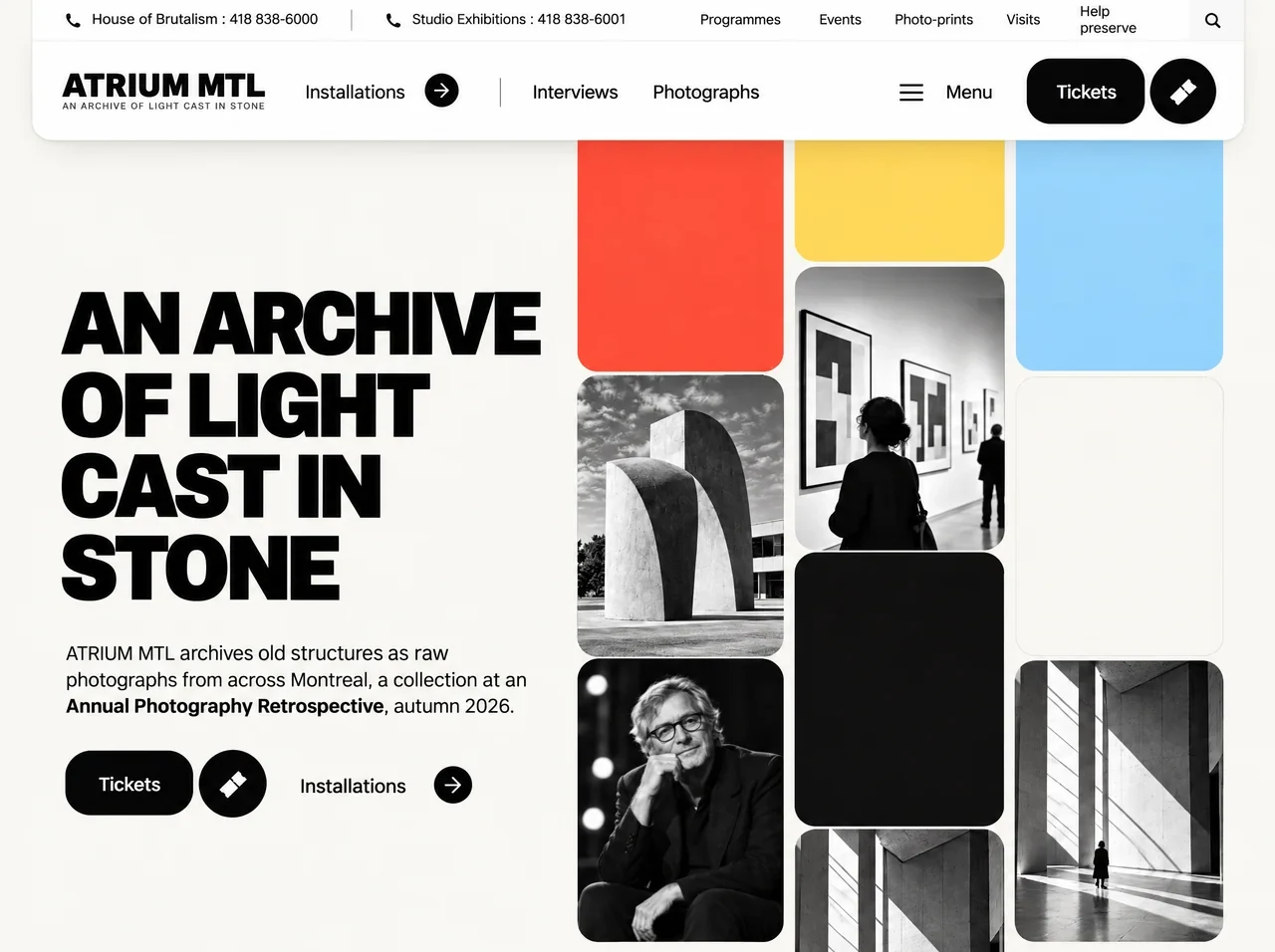
Build ONE self-contained file: index.html — no build step, no npm, no React/Vue, no external CSS/JS libraries. Everything in a single document: inline <style>, inline SVG icons, vanilla JavaScript only. Page title: "ATRIUM MTL — An archive of light cast in stone". Viewport meta: width=device-width, initial-scale=1, viewport-fit=cover.

IMPORTANT — MEDIA: There is NO <video> element and NO CloudFront video URL on this page. The right-hand mosaic uses four CloudFront WEBP photos + one CloudFront SVG grain texture (listed below). Continuous motion is pure CSS @keyframes on columns (14.6s loop), timed to match a reference recording (0.342 card-heights per second). Do not embed or link any video file.

Use these EXACT remote asset URLs in :root (do not substitute local paths for images/grain):

--img-sculpt: url(https://d2ol7oe51mr4n9.cloudfront.net/user_38xzZboKViGWJOttwIXH07lWA1P/fc524fc3-03c3-40a1-9954-22eab1322592.webp)
--img-man: url(https://d2ol7oe51mr4n9.cloudfront.net/user_38xzZboKViGWJOttwIXH07lWA1P/1d56967e-0ed5-40f8-812d-9360e5ec1780.webp)
--img-visit: url(https://d2ol7oe51mr4n9.cloudfront.net/user_38xzZboKViGWJOttwIXH07lWA1P/5f3f6135-26b9-4c48-92ad-105161327cbc.webp)
--img-sil: url(https://d2ol7oe51mr4n9.cloudfront.net/user_38xzZboKViGWJOttwIXH07lWA1P/e7b68ae9-9240-4f52-a0a2-89082df4b8d0.webp)
--grain: url(https://d2ol7oe51mr4n9.cloudfront.net/user_38xzZboKViGWJOttwIXH07lWA1P/40b7fef3-410d-4ef3-bd67-0a2fc7ee5a1d.svg)

FONTS — self-hosted @font-face (required for pixel match):
@font-face Archivo: weight 100–900, font-stretch 62%–125%, woff2 at assets/fonts/archivo.woff2
@font-face Inter: weight 100–900, woff2 at assets/fonts/inter.woff2
--display: "Archivo","Arial Black",Impact,system-ui,sans-serif
--sans: "Inter",system-ui,-apple-system,"Segoe UI",Roboto,Arial,sans-serif
font-display: block on both. Body uses --sans with antialiased/geometricPrecision.

DESIGN TOKENS (:root):
--paper #f5f4ef (page bg)
--ink #0f0f0e
--card-dark #151515, --card-cream #f9f6f1
--red #ef5d44, --yellow #fcdd71, --blue #9fd5f7
White header theme: --nav-bg/#ffffff, --nav-bar/#ffffff, --nav-fg/--ink, --nav-muted #62615d, --nav-line rgba(15,15,14,.08), --nav-rule rgba(15,15,14,.16), --nav-search #e8e7e2, --nav-cta var(--ink), --nav-cta-fg #fff
Grid desktop tokens: --col 205.33px, --gap 13px, --pitch 282.5px, --r 22px

OVERALL LAYOUT (editorial museum / brutalist archive):
Warm off-white full viewport. Floating white header card (rounded bottom corners 22px, subtle border + shadow). Left: oversized uppercase headline + body + CTAs. Right: 3-column staggered mosaic of rounded tiles (photos + solid color blocks) scrolling vertically forever; grid sits under header z-index. No page scroll on desktop/tablet/mobile — viewport-locked compositions using 100svh and overflow:hidden where specified.

DOM STRUCTURE (inside .stage):
1) .grid[aria-hidden=true] — 6 columns (.col): optional wide-screen .x3,.x2,.x1 (hidden by default) + main .c1,.c2,.c3. Each column has exactly 5 .cell children in this order:

x3: i-man, blue, dark, i-sculpt, yellow
x2: yellow, i-sil, cream, red, i-visit
x1: blue, i-man, red, i-sculpt, cream
c1: red, i-sculpt f-sculpt, i-man f-man, blue, i-visit
c2: yellow, i-visit f-visit visit, dark, i-sil, red
c3: blue, cream, i-sil f-sil, yellow, i-sculpt

Photo cells: .ph + .i-sculpt|.i-man|.i-visit|.i-sil — image via ::before { background: var(--pic) } where --pic maps to --img-* custom properties.
Solid cells: .red, .yellow, .blue, .cream (inset 1px #e9e6df), .dark (inset 1px rgba(255,255,255,.14)).
Grain overlay on solid tiles: ::after with background-image var(--grain), opacity .13 multiply; .dark ::after screen .035.

NUMERIC PHOTO CROPS (desktop hero tiles — ::before on .f-*):
.f-sculpt: width 124.19%, height 112.57%, left -16.07%, top -8.5%, background-size 100% 100%
.f-man: 113.48%, 103.36%, -5.36%, -3.54%
.f-visit: 110.07%, 100%, -3.9%, 8.5%; tile bg linear-gradient(90deg,#c6c5c3,#9b9a98 55%,#7a7977); ::after top fade rgba(0,0,0,.26)→0 at 13%
.f-sil: 139.29%, 126.37%, -8.77%, -56.64%
Mobile: .f-visit and .f-sil fall back to cover; .f-visit ::after hidden on mob.

COLUMN MARQUEE (CSS):
@keyframes colDown: translate3d 0→-50%; colUp: -50%→0
Default .col: colDown 14.6s linear infinite
.c2, .x1, .x3: colUp
.c1 left 0 top 86px; .c2 left calc(col+gap) top -11.5px; .c3 left calc(2*(col+gap)) top 86.5px
Extra cols: x1/x2/x3 at negative left offsets; display:none until html.desk.ex1|ex2|ex3
@media (prefers-reduced-motion: reduce) { .col animation none }

JS clones each column’s 5 cells once (duplicate appendChild) so 50% translate loops seamlessly.

DESKTOP MODE (html.desk):
Reference canvas 1280×800. .stage fixed, transform scale(--s) from origin 0 0, width calc(var(--W)*1px), height calc(var(--H)*1px).
--s = cover viewport: if vw/vh > 1280/800 then vh/800 else vw/1280 (no letterboxing).
--W = vw/s, --H = vh/s. class .tall if vh/s > 845.
Extra columns: extra = clamp(0..3, floor((vw/s - 1294)/218.33)); add ex1/ex2/ex3.
.grid: absolute right 62px top 0 bottom 0 width calc(3*col + 2*gap).

HEADER (desktop absolute positions — white theme):
.hdr: left/right 40px, height 142px, z-index 5, radius 0 0 22px 22px, shadow 0 0 0 1px nav-line, 0 16px 36px -24px rgba(15,15,14,.30)
Utility strip .util height 40px, border-bottom nav-line:
  Phone p1 tel:+14188386000 — "House of Brutalism : 418" line break "838-6000" (16px phone SVG)
  Vertical rule at 313px
  Phone p2 tel:+14188386001 — "Studio Exhibitions : 418" / "838-6001"
  .unav links (14px, weight 500): Programmes, Events, Photo-prints (two-line), Visits, Help preserve (two-line); search button 39×39 #e8e7e2, radius 5px 0 0 5px, magnifier SVG 13×13
Main row:
  Logo: ATRIUM MTL (Archivo 900, 31px, stretch 85%, stroke .35px) + small "AN ARCHIVE OF LIGHT CAST IN STONE" (8.6px, muted)
  Nav: Installations + 24px black circle arrow; separator; Interviews; Photographs; Menu burger + label
  CTA: black pill "Tickets" 116×63 radius 22px + 64×64 circle ticket SVG (rotated -45°)

HERO (desktop):
left 86px, top calc(200px + (var(--H,800)-800)*0.5px), width 480px
h1 four lines (each .ln inside span): "An archive" / "of light" / "cast in" / "stone"
Typography: Archivo 900, 80px, line-height 75.3px, letter-spacing -.06em, uppercase, stroke 1.1px; spans .95em, letter-spacing -.05em
p at top 344px, 460px wide, 18px/26.6px: "ATRIUM MTL archives old structures as raw photographs from across Montreal, a collection at an **Annual Photography Retrospective**, autumn 2026."
.acts at top 460px: Tickets pill + ticket circle + "Installations" bold link with 32px arrow circle (same ticket SVG style)

RESPONSIVE MODES — CSS-only --mode on :root, JS mirrors class on <html>:
Default --mode:mob
mob-l: min-width 560px AND aspect-ratio ≥ 1/1
tab-p: min-width 600px, min-height 820px, max-aspect-ratio 21/20
tab-l: min-width 900px, min-height 540px, min-aspect-ratio 21/20
desk: min-width 1097px AND min-aspect-ratio 27/25

JS: MODES array desk,mob,mob-l,tab,tab-l,tab-p; readMode from computed --mode; add matching class; tab* → also class tab, mob* → class mob; on resize/orientationchange run fit().

MOBILE (html.mob + html.mob body overflow hidden):
.stage flex column 100svh. Header grid: Logo | Menu only; all other header links in expandable panel (header[data-open]). Safe area insets. Tokens --tm, --hp, --row, --hh, --h1, --fp, --btn, menu rhythm --m-ph/u/p/fu/fp. Hero order 1, grid order 2 flex 1 min-height 0. Grid --gw calc(100vw - 2*tm), responsive --col/--pitch/--r. Stagger tops for c1/c2/c3 negative pitch fractions. Menu navIn animation stagger on open. Landscape phone html.mob-l: CSS grid stage — hero left, grid right (--lgw), column tops aligned to header height.

TABLET (html.tab):
--tm clamp 20–40px, --hh 142px, --h1 clamp up to 80px. Header: utility strip visible; logo + Menu + Tickets visible; main nav links in menu panel. tab-l: side-by-side hero + right grid like desktop native px. tab-p: stage grid rows header / hero block / grid band.

MENU BEHAVIOR (mob + tab only):
.menu-btn toggles header[data-open], aria-expanded. Escape closes. Click outside closes. Click nav link closes. Keyboard open focuses first item.

LOAD ENTRANCE (once, skip if prefers-reduced-motion):
Before main script: if not reduced-motion, add class intro to html; safety remove intro after 4s.
intro CSS: header translated up off-screen; many elements opacity 0; h1 lines translateY(110%). h1.masking uses clip-path inset per line.

WAAPI timeline (easing EXPO 0.16,1,0.3,1 | QUART 0.25,1,0.5,1 | QUINT 0.22,1,0.36,1):
- Header slide down 0.95s from translateY(calc(-100% - 48px))
- Utility fade stagger from 0.32s
- Logo drop 10px, nav items drop 8px stagger, CTA drop
- Each h1 .ln rise from 110% over 1s, stagger 0.085s from 0.30s
- Visible grid columns: custom translateY entrance ending at HANDOFF=2.10s with CRUISE=3.42 %/s and EXTRA=8% quint-out drift; opacity fade; then pause CSS marquee animations until T0+2100ms so handoff is seamless
- Hero p rise 14px; .acts children rise 12px stagger
On complete: remove masking, set data-entrance=done

ACCESSIBILITY:
Focus visible outline #3b82f6 offset 3px. aria-labels on logo, search, menu, ticket links. nav aria-labels "Useful links" / "Main navigation". Grid decorative aria-hidden.

COPY EXACTLY (English):
All strings as in DOM above — brand ATRIUM MTL, tagline AN ARCHIVE OF LIGHT CAST IN STONE, phones, nav labels, hero headline lines, body paragraph with bold "Annual Photography Retrospective", autumn 2026, Tickets, Installations, Menu.

QUALITY BAR:
Match spacing, typography weights, letter-spacing, pill radii, tile corner radius, header overlap with grid, infinite scroll speed (14.6s = 5 tiles × 2.92s), alternating column directions, wide-screen extra columns, and all five responsive architectures. Output must render identically at 1280×800 desktop and scale cleanly on mobile portrait/landscape and tablet without document scroll where specified.
提示词已复制,选择一个常用平台继续。
