

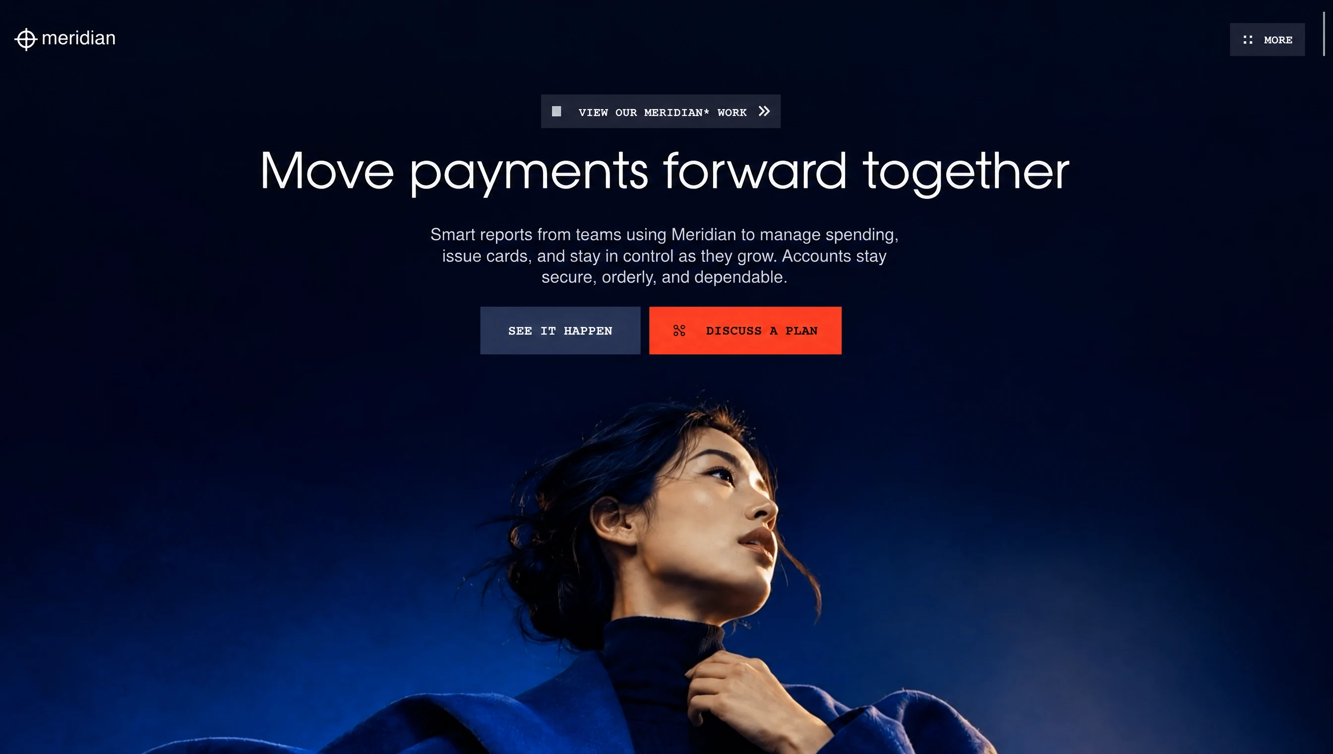
以钴蓝色调、数据氛围和精致动效塑造现代金融体验,适合金融科技与投资服务。
钴蓝时刻金融首屏
效果案例
READY TO USE
直接开始使用
这条提示词无需补充变量,可查看并复制完整提示词。
复制后粘贴到任意 AI 平台即可直接使用
更新于 2026.10.14 · 持续复测
以钴蓝色调、数据氛围和精致动效塑造现代金融体验,适合金融科技与投资服务。
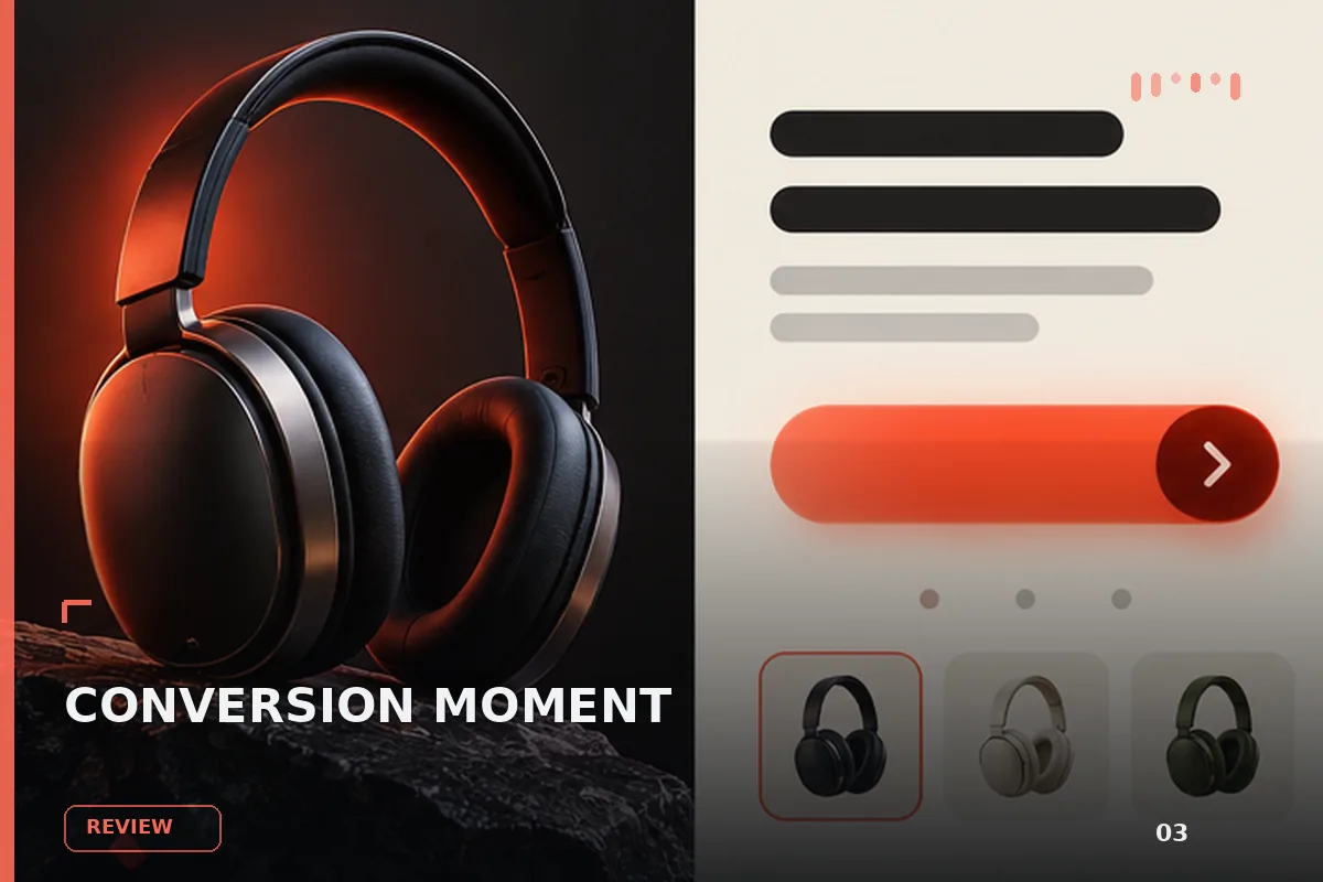
面向现代品牌的行动号召效果,以玻璃拟态、悬停反馈、沉浸式视频组织视觉层次;适合用于网页原型、品牌展示与交互动效参
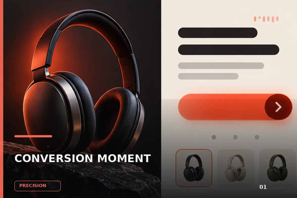
以“先澄清目标与边界,再按优先级完成单一最佳方案”处理试用注册 CTA,输出语义明确、有信任支撑的行动号召区域;
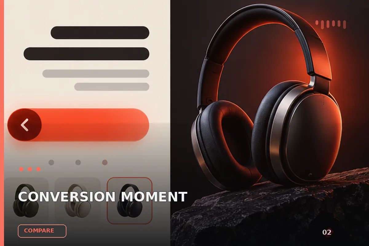
以“从稳妥、平衡、突破三个方向并行推演”处理试用注册 CTA,输出语义明确、有信任支撑的行动号召区域;包含输入澄
以“先产出草案,再从事实、逻辑、语气和风险四层审校”处理试用注册 CTA,输出语义明确、有信任支撑的行动号召区域
以“建立评价量表,对初稿评分并针对最低分项定向重写”处理试用注册 CTA,输出语义明确、有信任支撑的行动号召区域
以“将任务拆成输入、决策、执行、验收和交接五个环节”处理试用注册 CTA,输出语义明确、有信任支撑的行动号召区域
查看完整提示词,复制后粘贴到任意 AI 平台使用。
Build a single-file landing hero, `index.html`, for a fictional fintech brand "Meridian": plain HTML, one inline `<style>`, inline `<script>`s, no frameworks. It is one full-viewport hero section. Reproduce every value below exactly. Do not round numbers, add sections or restyle anything.

## 1. Assets

- **Background video (silent, looping, 1586×992, 9 s, 24 fps):**
  `https://d2ol7oe51mr4n9.cloudfront.net/user_38xzZboKViGWJOttwIXH07lWA1P/0e1b18f2-b590-4b97-96f0-b05e019d07eb.mp4`
  A low-angle photographic portrait: a young woman with dark hair in a loose low bun, black turtleneck and oversized cobalt-blue wool coat. One hand is at her collar and she gazes up to the right. Warm golden side light falls on her face. The top ~55% of the frame is an empty deep-navy sky (near `#020816`), shading to a brighter blue towards the bottom. In the video a breeze moves her hair and coat.
- **Poster / still image (same composition, 1586×992):** `assets/images/meridian-hero.jpg`. If you don't have that file, use
  `https://d2ol7oe51mr4n9.cloudfront.net/user_38xzZboKViGWJOttwIXH07lWA1P/19548534-c502-431f-904d-24d31b17c471.jpg`
- **Fonts:** three static WOFF2s from the free GUST "TeX Gyre" collection:
  - "M Display" = TeX Gyre Adventor Regular (the ITC Avant Garde Gothic design), weight 400
  - "M Sans" = TeX Gyre Heros Regular (Helvetica design), weight 400
  - "M Mono" = TeX Gyre Cursor Bold (Courier design), weight 700
  ```css
  @font-face{font-family:"M Display";src:url(assets/fonts/m-display.woff2) format("woff2");font-weight:400;font-display:block}
  @font-face{font-family:"M Sans";src:url(assets/fonts/m-sans.woff2) format("woff2");font-weight:400;font-display:block}
  @font-face{font-family:"M Mono";src:url(assets/fonts/m-mono-bold.woff2) format("woff2");font-weight:700;font-display:block}
  ```

## 2. Tokens and base

```css
:root{
  --ink-bg:#020816; --glass:rgba(51,52,74,.6); --glass-blur:14px; --navy:rgba(45,56,92,.85);
  --peach:#f2b380; --cta:#f93f28; --peach-ink:#331200; --white:#ffffff; --display:#f6f8fc;
  --body:#cfd3e0; --chip:#c9ccd4; --rail:#989eac; --u:1; --vh:100vh; --cap-shift:-0.055em;
  --f-display:"M Display","ITC Avant Garde Gothic","Avant Garde","URW Gothic","Century Gothic",sans-serif;
  --f-sans:"M Sans","Helvetica Neue",Helvetica,Arial,sans-serif;
  --f-mono:"M Mono","Courier New",Courier,monospace;
}
```

- Base rules: `*,*::before,*::after{box-sizing:border-box}`; html and body: `margin:0; height:100%; background:#020816; color:#fff`.
- Text rendering: `text-size-adjust:100%`; body `-webkit-font-smoothing:antialiased; -moz-osx-font-smoothing:grayscale; text-rendering:geometricPrecision`.
- Links and buttons: `a{color:inherit;text-decoration:none}`;
- Focus: `:focus-visible{outline:2px solid #f2b380; outline-offset:3px}`.
- Meta tags: viewport `width=device-width, initial-scale=1, viewport-fit=cover`; `theme-color #020816`; title `Meridian — Move payments forward together`.

## 3. Structure

```
section.hero#hero (aria-label="Meridian")
├─ div.photo#photo (aria-hidden) > video
├─ div.nav-l > a.brand
├─ div.nav-r > button.more + span.rail
└─ main.stage#stage > a.pill, h1, p.lede, div.cta#cta > a.btn.b1 + a.btn.b2
```

**.hero:**
- `position:relative; width:100%; height:100vh; height:100dvh; height:var(--vh); min-height:100%; overflow:hidden; background:#020816; isolation:isolate`.

**.photo:**
- `position:absolute; left:0; top:0; width:100%; height:100%; z-index:0; will-change:transform; transform-origin:0 0`.
- With JS: `.js .photo{width:calc(1586px*var(--s,1)); height:calc(992px*var(--s,1)); transform:translate3d(var(--x0,0px),var(--y0,0px),0)}`.
- The video: `<video autoplay muted loop playsinline preload="auto" width="1586" height="992" poster="…" src="…">`, styled `position:absolute; inset:0; width:100%; height:100%; object-fit:cover; object-position:50% 100%; display:block; user-select:none`.
- Top feather: `.photo::after{content:""; position:absolute; inset:-1px; pointer-events:none; background:linear-gradient(180deg, rgba(2,8,22,1) 0%, rgba(2,8,22,.55) 6%, rgba(2,8,22,.15) 14%, rgba(2,8,22,0) 22%, rgba(2,8,22,0) 100%)}`.

## 4. Top chrome (anchored to the edges, scaled by --u)

**Wrappers:**
- `.nav-l,.nav-r{position:absolute; top:0; z-index:3; width:0; height:0}`.
- `.nav-l{left:0; transform-origin:0 0; transform:scale(var(--u))}`.
- `.nav-r{right:0; transform-origin:100% 0; transform:scale(var(--u))}`.

**Brand** (`a.brand`, `aria-label="Meridian home"`, inline style `--nx:-0.5px; --ny:-2.75px`):
- Box: absolute, left 16px, top 29.3px, flex, `align-items:flex-start`, nowrap.
- Logo SVG: 24×24, viewBox `0 0 24 24`, `fill="none" stroke="#fff"`, overflow visible:
  - `<circle cx="12.2" cy="11.9" r="8.45" stroke-width="2"/>`
  - `<path d="M12.2 0.1V24" stroke-width="1.9"/>`
  - `<path d="M0 11.9H24.4" stroke-width="1.95"/>`
- Word "meridian" (lowercase): M Sans 21px, letter-spacing -0.1px, line-height 1, margin-left 4px, `position:relative; left:var(--nx); top:var(--ny)`.

**MORE button** (`button.more`, `aria-haspopup="true"`, style `--nx:0.25px; --ny:-1.0px`):
- Box: absolute, right 29.65px, top 23.83px, 80.45×35.35px, flex, items centred, padding `0 14.76px 0 15.14px`.
- Style: background `rgba(51,52,74,.6)`, `backdrop-filter:blur(14px)` (with the -webkit- prefix), square corners, nowrap, `transition:background-color .2s`. On hover-capable devices, hover background `rgba(66,66,96,.66)`.
- Icon: SVG `.dots`, 8.4×8.4px, viewBox `0 0 8.4 8.4`, fill #fff, four 2.4×2.4 rects at (0,0), (6,0), (0,6), (6,6); `left:0.2px; transform:translateY(0.31px)`.
- Label "MORE": M Mono 700, 12px, letter-spacing 0.2px, line-height 1, margin-left 13.4px, `position:relative; left:var(--nx); top:calc(var(--ny) + var(--cap-shift))`.

**Rail** (`span.rail`, aria-hidden):
- Absolute, right 8.7px, top 11.9px, 1.9×47.2px, background `#989eac`, radius 1px, `pointer-events:none`, `transform-origin:50% 0`.

## 5. Stage (a 1280×800 composition scaled uniformly)

**Stage box:** `.stage{position:absolute; left:50%; top:0; width:1280px; height:800px; z-index:2; transform-origin:50% 0; transform:translateX(-50%) scale(var(--u))}`.

**Eyebrow pill** (`a.pill` → `#work`, style `--nx:0.75px; --ny:0px`):
- Box: absolute, left 506px, top 99.76px, height 35.3px, flex, items centred, padding `0 11.78px 0 11.92px`.
- Style: glass background `rgba(51,52,74,.6)` with `blur(14px)`, square corners, nowrap, `transition:background-color .2s`; hover `rgba(66,66,96,.66)`.
- Contents, in order:
  1. `<i class="sq">`: 9.3×11.1px, background `#c9ccd4`, `top:0.1px`.
  2. Label "VIEW OUR MERIDIAN* WORK": M Mono 700, 12px, letter-spacing 0.6px, line-height 1, margin-left 18.3px, `position:relative; left:var(--nx); top:calc(var(--ny) + var(--cap-shift))`.
  3. Double-chevron SVG: 11×10.5px, viewBox `0 0 11 10.5`, margin-left 13.5px, `top:0.15px`, `fill="none" stroke="#fff" stroke-width="1.75" stroke-linecap="square" stroke-linejoin="miter"`, paths `M1 0.9l4.2 4.35L1 9.6` and `M6.2 0.9l4.2 4.35L6.2 9.6`.

**Headline** (`h1`): "Move payments forward together", on one line on desktop.
- Box: absolute, left 0, top 0, width 1280px, margin 0, centred, nowrap, `transform:translate(var(--nx),var(--ny))` with inline style `--nx:-3.0px; --ny:159.5px`.
- Type: M Display 400, 53px, letter-spacing 0, line-height 1, colour `#f6f8fc`.

**Lede** (`p.lede`, style `--nx:-3.0px; --ny:236.5px`):
- Box: absolute, left 0, top 0, width 1280px, margin 0, centred, `transform:translate(var(--nx),var(--ny))`.
- Type: M Sans 18px, line-height 23px, colour `#cfd3e0`.
- Text on three lines, with each break written `<br class="d">`:
  - "Smart reports from teams using Meridian to manage spending,"
  - "issue cards, and stay in control as they grow. Accounts stay"
  - "secure, orderly, and dependable."
- `br.d{display:inline}`.

**CTA row** (`div.cta#cta`): absolute, left 441.1px, top 326.55px, flex, gap 8.76px.

**Buttons (shared)** (`.btn`):
- Height 51.2px, inline-flex, items centred, nowrap.
- Type: M Mono 700, 13.5px, letter-spacing 0.4px, line-height 1. `transition:filter .2s, background-color .2s`.
- The label span is `position:relative; left:var(--nx); top:calc(var(--ny) + var(--cap-shift))`.

**b1** "SEE IT HAPPEN" → `#demo` (style `--nx:-0.25px; --ny:0px`):
- Padding `0 30.35px`, background `rgba(45,56,92,.85)` with `blur(14px)`, white text. Hover `rgba(58,72,114,.9)`.

**b2** "DISCUSS A PLAN" → `#contact` (style `--nx:0.5px; --ny:0px`):
- Padding `0 25.92px 0 25.78px`, background `#f93f28`, text `#331200`. Hover `filter:brightness(1.05)`.
- Leading icon: SVG 12×12, viewBox `0 0 12 12`, margin-right 22.5px, `top:0.34px`, `fill="none" stroke="currentColor" stroke-width="1.05"`. It contains four circles r=1.75 at (2.3,2.3), (9.7,2.3), (2.3,9.7), (9.7,9.7), plus path `M3.6 3.9L8.4 8.1`.

All corners are square: no border-radius anywhere except the rail.

## 6. Scripts

**In `<head>`, before first paint:**
- Set `--u = min(clientWidth/1280, innerHeight/800)` and `--vh = innerHeight + 'px'` on `<html>`, and add class `js`.
- If reduced motion is not requested and `'animate' in document.documentElement`, add class `intro`, plus a failsafe that removes it after 4000ms.

**Layout engine** (runs on load, resize, visualViewport resize, media-query changes, `fonts.ready`, and a ResizeObserver on the stage; throttled with rAF):
- Constants: `IW=1586, IH=992, CROWN=530, GAP_D=49.24, GAP_M=26, OVERSCAN=1.00078, K_T=.9, MAX_ZOOM=1.4`.
- Media queries: `DESK = (min-width:1152px) and (min-height:720px)`; `PHONE = (max-width:510.98px)`. Mode is `d` (desktop), `m` (phone) or `t` (tablet).
- On each run:
  1. Recompute `u = min(vw/1280, vh/800)` and set `--u` and `--vh`.
  2. `cb` = the CTA's bottom edge relative to the hero. `k` = the CSS `--k` value, or `K_T` if unset.
  3. `crown = cb + (d ? GAP_D*u : t ? GAP_D*k : GAP_M)`.
  4. `cover = max(vw/IW, H/IH)`, where H is the hero's height.
  5. `s = max(cover, (H-crown)/(IH-CROWN))`. If `s > cover*MAX_ZOOM`, set `s = cover*MAX_ZOOM` and `crown = H-(IH-CROWN)*s`. Then multiply `s` by `OVERSCAN`.
  6. `fx = (vw/H < 1) ? 815 : IW/2`.
  7. `x0 = clamp(vw/2 - fx*s, vw - IW*s, 0)`; `y0 = crown - CROWN*s`.
  8. Set `--s`, `--x0` and `--y0` on `.photo`.

**Entrance** (Web Animations API):
- Start after `document.fonts.ready`, then one rAF.
- Every tween uses `fill:'backwards'`.
- Easings: `EXPO=cubic-bezier(.16,1,.3,1)`, `QUART=cubic-bezier(.25,1,.5,1)`, `SHUTTER=cubic-bezier(.76,0,.24,1)`. Travel multiplier `d=.75` on phones, `1` otherwise.
- CSS support:
  - While `html.intro` is present, the brand, `.more`, rail, pill, h1, lede and `.btn` start at `opacity:0`.
  - Headline word masks: `h1 .w{display:inline-block; overflow:hidden; vertical-align:top; padding:.08em 0 .2em; margin:-.08em 0 -.2em}`, `h1 .w>span{display:inline-block}`.
- Timeline (all in seconds):

  | Element | From → to | Delay | Duration | Easing |
  |---|---|---|---|---|
  | Brand | opacity 0, translate `0 -8d px` → opacity 1, in place | .15 | .8 | QUART |
  | MORE | opacity 0, translate `0 -8d px` → opacity 1, in place | .25 | .8 | QUART |
  | Rail | scale `1 0` → `1 1` | .35 | .9 | EXPO |
  | Pill | clip-path `inset(0 100% 0 0)` → `inset(0 0% 0 0)` (left-to-right wipe) | .30 | .75 | SHUTTER |
  | Headline, word i | inner span translate `0 132%` → `0 0` | .45 + i×.055 | 1.05 | EXPO |
  | Lede | opacity 0, translate `0 12d px` → opacity 1, in place | .85 | .9 | QUART |
  | b1 | clip-path `inset(100% 0 0 0)` → `inset(0% 0 0 0)` (bottom-to-top wipe) | 1.05 | .75 | EXPO |
  | b1 label | opacity 0, translate `0 8d px` → opacity 1, in place | 1.15 | .7 | QUART |
  | b2 | same bottom-to-top wipe | 1.13 | .75 | EXPO |
  | b2 label and icon | opacity 0, translate `0 8d px` → opacity 1, in place | 1.23 | .7 | QUART |

- Before the tweens, split the headline's words into `<span class="w"><span>word</span></span>`.
- After creating the tweens, remove `intro` in the same frame.
- When the word tweens finish, restore the headline's original markup.
- When all tweens finish, cancel them and add `intro-done`.
- Under `prefers-reduced-motion: reduce`, disable all transitions and skip the intro.

**Video playback:**
- Set `muted=true` and call `play()`, swallowing the rejected promise.
- Call it again on `canplay`, when the page becomes visible, and once on the first `pointerdown`, `touchstart` or `scroll`.

## 7. Responsive

**Tablet** — `(min-width:511px) and (max-width:1151.98px), (min-width:511px) and (max-height:719.98px)`:
- Variables: `--k:.9; --gut:clamp(32px,5vw,48px)`. `.hero{height:auto; min-height:var(--vh)}`. `.nav-l,.nav-r{transform:scale(var(--k))}`.
- Stage becomes a centred flex column: `position:relative; left:auto; top:auto; width:auto; height:auto; transform:none; display:flex; flex-direction:column; align-items:center; text-align:center`, padding `calc(clamp(70px,12.47vh,89.8px) + env(safe-area-inset-top,0px)) var(--gut) 0`.
- Pill, h1, lede and CTA become `position:relative` with no offsets or transforms. `.pill,.cta{zoom:var(--k)}`. `.pill span,.btn span{left:0; top:var(--cap-shift)}`.
- h1: `width:auto; margin-top:min(calc(24.44px*var(--k)),2.9vh); font-size:clamp(40px,calc((100vw - 2*var(--gut))/16.4),calc(53px*var(--k)))`.
- Lede: `width:auto; margin-top:min(calc(24px*var(--k)),2.85vh); font-size:min(calc(18px*var(--k)),calc((100vw - 2*var(--gut))/27.9)); line-height:1.278`.
- CTA: `margin-top:min(21.05px,2.8vh)`.
- Hit areas: `.more::after,.pill::after{content:""; position:absolute; inset:-6px -2px}`.

**511–719.98px:**
- h1: `white-space:normal; font-size:clamp(40px,6.9vw,46px); line-height:1.06; max-width:9.6em; text-wrap:balance`.

**Portrait tablet** — `(min-width:511px) and (max-width:1151.98px) and (orientation:portrait)`:
- `--k:1`. Stage padding-top `calc(clamp(96px,10.5vh,150px) + env(safe-area-inset-top,0px))`.
- h1: `white-space:normal; font-size:clamp(44px,7.6vw,78px); line-height:1.04; max-width:9.6em; text-wrap:balance; margin-top:clamp(24px,2.6vh,34px)`.
- Lede `margin-top:clamp(22px,2.4vh,30px)`; CTA `margin-top:clamp(24px,2.6vh,34px)`.

**Phone** — `(max-width:510.98px)`:
- Variables and hero: `--gut:clamp(20px,5.5vw,24px)`. `.hero{height:auto; min-height:100svh; min-height:var(--vh)}`.
- Nav: `.nav-l,.nav-r{transform:scale(.88); top:env(safe-area-inset-top,0px)}`.
- Stage: the same flex column as tablet, with padding `calc(clamp(80px,10.5vh,94px) + env(safe-area-inset-top,0px)) var(--gut) 0`. Pill: `zoom:.86`.
- h1: `margin-top:clamp(17px,2.2vh,21px); white-space:normal; font-size:clamp(32px,9.25vw,37px); line-height:1.06; max-width:9.6em; text-wrap:balance`.
- Lede: `margin-top:clamp(13px,1.8vh,16px); font-size:clamp(14px,3.72vw,15px); line-height:1.42; max-width:32em; text-wrap:pretty`. `br.d{display:none}`.
- CTA row: `margin-top:clamp(18px,2.4vh,22px); gap:8px; flex-wrap:wrap; justify-content:center; width:100%; max-width:330px`.
- Buttons: `.btn{height:46px; flex:1 1 auto; justify-content:center; font-size:11.5px; letter-spacing:.35px}`. `.b1` padding `0 clamp(13px,3.5vw,20px)`. `.b2` padding `0 calc(clamp(13px,3.5vw,20px) - .34px) 0 calc(clamp(13px,3.5vw,20px) + .34px)`. `.b2 svg` 11×11px with `margin-right:clamp(12px,3.5vw,16px)`.
- Hit areas: `inset:-8px -4px`.

## Final check

At 1280×800:
- "meridian" logo top-left, a glass "MORE" button top-right with a thin grey rail at the far edge.
- Centred: the glass pill, then a one-line 53px headline, a three-line pale lede, and the navy + red-orange CTA pair.
- The woman's head sits about 49px below the CTA row, with deep-navy sky filling everything above.
- The entrance plays once, in about 1.95s.
提示词已复制,选择一个常用平台继续。
