

以交易信息、流畅动效和可信层级展示金融产品价值,适合支付、资产和金融科技服务。
Sellix 金融科技首屏
效果案例

READY TO USE
直接开始使用
这条提示词无需补充变量,可查看并复制完整提示词。
复制后粘贴到任意 AI 平台即可直接使用
更新于 2026.10.14 · 持续复测
以交易信息、流畅动效和可信层级展示金融产品价值,适合支付、资产和金融科技服务。
面向现代品牌的行动号召效果,以玻璃拟态、视差滚动、滚动触发组织视觉层次;适合用于网页原型、品牌展示与交互动效参考
面向现代品牌的行动号召效果,以玻璃拟态、悬停反馈、沉浸式视频组织视觉层次;适合用于网页原型、品牌展示与交互动效参
以“先澄清目标与边界,再按优先级完成单一最佳方案”处理试用注册 CTA,输出语义明确、有信任支撑的行动号召区域;
以“从稳妥、平衡、突破三个方向并行推演”处理试用注册 CTA,输出语义明确、有信任支撑的行动号召区域;包含输入澄
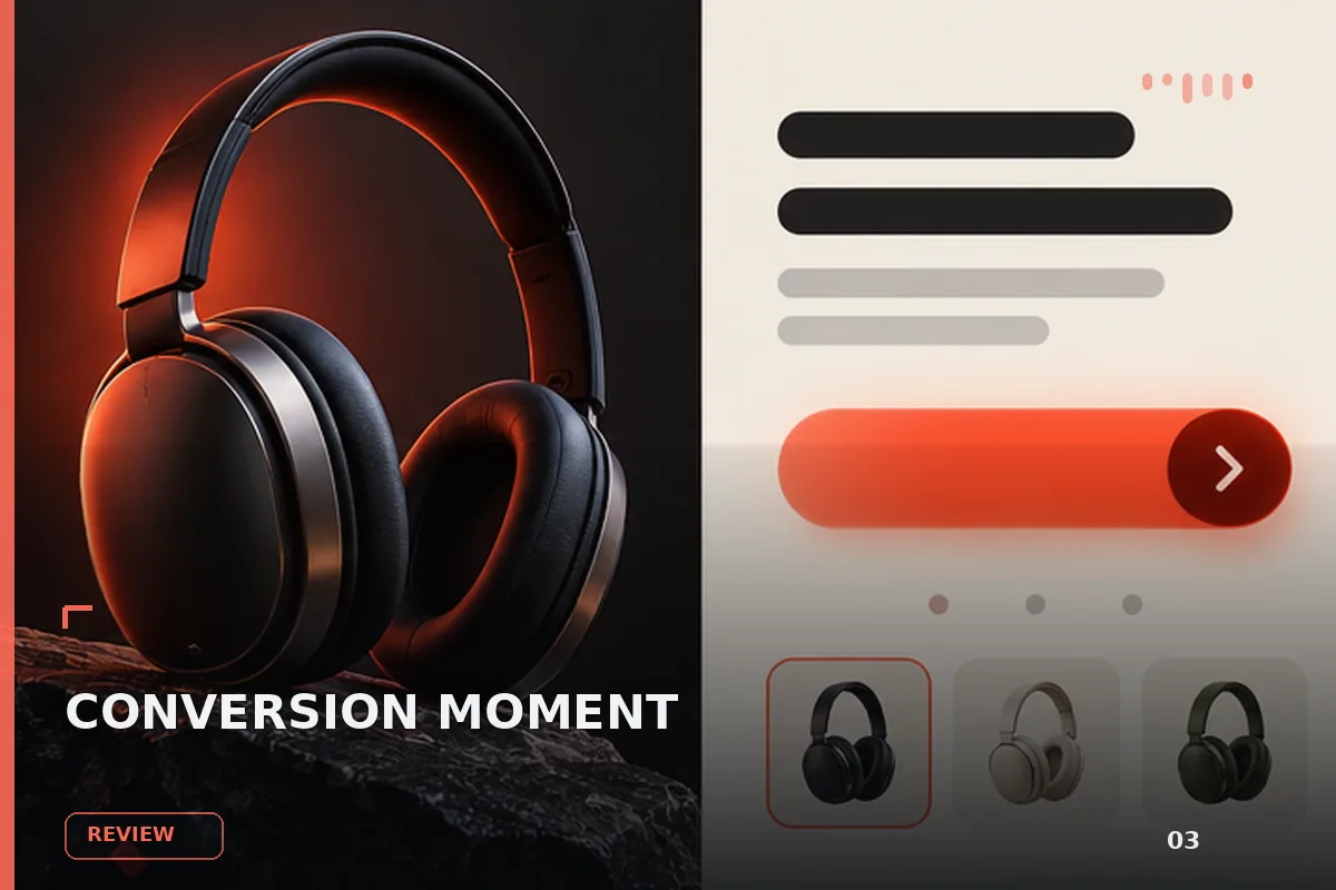
以“先产出草案,再从事实、逻辑、语气和风险四层审校”处理试用注册 CTA,输出语义明确、有信任支撑的行动号召区域
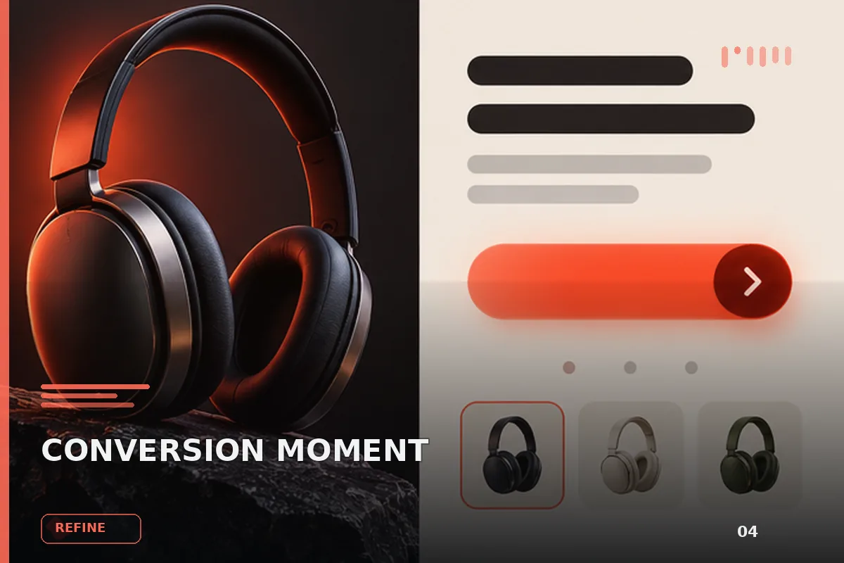
以“建立评价量表,对初稿评分并针对最低分项定向重写”处理试用注册 CTA,输出语义明确、有信任支撑的行动号召区域
查看完整提示词,复制后粘贴到任意 AI 平台使用。
Build a single, self-contained `index.html` — one file, no build step, no frameworks,
no external CSS or JS libraries. All CSS in one <style> in <head>. All JS in inline
<script> tags. The page is a full-viewport hero section with a looping video background.

============================================================
0. DOCUMENT
============================================================
<!DOCTYPE html>, <html lang="en">.
<meta charset="utf-8">
<meta name="viewport" content="width=device-width, initial-scale=1, viewport-fit=cover">
<title>Sellix — Cross-border finance</title>

============================================================
1. FONTS
============================================================
Typeface: Plus Jakarta Sans, weights 300, 400, 500, 600, 800.
Load from Google Fonts and alias the family to 'PJS' via @font-face, or link it
directly and use the family name in the stack. Use font-display: block (the entrance
animation waits on document.fonts.ready; a swap would play the headline reveal
against invisible text).

body font stack:
  'PJS', -apple-system, BlinkMacSystemFont, 'Segoe UI', Roboto, sans-serif
body also gets: -webkit-font-smoothing:antialiased; -moz-osx-font-smoothing:grayscale;
text-rendering:geometricPrecision; color:var(--ink).

============================================================
2. DESIGN SYSTEM — the reference-pixel unit
============================================================
The whole desktop layout is authored against a 1280 x 800 reference render and scales
proportionally. Define ONE unit and express every desktop measurement as a multiple
of it. Do not substitute rem/px on desktop.

:root{
  --u: min(calc(100vw / 1280), calc(100dvh / 760));

  --ink:        #ffffff;
  --ink-muted:  #ededed;
  --panel:      #181818;
  --white-btn:  #fdfdfd;
  --btn-ink:    #050505;
  --glass-fill: rgba(0,0,0,.78);
  --glass-line: rgba(255,255,255,.09);

  --dx: 8.5;    /* hero block optical offset, solved against the reference render */
  --dy: 13.1;
}
@supports not (height: 100dvh){
  :root{ --u: min(calc(100vw / 1280), calc(100vh / 760)); }
}

Global: *{box-sizing:border-box}
html,body{height:100%;margin:0;padding:0;overflow:hidden;background:#000}

============================================================
3. STRUCTURE
============================================================
<main class="hero">
  <div class="bg" role="img" aria-label="Stylised globe of Earth rendered as a purple
       dot matrix against a starfield, slowly rotating">
    <video class="bg-video is-active" id="bgVideoA" …>
    <video class="bg-video" id="bgVideoB" …>
  </div>
  <header class="nav"> logo, nav-links, nav-actions, burger </header>
  <nav class="menu" id="menu"> mobile panel </nav>
  <div class="hero-inner"> h1, .sub, .ctas </div>
</main>

.hero{position:relative;width:100vw;height:100dvh;overflow:hidden;background:#000}
@supports not (height: 100dvh){ .hero{height:100vh} }

============================================================
4. VIDEO BACKGROUND  (exact URLs — use these verbatim, do not localise)
============================================================
Video : https://d8j0ntlcm91z4.cloudfront.net/user_38xzZboKViGWJOttwIXH07lWA1P/hf_20260912_104036_bd6924f6-3c8e-417e-8465-6d03c8c2e9e6.mp4
Poster: https://d2ol7oe51mr4n9.cloudfront.net/user_38xzZboKViGWJOttwIXH07lWA1P/82e7eb75-c65f-490a-99b5-f3d1cad54200.webp

The clip is 1920x1080, 10.04s, silent: a violet dot-matrix Earth rotating slowly
right-to-left against a starfield, with a faceted wireframe lattice, pulsing light
arcs, an orbiting satellite and a breathing rim glow. Locked-off camera.

TWO <video> elements, both pointing at the same source, stacked in .bg. The clip's
last frame does NOT match its first, so a plain loop snaps a continent sideways every
ten seconds — the two copies cross-fade at the loop point to hide that.

Video A: class="bg-video is-active" id="bgVideoA" autoplay muted loop playsinline
         preload="auto" disablepictureinpicture aria-hidden="true" poster="…"
Video B: class="bg-video"           id="bgVideoB"         muted loop playsinline
         preload="auto" disablepictureinpicture aria-hidden="true" poster="…"
Each wraps a <source src="…" type="video/mp4">. (B has no autoplay.)

/* 1280:800 bleed box, always covering the viewport */
.bg{
  position:absolute;left:50%;top:50%;
  transform:translate(-50%,-50%);
  width:max(100vw, calc(100dvh * 1.6));
  height:max(62.5vw, 100dvh);
  background-color:#000;
}
@supports not (height: 100dvh){
  .bg{width:max(100vw, calc(100vh * 1.6));height:max(62.5vw, 100vh)}
}
.bg-video{
  position:absolute;inset:0;
  width:100%;height:100%;
  object-fit:cover;
  object-position:51% 8%;      /* framing inherited from the still it replaces */
  display:block;
  background-color:#000;
  pointer-events:none;
  opacity:0;
  transition:opacity .9s linear;
}
.bg-video.is-active{opacity:1}

============================================================
5. NAV  (desktop)
============================================================
.nav{position:absolute;top:0;left:0;right:0;height:calc(67 * var(--u));
     display:flex;align-items:center;
     padding-left:calc(24.5 * var(--u));padding-right:calc(50.7 * var(--u));z-index:3}

.logo — text "Sellix", <a href="#">
  font-weight:800;font-size:calc(26 * var(--u));letter-spacing:calc(0.45 * var(--u));
  transform:translateY(calc(-2.4 * var(--u)));line-height:1;color:var(--ink);
  text-decoration:none;white-space:nowrap;

.nav-links — <nav aria-label="Primary">, five <a>: Products, Pricing, Developers,
             Resources, Contact Sales
  position:absolute;left:50%;top:50%;
  transform:translate(-50%,-50%) translateX(calc(-23 * var(--u)));
  display:flex;align-items:center;gap:calc(24.3 * var(--u));white-space:nowrap;
  a: color:var(--ink-muted);text-decoration:none;font-size:calc(11.5 * var(--u));
     font-weight:500;letter-spacing:calc(-0.15 * var(--u));line-height:1;
     transition:color .18s ease;  hover -> #fff

.nav-actions{margin-left:auto;display:flex;align-items:center;gap:calc(6.8 * var(--u))}

.btn (shared): display:inline-flex;align-items:center;justify-content:center;
  font-family:inherit;text-decoration:none;white-space:nowrap;border:0;cursor:pointer;

.btn-login — "Login"
  height:calc(28 * var(--u));padding:0 calc(12.9 * var(--u));
  border-radius:calc(14 * var(--u));background:var(--panel);color:#e8e8e8;
  font-size:calc(11.5 * var(--u));font-weight:500;letter-spacing:calc(-0.15 * var(--u));
  transition:background .18s ease,color .18s ease;
  hover -> background:#232323;color:#fff

.btn-nav-start — "Get Started" + arrow
  height:calc(28 * var(--u));padding-left:calc(13.5 * var(--u));
  padding-right:calc(14.5 * var(--u));border-radius:calc(14 * var(--u));
  background:var(--white-btn);color:var(--btn-ink);font-size:calc(11.1 * var(--u));
  font-weight:500;letter-spacing:0;gap:calc(7 * var(--u));
  transition:background .18s ease;  hover -> #fff
  .arw{width:calc(11.5 * var(--u));height:calc(9.6 * var(--u))}

.burger — <button id="burger" aria-label="Open menu" aria-expanded="false"
          aria-controls="menu"><span></span></button>
  display:none (desktop);margin-left:auto;width:calc(40 * var(--u));
  height:calc(28 * var(--u));align-items:center;justify-content:center;
  background:var(--panel);border-radius:calc(14 * var(--u));border:0;cursor:pointer;padding:0;
  span{display:block;width:16px;height:1.5px;background:#ededed;border-radius:2px;position:relative}
  span::before,span::after{content:"";position:absolute;left:0;width:16px;height:1.5px;
    background:#ededed;border-radius:2px}
  span::before{top:-5px}  span::after{top:5px}

ARROW ICON (every "Get Started" / "Contact Sales"), inline SVG:
<svg class="arw" viewBox="0 0 12 10" fill="none" aria-hidden="true">
  <path d="M0.8 5h10M7.1 1.4 10.9 5l-3.8 3.6" stroke="currentColor"
        stroke-width="1.35" stroke-linecap="round" stroke-linejoin="round"/>
</svg>
.arw{flex:0 0 auto;display:block}

============================================================
6. HERO CONTENT
============================================================
.hero-inner{
  position:absolute;left:50%;top:50%;
  transform:translate(-50%,-50%) translate(calc(var(--dx) * var(--u)), calc(var(--dy) * var(--u)));
  width:max-content;text-align:center;z-index:2;
}

h1 — markup is two block lines, NOT a <br>, because the entrance masks each line:
  <h1><span class="ln"><span class="ln-i">Cross-border</span></span>
      <span class="ln"><span class="ln-i">finance</span></span></h1>
  .ln{display:block} .ln-i{display:block}
  h1{margin:0;font-weight:500;font-size:calc(89 * var(--u));
     line-height:calc(90 * var(--u));letter-spacing:calc(-1 * var(--u));color:var(--ink)}

.sub — <p class="sub">, exact copy with two <br>:
  "Accept payments, manage and custody your assets with ease,<br>
   enjoy seamless on/off-ramping between cryptocurrencies and fiat,<br>
   and explore integrated eCommerce solutions."
  margin:calc(16.1 * var(--u)) 0 0;font-weight:300;font-size:calc(17.4 * var(--u));
  line-height:calc(27 * var(--u));letter-spacing:calc(-0.30 * var(--u));color:#f6f6f6;

.ctas{margin-top:calc(21.8 * var(--u));display:flex;align-items:center;
      justify-content:center;transform:translateX(calc(-0.75 * var(--u)));
      gap:calc(7 * var(--u))}
  Two links: "Get Started" (.btn .btn-lg .btn-primary) and
             "Contact Sales" (.btn .btn-lg .btn-ghost), each with the arrow SVG.

.btn-lg{height:calc(39 * var(--u));border-radius:calc(19.5 * var(--u));
        font-size:calc(13.3 * var(--u));font-weight:500;
        letter-spacing:calc(-0.3 * var(--u));gap:calc(9 * var(--u))}
.btn-primary{background:var(--white-btn);color:var(--btn-ink);
  padding-left:calc(18.2 * var(--u));padding-right:calc(19.2 * var(--u));
  transition:background .18s ease,transform .18s ease}  hover -> #fff
.btn-ghost{background:var(--glass-fill);color:#d9d9d9;padding:0 calc(17.4 * var(--u));
  border:1px solid var(--glass-line);-webkit-backdrop-filter:blur(2px);
  backdrop-filter:blur(2px);transition:background .18s ease,border-color .18s ease}
  hover -> background:rgba(0,0,0,.66);border-color:rgba(255,255,255,.16)
.btn-lg .arw{width:calc(13 * var(--u));height:calc(10.8 * var(--u))}

FOCUS: a:focus-visible,button:focus-visible{outline:2px solid #a78bfa;
       outline-offset:3px;border-radius:99px}

============================================================
7. MOBILE MENU MARKUP
============================================================
<nav class="menu" id="menu" aria-label="Mobile"> with, in order:
  Products, Pricing, Developers, Resources, Contact Sales,
  <div class="divider"></div>, Login,
  <a class="m-start">Get Started + arrow</a>
.menu{display:none} at desktop.
@keyframes menuIn{from{opacity:0;transform:translateY(-6px) scale(.985)}to{opacity:1;transform:none}}

============================================================
8. BREAKPOINTS — derived from the design, not stock values
============================================================
--- TABLET: @media (max-width:1160px) ---
Rationale: at ~1155px the 11.5u nav label drops under 10.5px, the 13.3u CTA label
under 12px, the 28u pill under 25px, the 17.4u subtitle under 15.5px. Everything
holds at 1160.

:root{ --u: min(
    max(0.9px, min(calc(100vw / 1280), calc(100dvh / 760))),
    calc((100vw - 72px) / 575),
    calc(100dvh / 620)
  ); }
.nav{height:max(58px, calc(67 * var(--u)));
     padding-left:max(24px, calc(28 * var(--u)));
     padding-right:max(24px, calc(28 * var(--u)))}
.nav-links,.nav-actions{display:none}
.burger{display:flex;width:max(46px, calc(48 * var(--u)));
        height:max(38px, calc(34 * var(--u)));border-radius:999px}
.hero-inner{max-width:calc(100vw - 48px)}
.sub{font-size:max(16px, calc(17.4 * var(--u)));line-height:max(25px, calc(27 * var(--u)))}
.ctas{margin-top:max(26px, calc(21.8 * var(--u)));gap:max(10px, calc(7 * var(--u)))}
.btn-lg{height:max(44px, calc(39 * var(--u)));border-radius:max(22px, calc(19.5 * var(--u)));
        font-size:max(15px, calc(13.3 * var(--u)));gap:max(10px, calc(9 * var(--u)))}
.btn-primary{padding-left:max(21px, calc(18.2 * var(--u)));
             padding-right:max(22px, calc(19.2 * var(--u)))}
.btn-ghost{padding-left:max(20px, calc(17.4 * var(--u)));
           padding-right:max(21px, calc(18.4 * var(--u)))}
.btn-lg .arw{width:max(14px, calc(13 * var(--u)));height:max(11.6px, calc(10.8 * var(--u)))}
.menu{position:absolute;top:calc(max(58px, calc(67 * var(--u))) - 6px);
      right:max(24px, calc(28 * var(--u)));width:min(320px, calc(100vw - 48px));
      background:rgba(10,10,12,.86);-webkit-backdrop-filter:blur(22px);
      backdrop-filter:blur(22px);border:1px solid rgba(255,255,255,.09);
      border-radius:20px;padding:10px 8px 12px;flex-direction:column;
      box-shadow:0 24px 60px rgba(0,0,0,.55);transform-origin:top right;z-index:5}
.menu.open{display:flex;animation:menuIn .18s ease both}
.menu a{color:var(--ink-muted);text-decoration:none;font-size:15px;font-weight:500;
        letter-spacing:calc(-0.15 * var(--u));padding:12px 14px;border-radius:12px;
        transition:background .18s ease,color .18s ease}
.menu a:hover{background:rgba(255,255,255,.06);color:#fff}
.menu .divider{height:1px;background:rgba(255,255,255,.08);margin:8px 14px}
.menu .m-start{display:flex;align-items:center;justify-content:center;gap:9px;
  background:var(--white-btn);color:var(--btn-ink);margin:6px 8px 0;padding:13px 16px;
  border-radius:14px;font-weight:600}
.menu .m-start:hover{background:#fff;color:var(--btn-ink)}
.menu .m-start .arw{width:13px;height:11px}

--- MOBILE: @media (max-width:552px) ---
Rationale: running the tablet architecture down, the side margin falls under 24px at
~550px and the subtitle's 3-line composition collapses into ragged wrapping at ~535px.
The architectural change: the subtitle becomes a fluid measure instead of a fixed
3-line composition, and the headline is sized from available width so "Cross-border"
never breaks at its hyphen.

:root{--u:1px}
.nav{height:56px;padding:0 20px}
.logo{font-size:22px;letter-spacing:-.4px}
.burger{width:42px;height:36px}
.hero-inner{position:absolute;left:0;right:0;top:50%;width:auto;max-width:none;
            padding:0 20px;transform:translateY(-47%)}
h1{font-size:min(74px, calc((100vw - 44px) / 6.9));line-height:1.04;letter-spacing:-.02em}
   /* "Cross-border" ink is 6.46x the font size; 6.9 leaves headroom at every width */
.sub{margin-top:16px;font-size:clamp(15.5px, 4vw, 16.5px);line-height:1.6;
     letter-spacing:0;max-width:42ch;margin-left:auto;margin-right:auto}
.sub br{display:none}
.ctas{margin-top:24px;gap:10px;transform:none;flex-wrap:wrap}
.btn-lg{height:46px;border-radius:23px;font-size:15px;gap:9px}
.btn-primary{padding-left:20px;padding-right:21px}
.btn-ghost{padding-left:19px;padding-right:20px}
.btn-lg .arw{width:13px;height:11px}
.menu{top:50px;left:16px;right:16px;width:auto}
.menu a{font-size:15.5px;padding:13px 14px}
.menu .m-start{padding:14px 16px}

--- NARROW PHONES: @media (max-width:353px) ---
The CTA pair measures 314px and stops fitting inside the 40px side padding at 354px.
.ctas{flex-direction:column;align-items:center}
.btn-lg{width:min(100%,272px)}

--- SHORT LANDSCAPE: @media (max-width:552px) and (max-height:460px) ---
h1{font-size:min(44px, calc((100vw - 44px) / 6.9))}
.sub{margin-top:12px;font-size:15px;line-height:1.5}
.ctas{margin-top:18px}
.hero-inner{transform:translateY(-44%)}

============================================================
9. ENTRANCE SEQUENCE — runs once on first load, then detaches
============================================================
The background video is the stage and is NEVER animated. Only the foreground performs.
The whole apparatus removes itself when the last tween ends, leaving the static design.

Four behaviours only:
  A  masked line rise   h1 only — the signature move
  B  lift + focus       subtitle — blur settling to 0
  C  settle             pills and CTAs — rise + small scale
  D  quiet lift         logo, nav links — opacity + rise

Timeline (seconds from sequence start):
  0.12  headline line 1        1.05s
  0.22  headline line 2        1.05s
  0.46  logo                   0.62s
  0.54  nav links (+0.045 each) 0.55s
  0.58  subtitle               0.85s
  0.68  Login / burger         0.55s
  0.73  Get Started            0.55s
  0.90  CTA primary            0.70s
  0.97  CTA secondary          0.70s   <- last to finish, 1.67s

:root{
  --e-reveal: cubic-bezier(.16, 1, .3, 1);   /* long, graceful settle */
  --e-soft:   cubic-bezier(.25, .8, .3, 1);  /* supporting elements   */
}

/* resting state while fonts resolve — stage lit, cast offstage */
html.anim .ln{overflow:hidden;padding-top:.26em;margin-top:-.26em}
html.anim .ln-i{transform:translateY(100%)}
html.anim .logo, html.anim .nav-links a, html.anim .nav-actions .btn,
html.anim .burger, html.anim .sub, html.anim .ctas .btn{opacity:0}
(add will-change:transform,opacity to .ln-i,.logo,.nav-links a,.nav-actions .btn,.sub,.ctas .btn)

@keyframes lineRise{from{transform:translateY(100%)}to{transform:translateY(0)}}
@keyframes subIn{from{opacity:0;transform:translateY(calc(14 * var(--u)));filter:blur(4px)}
                 to{opacity:1;transform:none;filter:blur(0)}}
@keyframes subInFlat{from{opacity:0;transform:translateY(calc(12 * var(--u)))}
                     to{opacity:1;transform:none}}
@keyframes pillIn{from{opacity:0;transform:translateY(calc(8 * var(--u))) scale(.972)}
                  to{opacity:1;transform:none}}
@keyframes liftIn{from{opacity:0;transform:translateY(calc(9 * var(--u)))}
                  to{opacity:1;transform:none}}
/* the logo carries an authored -2.4u optical offset; the keyframes carry it through
   so the resting frame is bit-identical */
@keyframes logoIn{
  from{opacity:0;transform:translateY(calc(-2.4 * var(--u))) translateY(calc(9 * var(--u)))}
  to  {opacity:1;transform:translateY(calc(-2.4 * var(--u)))}}

html.anim.go .ln-i{animation:lineRise 1.05s var(--e-reveal) both}
html.anim.go .ln:nth-child(1) .ln-i{animation-delay:.12s}
html.anim.go .ln:nth-child(2) .ln-i{animation-delay:.22s}
html.anim.go .logo{animation:logoIn .62s var(--e-soft) .46s both}
html.anim.go .nav-links a{animation:liftIn .55s var(--e-soft) both}
html.anim.go .nav-links a:nth-child(1){animation-delay:.540s}
html.anim.go .nav-links a:nth-child(2){animation-delay:.585s}
html.anim.go .nav-links a:nth-child(3){animation-delay:.630s}
html.anim.go .nav-links a:nth-child(4){animation-delay:.675s}
html.anim.go .nav-links a:nth-child(5){animation-delay:.720s}
html.anim.go .sub{animation:subIn .85s var(--e-reveal) .58s both}
html.anim.go .btn-login{animation:pillIn .55s var(--e-soft) .68s both}
html.anim.go .burger{animation:pillIn .55s var(--e-soft) .68s both}
html.anim.go .btn-nav-start{animation:pillIn .55s var(--e-soft) .73s both}
html.anim.go .ctas .btn-primary{animation:pillIn .70s var(--e-reveal) .90s both}
html.anim.go .ctas .btn-ghost{animation:pillIn .70s var(--e-reveal) .97s both}

/* mobile: same language, restrained — drop the focus pull */
@media (max-width:552px){
  html.anim.go .sub{animation-name:subInFlat}
  html.anim.go .ln-i{animation-duration:.92s}
  html.anim.go .ctas .btn-primary{animation-delay:.84s}
  html.anim.go .ctas .btn-ghost{animation-delay:.90s}
}

/* reduced motion — belt and braces alongside the script's own opt-out */
@media (prefers-reduced-motion:reduce){
  html.anim .ln{overflow:visible;padding-top:0;margin-top:0}
  html.anim .ln-i{transform:none}
  html.anim .logo, html.anim .nav-links a, html.anim .nav-actions .btn,
  html.anim .burger, html.anim .sub, html.anim .ctas .btn{opacity:1}
}
@media (prefers-reduced-motion:reduce){*{transition:none!important;animation:none!important}}

============================================================
10. SCRIPTS — three inline blocks, in this order
============================================================
A) ENTRANCE — in <head>, immediately after </style>. Must arm synchronously so
   there is no flash of unanimated content.
   - Return immediately if matchMedia('(prefers-reduced-motion: reduce)').matches
     (no class set, no entrance rule matches, page renders as the finished design).
   - Add class 'anim' to documentElement synchronously.
   - boot(): setTimeout(start, 900) as a ceiling, and document.fonts.ready.then(start,start)
     so the reveal never plays against invisible text; fall back to start() if no
     fonts API. Wire boot on DOMContentLoaded if readyState === 'loading'.
   - start(): guard against re-entry, clear the boot timer, addEventListener
     ('animationend', onEnd, true), set a 2600ms safety timeout to clean(), add 'go'.
   - onEnd(e): if e.animationName === 'pillIn' && e.target.classList.contains('btn-ghost')
     -> clean()  (the secondary CTA is last on the timeline).
   - clean(): run once; clear the safety timer, remove the animationend listener,
     remove both 'anim' and 'go' so every entrance rule stops matching.

B) BURGER — at end of <body>, before the video script.
   - Grab #burger and #menu; bail if missing.
   - set(open): toggle 'open' on the menu, set aria-expanded, set aria-label to
     'Close menu' / 'Open menu'.
   - Burger click: stopPropagation, toggle.
   - Click inside the menu on an <a>: close.
   - Document click outside both menu and burger while open: close.
   - Escape while open: close and return focus to the burger.

C) BACKGROUND VIDEO — LAST element in <body>. It must come after the video markup;
   placing it in <head> silently no-ops because the elements do not exist yet.
   - Grab #bgVideoA and #bgVideoB; bail if missing.
   - Reduced motion: removeAttribute('autoplay') on A, pause both, and set
     A.currentTime = 0 inside try/catch (autoplay may already have advanced a frame
     or two; hold on the first, which is the still the hero was composed against).
     Then return — no cross-fade, no playback.
   - Otherwise: FADE = 0.9; cur = A, nxt = B, swapping = false.
     play(v) helper calls v.play() and swallows a rejected promise (some browsers
     ignore the autoplay attribute until play() is called). Call play(A) up front.
   - tick(): return if swapping or !cur.duration; return if
     cur.duration - cur.currentTime > FADE. Otherwise:
       swapping = true; keep a reference `out = cur`;
       nxt.currentTime = 0; play(nxt);
       nxt.classList.add('is-active'); out.classList.remove('is-active');
       swap cur/nxt;
       setTimeout(FADE*1000 + 100) -> out.pause(); out.currentTime = 0; swapping = false;
   - Attach tick to 'timeupdate' on BOTH videos.
   - With no JS the loop attribute still carries it: one visible cut per pass,
     never a freeze.

============================================================
11. ACCEPTANCE
============================================================
- Desktop 1280x800 reproduces the reference render exactly; scaling the window
  scales the whole composition proportionally with no reflow above 1160px.
- The globe plays continuously with no visible seam at the 10s loop point.
- The headline stays two lines and never breaks at the hyphen of "Cross-border"
  at any width down to 320px.
- Nav folds into the burger at 1160px; the panel anchors under it, top-right.
- prefers-reduced-motion: reduce -> a still first frame, no entrance, no transitions.
- No horizontal scrollbar at any width; html/body keep overflow:hidden.
提示词已复制,选择一个常用平台继续。
