

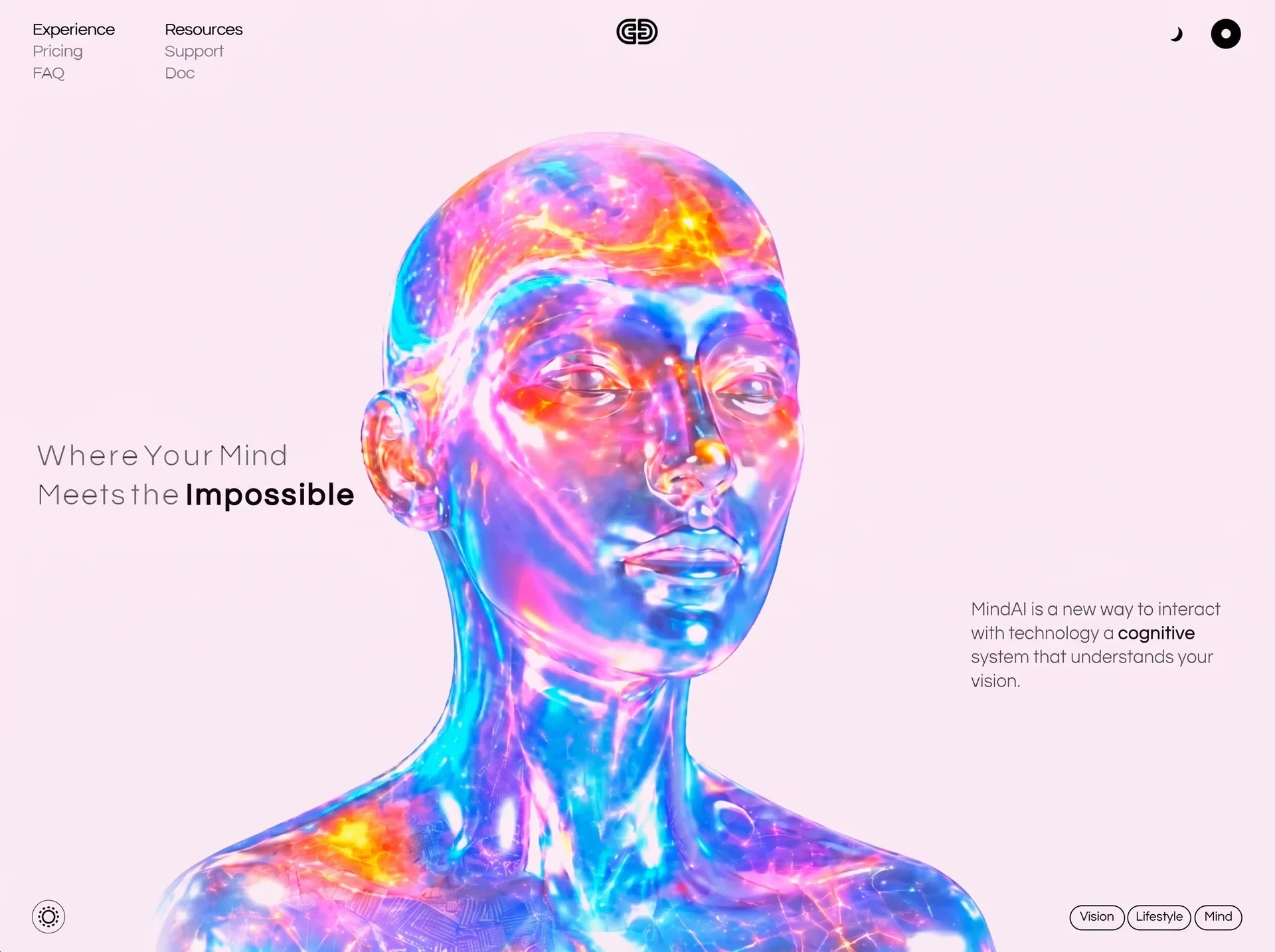
以三维核心、神经网络意象与空间动效表现智能能力,适合 AI 平台和研究型产品。
Mind AI 三维智能首屏
效果案例
READY TO USE
直接开始使用
这条提示词无需补充变量,可查看并复制完整提示词。
复制后粘贴到任意 AI 平台即可直接使用
更新于 2026.10.14 · 持续复测
以三维核心、神经网络意象与空间动效表现智能能力,适合 AI 平台和研究型产品。
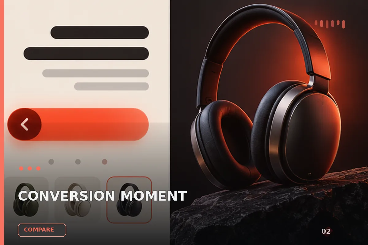
面向现代品牌的行动号召效果,以玻璃拟态、视差滚动、滚动触发组织视觉层次;适合用于网页原型、品牌展示与交互动效参考
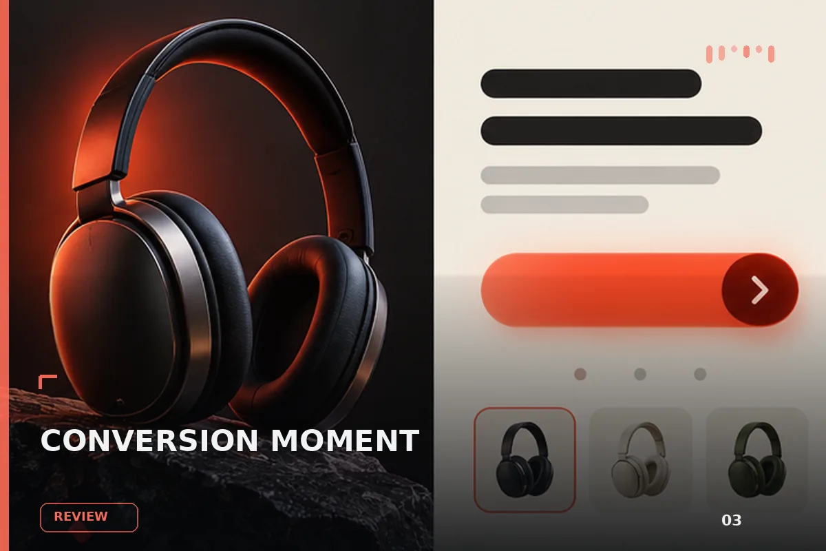
面向现代品牌的行动号召效果,以玻璃拟态、悬停反馈、沉浸式视频组织视觉层次;适合用于网页原型、品牌展示与交互动效参
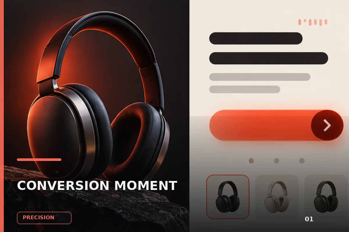
以“先澄清目标与边界,再按优先级完成单一最佳方案”处理试用注册 CTA,输出语义明确、有信任支撑的行动号召区域;
以“从稳妥、平衡、突破三个方向并行推演”处理试用注册 CTA,输出语义明确、有信任支撑的行动号召区域;包含输入澄
以“先产出草案,再从事实、逻辑、语气和风险四层审校”处理试用注册 CTA,输出语义明确、有信任支撑的行动号召区域
以“建立评价量表,对初稿评分并针对最低分项定向重写”处理试用注册 CTA,输出语义明确、有信任支撑的行动号召区域
查看完整提示词,复制后粘贴到任意 AI 平台使用。
Build a single self-contained static HTML file (no build step, no framework, no
dependencies, no local asset files — every external reference must be an absolute
https URL). Everything below is exact: reproduce all numbers verbatim.

================================================================================
PROJECT
================================================================================
A full-viewport hero page for a product called "MindAI".
Title: MindAI — Where Your Mind Meets the Impossible
It is one screen only: the page never scrolls (body has overflow:hidden).
Composition: a translucent 3D figure bleeding off the bottom of the frame, a
two-column nav top-left, a centred logo, two icons top-right, a large headline on
the left of the middle row, a paragraph on the right of the middle row, a circular
button bottom-left, and three pill tags bottom-right.

Deliver ONE file: public/index.html
Structure: <head> with <link> font tags + one <style> + one tiny inline <script>;
<body> with <main class="stage"> + one inline <script> at the end.

================================================================================
FONTS (hosted only — no @font-face to local files)
================================================================================
In <head>, before the <style>:

<link rel="preconnect" href="https://fonts.googleapis.com">
<link rel="preconnect" href="https://fonts.gstatic.com" crossorigin>
<link rel="stylesheet" href="https://fonts.googleapis.com/css2?family=Questrial&display=block">

Use display=block deliberately: the type IS the composition, so it must wait
rather than flash a fallback whose metrics do not match.
Body stack: 'Questrial', system-ui, -apple-system, 'Segoe UI', sans-serif

================================================================================
THE UNIT SYSTEM (this is the core of the whole layout — get it exactly right)
================================================================================
The design reference frame is 1594 x 987 px. 1rem === one reference pixel.

html{
  font-size:min(calc(100vw / 1594), calc(100vh / 987), 1.75px);
  -webkit-text-size-adjust:100%;
}
@supports (height:100dvh){
  html{font-size:min(calc(100vw / 1594), calc(100dvh / 987), 1.75px)}
}

Because the unit takes the SMALLER of the two ratios, the layout is either an
exact uniform scale of the reference (width governs) or the reference pulled
APART (height governs). It can never be compressed, so pinned elements cannot
collide. The 1.75px cap only stops type ballooning on huge displays; it creates
no margins because everything pins to viewport edges, not to a fixed canvas.

EVERY size, offset, border and radius in the desktop composition is expressed in
these rem units. Do not convert them to px.

================================================================================
CSS VARIABLES
================================================================================
:root{
  --ink:#000000;
  --bg:#F6EAF2;
  --hairline:rgba(0,0,0,.55);
  --glass:rgba(255,255,255,.15);
  --bust-top:80.5rem;
  --bust-zoom:1;
  --bust-nudge-x:0%;
  --bust-nudge-y:0%;
}

================================================================================
RESET / BASE
================================================================================
button{font:inherit;letter-spacing:inherit;color:inherit;background:none;border:0;cursor:pointer}
body{
  min-height:100vh;min-height:100dvh;
  background:var(--bg);
  color:var(--ink);
  font-family:'Questrial',system-ui,-apple-system,'Segoe UI',sans-serif;
  overflow:hidden;
  -webkit-font-smoothing:antialiased;
  text-rendering:geometricPrecision;
}
.stage{position:fixed;inset:0;isolation:isolate}
:focus-visible{outline:2px solid #000;outline-offset:3px}

================================================================================
THE ANCHOR FRAME (7 pin classes)
================================================================================
Each element declares the edge it belongs to plus its measured offset from that
edge (--x / --y), so a right-hand element is structurally incapable of being
driven from the left. Middle-row items hang off the vertical centre (--dy is the
measured distance from y=493.5 in the reference).

.pin{position:absolute}
.pin-tl{top:var(--y);left:var(--x)}
.pin-tc{top:var(--y);left:50%;transform:translateX(calc(-50% + var(--dx,0rem)))}
.pin-tr{top:var(--y);right:var(--x)}
.pin-ml{top:calc(50% + var(--dy));left:var(--x)}
.pin-mr{top:calc(50% + var(--dy));right:var(--x)}
.pin-bl{bottom:var(--y);left:var(--x)}
.pin-br{bottom:var(--y);right:var(--x)}

================================================================================
THE FIGURE (video, masked into the page)
================================================================================
The box is a viewport onto a 16:9 clip, not the clip's own frame. It is
cover-fitted so only the central ~57% of the source is ever visible.

.bust{
  position:absolute;
  top:var(--bust-top);
  left:50%;
  height:calc(100vh - var(--bust-top));
  width:auto;
  aspect-ratio:1049 / 1032;
  transform:translateX(calc(-50% + -51.50rem));
  z-index:0;
  pointer-events:none;
  user-select:none;
  overflow:hidden;
  background:var(--bg);
  -webkit-mask-image:
    linear-gradient(to right, transparent 0, #000 7%, #000 93%, transparent 100%),
    linear-gradient(to bottom, transparent 0, #000 9%, #000 100%);
  mask-image:
    linear-gradient(to right, transparent 0, #000 7%, #000 93%, transparent 100%),
    linear-gradient(to bottom, transparent 0, #000 9%, #000 100%);
  -webkit-mask-composite:source-in;
  mask-composite:intersect;
}
@supports (height:100dvh){
  .bust{height:calc(100dvh - var(--bust-top))}
}

.bust-v{
  position:absolute;
  inset:0;
  width:100%;
  height:100%;
  object-fit:cover;
  object-position:50% 50%;
  transform:scale(var(--bust-zoom)) translate(var(--bust-nudge-x), var(--bust-nudge-y));
  transform-origin:50% 100%;
  display:block;
  filter:brightness(1.18) saturate(1.22);
  mix-blend-mode:multiply;
}

WHY THOSE TWO STEPS: the clip is a filled rectangle but must read as a cut-out.
The box carries the page colour and the clip multiplies onto it; brightness(1.18)
pushes the clip's ~#e8d8dc backdrop to clipping white so the multiply resolves it
to exactly var(--bg), and saturate(1.22) restores the colour the lift washed out
of the figure. The mask then fades the top and sides (where a single filter
cannot flatten the gradient) into var(--bg), so the edge has nothing to be an
edge against. The bottom is left solid — the figure bleeds off the frame there.

--bust-zoom / --bust-nudge-x / --bust-nudge-y are the ONLY three numbers to
retune if the clip is ever regenerated.

================================================================================
MASTHEAD
================================================================================
.nav{
  --x:41.7rem; --y:29.0rem;
  font-size:21.1rem;
  line-height:27.0rem;
  letter-spacing:-0.33rem;
  -webkit-text-stroke:0.323rem var(--bg);paint-order:fill stroke;
  z-index:3;
}
.nav ul{list-style:none;white-space:nowrap}
.nav .col-b{position:absolute;top:0;left:165.0rem}
.nav a{color:inherit;text-decoration:none;display:block}
.nav .lead{-webkit-text-stroke:0.146rem var(--ink);paint-order:stroke fill;letter-spacing:-0.33rem}

Column A: Experience (.lead) / Pricing / FAQ   -> href #experience #pricing #faq
Column B: Resources (.lead) / Support / Doc    -> href #resources #support #doc

.burger{
  display:none;
  border-radius:50%;
  border:1.1rem solid var(--hairline);
  background:var(--glass);
  -webkit-backdrop-filter:blur(6rem);backdrop-filter:blur(6rem);
  place-items:center;
  z-index:5;
}
.burger svg{width:60%;height:60%;display:block;fill:var(--ink)}

.logo{--y:24.0rem; --dx:-0.5rem; width:60rem;height:38rem;z-index:3}
.moon{--x:115.0rem; --y:35.0rem; width:21rem;height:22rem;z-index:3}
.mode{--x:44.5rem; --y:26.9rem; width:37.8rem;height:37.8rem;z-index:3}

================================================================================
HEADLINE  (per-word letter-spacing — these values are not decorative, they are
           measured from the prototype and must be copied exactly)
================================================================================
.headline{
  --x:47.0rem; --dy:-38.5rem;
  font-size:42.3rem;
  line-height:55.0rem;
  letter-spacing:1.5rem;
  font-weight:400;
  white-space:nowrap;
  -webkit-text-stroke:0.791rem var(--bg);paint-order:fill stroke;
  z-index:2;
}
.headline .l1,.headline .l2,.headline .ln{display:block}
.headline .l2{word-spacing:0.0rem}
.headline .w1{letter-spacing:3.25rem}
.headline .w2{letter-spacing:3.167rem;margin-left:-7.0rem}
.headline .w3{letter-spacing:1.167rem;margin-left:-7.0rem}
.headline .w4{letter-spacing:1.5rem}
.headline .w5{letter-spacing:2.5rem;margin-left:-5.0rem}
.headline b{
  font-weight:400;
  -webkit-text-stroke:1.436rem var(--ink);paint-order:stroke fill;
  margin-left:-4.0rem;
  letter-spacing:2.858888888888889rem;
}

Markup (must be on ONE line with no whitespace between the spans, because
white-space:nowrap would otherwise render stray gaps):

<h1 class="headline pin pin-ml"><span class="l1"><span class="ln"><span class="w1">Where</span> <span class="w2">Your</span> <span class="w3">Mind</span></span></span><span class="l2"><span class="ln"><span class="w4">Meets</span> <span class="w5">the</span> <b>Impossible</b></span></span></h1>

The .l1/.l2 wrappers exist to be overflow:hidden masks during the entrance; the
.ln inner spans are what actually travel.

================================================================================
BLURB
================================================================================
.blurb{
  --x:32.0rem; --dy:162.5rem;
  width:400.5rem;
  font-size:22.66rem;
  line-height:30.0rem;
  letter-spacing:0.06rem;
  -webkit-text-stroke:0.189rem var(--bg);paint-order:fill stroke;
  z-index:2;
}
.blurb b{font-weight:400;-webkit-text-stroke:0.147rem var(--ink);paint-order:stroke fill;letter-spacing:0.5rem}

<p class="blurb pin pin-mr">MindAI is a new way to interact with technology a <b>cognitive</b> system that understands your vision.</p>

================================================================================
CONTROLS
================================================================================
.brightness{
  --x:41.0rem; --y:6.0rem;
  width:41.6rem;height:41.6rem;
  border-radius:50%;
  border:1.1rem solid var(--hairline);
  background:var(--glass);
  -webkit-backdrop-filter:blur(6rem);backdrop-filter:blur(6rem);
  display:grid;place-items:center;
  z-index:3;
}
.brightness svg{width:26rem;height:26rem;display:block}

.tags{--x:43.0rem; --y:9.0rem; display:flex;gap:3.0rem;z-index:3}
.tag{
  height:32.0rem;
  border:1.2rem solid var(--ink);
  border-radius:16.0rem;
  background:var(--glass);
  -webkit-backdrop-filter:blur(6rem);backdrop-filter:blur(6rem);
  display:flex;align-items:center;justify-content:center;
  font-size:16.6rem;
  letter-spacing:-0.2rem;
  line-height:1;
  -webkit-text-stroke:0.241rem var(--ink);paint-order:stroke fill;
  white-space:nowrap;
}
.tag:nth-child(1){width:68.5rem}   /* Vision    */
.tag:nth-child(2){width:81.0rem}   /* Lifestyle */
.tag:nth-child(3){width:60.5rem}   /* Mind      */

Wrap the brightness button and the tags row in <div class="instruments"> so they
animate as one group:
.instruments{display:contents}
html[data-anim] .instruments{display:block;position:absolute;inset:0;pointer-events:none}
html[data-anim] .instruments > *{pointer-events:auto}
The wrapper is inert (display:contents) normally and only becomes a real box
spanning the stage during the entrance — a transformed element becomes the
containing block for its absolutely positioned children, so any other size would
relocate the controls mid-animation.

HOVER:
@media (prefers-reduced-motion:no-preference){
  .nav a,.tag,.brightness{transition:opacity .25s ease}
  .nav a:hover,.tag:hover,.brightness:hover{opacity:.62}
}

================================================================================
ENTRANCE ANIMATION
================================================================================
Pre-paint guard, inline in <head> AFTER the <style> (must run before first paint):

<script>
(function(){var d=document.documentElement;
 if(!('animate' in Element.prototype))return;
 try{if(matchMedia('(prefers-reduced-motion: reduce)').matches)return;}catch(e){}
 d.setAttribute('data-anim','pending');
 window.__entryGuard=setTimeout(function(){d.removeAttribute('data-anim');},4000);
})();
</script>

Initial states (CSS). No script => no attribute => nothing hidden:
html[data-anim] *{transition:none !important}
html[data-anim="pending"] .bust{opacity:0;scale:1.028;transform-origin:50% 100%;will-change:opacity,scale}
html[data-anim="pending"] .logo{opacity:0;scale:.9;will-change:opacity,scale}
html[data-anim="pending"] .nav a,
html[data-anim="pending"] .burger,
html[data-anim="pending"] .moon,
html[data-anim="pending"] .mode{opacity:0;translate:0 -8rem;will-change:opacity,translate}
html[data-anim="pending"] .headline .l1,
html[data-anim="pending"] .headline .l2{overflow:hidden}
html[data-anim="pending"] .headline .ln{translate:0 105%;will-change:translate}
html[data-anim="pending"] .blurb{opacity:0;translate:0 12rem;will-change:opacity,translate}
html[data-anim="pending"] .instruments{opacity:0;translate:0 12rem;will-change:opacity,translate}
@media (prefers-reduced-motion:reduce){
  html[data-anim] *{opacity:1 !important;translate:none !important;scale:none !important}
}

Timeline via Web Animations API. Easing curves:
  HERO = cubic-bezier(.16,1,.3,1)
  TYPE = cubic-bezier(.3,.7,.55,1)
  UI   = cubic-bezier(.3,.7,.55,1)
All tweens use fill:'both'. Helper must SKIP any element whose computed display
is 'none' (the burger on desktop, the moon in portrait) — animating a
display:none element leaves a tween the compositor never paints, which makes the
final frame resolve a beat late.

01 .bust           opacity 0->1, scale 1.028->1     dur 1250  delay 50
02 .logo           opacity 0->1, scale .9->1        dur  550  delay 300
   .nav a (each i) opacity 0->1, translate 0 -8rem->0 0   dur 500  delay 380 + i*40
   .burger,.moon,.mode (each i)  same frames        dur  500  delay 440 + i*60
03 .headline .ln (each i)  translate 0 105% -> 0 0  dur  660  delay 580 + i*110
04 .blurb          opacity 0->1, translate 0 12rem->0 0   dur 620  delay 920
05 .instruments    opacity 0->1, translate 0 12rem->0 0   dur 620  delay 1060

When all tweens finish: clearTimeout(window.__entryGuard), set data-anim="done",
cancel every tween, then removeAttribute('data-anim') inside requestAnimationFrame
so authored CSS is restored and all effects drop in the same frame with
transitions still suppressed across it.

START GATE: wait on Promise.all of document.fonts.ready and a promise that
resolves on the video's 'loadeddata' or 'error' (resolve immediately if
readyState >= 2), then requestAnimationFrame(run). Also setTimeout(go, 400) as a
floor, guarded by a `fired` boolean so it only runs once. There is no poster, so
this wait is what stops the entrance fading in an empty box.

================================================================================
MOBILE MENU SCRIPT
================================================================================
One button, one attribute; CSS owns every breakpoint decision, so no viewport
measuring in script.
- Clicking .burger toggles html[data-menu="open"] and mirrors it to aria-expanded.
  Must call e.stopPropagation().
- Click anywhere outside .nav while open closes it.
- Escape closes it and returns focus to the burger.
- Clicking any <a> inside the nav closes it.

================================================================================
THE FIGURE'S TURN — MOUSE-SCRUB VIDEO (the signature interaction)
================================================================================
The clip is NOT playback, it is a dial the pointer holds. It never plays on its
own. Horizontal mouse travel is the only thing that moves it:
  move LEFT  -> figure turns forward
  move RIGHT -> figure turns back
Stop moving and it stops on the frame it was left on.

This must live in its OWN IIFE, separate from the entrance script, because that
script returns early when Web Animations is missing or reduced motion is set —
and the figure still has to answer the pointer in both cases.

Algorithm:
  SENSITIVITY = 0.8   // fraction of the clip covered by one full-width sweep
  EPSILON     = 0.04  // clip is 24fps; under one frame apart renders the same
                      // picture, so seeking there costs a decode for nothing
  state: prevX=null, targetTime=0, seeking=false, requested=-1

  duration(): return v.duration if finite and > 0, else 0

  pump():
    if (seeking || Math.abs(targetTime - v.currentTime) < EPSILON) return;
    seeking = true;
    requested = targetTime;
    try { v.currentTime = targetTime; } catch(e) { seeking = false; }

  on 'seeked':
    seeking = false;
    if (targetTime !== requested) pump();
    // Test against what was ASKED FOR, not against where the decoder landed.
    // A seek resolves to the nearest decodable frame, so comparing positions
    // would re-issue an already-honoured seek forever.

  on window 'mousemove' (passive):
    d = duration();
    if (prevX === null || !d) { prevX = e.clientX; return; }
    delta = prevX - e.clientX;           // NOTE the order: inverted on purpose
    prevX = e.clientX;
    if (!delta) return;
    t = targetTime + (delta / window.innerWidth) * SENSITIVITY * d;
    targetTime = clamp(t, 0, d);          // clamped, NOT wrapped — hard stops
    pump();

WHY THE SEEK GATE: a seek issued while another is in flight is discarded by the
browser. The pointer only ever updates a target; the 'seeked' event is the only
thing that issues the next seek. Without this, a fast sweep floods the decoder
and the figure lands far behind the pointer.

RE-ANCHORING: a pointer re-entering the page has no meaningful delta against
where it left, so reset prevX=null on document 'mouseleave', window 'blur', and
document 'visibilitychange'. Otherwise the figure jumps by the width of the gap.

FIRST FRAME: there is NO poster attribute. A <video> paints nothing until it
holds a decoded frame, and this one never plays, so without a nudge the box is
empty until the first mouse move and then the figure appears from nowhere. So:
  v.pause();
  function anchor(){ targetTime = v.currentTime; if(!v.currentTime){ v.currentTime = 0.001; } }
  v.addEventListener('loadeddata', anchor, {once:true});
  if (v.readyState >= 2) anchor();

BRANCHES (check these BEFORE wiring mousemove):
  reduced motion  -> matchMedia('(prefers-reduced-motion: reduce)')
                     v.pause() and return. Held on the opening frame.
  no hover        -> matchMedia('(hover: hover) and (pointer: fine)') false
                     (touch): there is no travel to read, so on 'canplay' (once)
                     call v.play() with the rejection caught, and return. The
                     figure simply turns on its own.
  Wrap both matchMedia calls in try/catch.

================================================================================
VIDEO SOURCE
================================================================================
<div class="bust" role="img"
     aria-label="Translucent iridescent figure with light tracing through it, turning to its left">
  <video class="bust-v" muted playsinline loop preload="auto" disablepictureinpicture
         tabindex="-1" aria-hidden="true"
         src="https://d2ol7oe51mr4n9.cloudfront.net/user_38xzZboKViGWJOttwIXH07lWA1P/24f3c998-86fb-4f1d-9906-07c7fa740f8a.mp4"></video>
</div>

That URL is a scrub-optimised encode: 960x900, H.264, 24fps, 4.042s, 97 frames,
1.89 MB, keyframe every 6 frames, no B-frames, faststart, no audio. The short GOP
is what makes seeking smooth — any seek decodes at most 5 frames. Do NOT swap in
a normal web encode: a clip with one keyframe forces a decode from frame 0 on
every seek and the scrub feels sticky. No poster attribute. preload="auto" so the
whole clip buffers up front.

================================================================================
RESPONSIVE — FOUR INDEPENDENT SWITCHES (must be mobile responsive)
================================================================================
Do not merge these into one breakpoint. Each keys off the thing that actually
governs it.

--- A. DENSITY: nav collapses to a burger ---
The burger is a TOUCH accommodation, so it keys off the input device, not
geometry. Viewport size cannot tell you what is pointing at the screen — a
maximised window on a 1200px monitor reports 1070, 856 or 713 CSS px depending
only on OS display scaling, so any height threshold fires on ordinary desktops.

@media (pointer:coarse) and (max-width:1600px), (max-width:999px){
  .burger{display:grid;--x:41rem;--y:24rem;width:56rem;height:56rem;border-width:1.4rem}
  .moon{--x:132rem;--y:32rem;width:28rem;height:29rem}
  .mode{--x:43rem;--y:23rem;width:50rem;height:50rem}
  .nav{
    --x:41rem;--y:96rem;
    display:flex;gap:62rem;
    padding:30rem 38rem 32rem;
    border:1.4rem solid var(--ink);
    border-radius:30rem;
    background:var(--glass);
    -webkit-backdrop-filter:blur(18rem);backdrop-filter:blur(18rem);
    font-size:30rem;line-height:40rem;letter-spacing:0;
    opacity:0;visibility:hidden;translate:0 -12rem;pointer-events:none;
    z-index:4;
  }
  .nav .col-b{position:static;left:auto}
  .nav .lead{letter-spacing:0}
  html[data-menu="open"] .nav{opacity:1;visibility:visible;translate:0 0;pointer-events:auto}
  .brightness{--x:41rem;--y:8rem;width:60rem;height:60rem;border-width:1.4rem}
  .brightness svg{width:37rem;height:37rem}
  .tags{--x:43rem;--y:9rem;gap:6rem}
  .tag{height:52rem;border-radius:26rem;font-size:27rem;border-width:1.6rem}
  .tag:nth-child(1){width:110rem}
  .tag:nth-child(2){width:130rem}
  .tag:nth-child(3){width:96rem}
}

--- B. PROPORTION: squarer frame, ease the type back ---
@media (min-aspect-ratio:13/10) and (max-aspect-ratio:31/20){
  .headline{font-size:38.4rem;line-height:49.5rem}
  .blurb{width:350rem}
}

--- C. STACK: tablet portrait / phone. Reference frame changes to 720 x 1040 ---
Past 13:10 the frame is too tall for a side-by-side reading, so the parts stack:
masthead, headline, blurb, figure bleeding off the bottom.

@media (max-aspect-ratio:13/10), (max-width:899px){
  html{font-size:min(calc(100vw / 720), calc(100vh / 1040), 1.75px)}
  :root{
    --bust-top:auto;
    --col-x:max(32rem, calc(50% - 336rem));
    --col-w:min(672rem, calc(100% - 64rem));
  }
  .burger{display:grid;--x:32rem;--y:32rem;width:48rem;height:48rem}
  .logo{--y:35rem;--dx:0rem;width:70rem;height:44rem}
  .moon{display:none}
  .mode{--x:32rem;--y:33rem;width:48rem;height:48rem}
  .nav{
    --x:32rem;--y:94rem;
    display:flex;gap:48rem;
    padding:24rem 30rem 26rem;
    border:1.4rem solid var(--ink);
    border-radius:26rem;
    background:var(--glass);
    -webkit-backdrop-filter:blur(18rem);backdrop-filter:blur(18rem);
    font-size:26rem;line-height:36rem;letter-spacing:0;
    opacity:0;visibility:hidden;translate:0 -10rem;pointer-events:none;
    z-index:4;
  }
  .nav .col-b{position:static;left:auto}
  .nav .lead{letter-spacing:0}
  html[data-menu="open"] .nav{opacity:1;visibility:visible;translate:0 0;pointer-events:auto}
  .headline{
    left:var(--col-x);right:auto;
    top:212rem;
    font-size:54rem;line-height:64rem;letter-spacing:0;
  }
  .headline .l2{word-spacing:0}
  .headline .w1,.headline .w2,.headline .w3,
  .headline .w4,.headline .w5{letter-spacing:0;margin-left:0}
  .headline .l1,.headline .l2,.blurb{-webkit-text-stroke-width:0}
  .headline b{margin-left:0;letter-spacing:0;-webkit-text-stroke:2.6rem var(--ink);paint-order:stroke fill}
  .blurb{
    left:var(--col-x);right:auto;width:var(--col-w);
    top:366rem;
    font-size:27rem;line-height:38rem;letter-spacing:0;
  }
  .bust{
    top:auto;bottom:0;
    height:max(430rem, calc(100vh - 496rem));
    transform:translateX(-50%);
  }
  .brightness{--x:32rem;--y:32rem;width:52rem;height:52rem;border-width:1.4rem}
  .brightness svg{width:32rem;height:32rem}
  .tags{--x:32rem;--y:36rem;gap:6rem}
  .tag{height:44rem;border-radius:22rem;font-size:21rem;border-width:1.6rem}
  .tag:nth-child(1){width:88rem}
  .tag:nth-child(2){width:104rem}
  .tag:nth-child(3){width:76rem}
}

@media (max-aspect-ratio:13/10) and (min-height:1px), (max-width:899px){
  @supports (height:100dvh){
    html{font-size:min(calc(100vw / 720), calc(100dvh / 1040), 1.75px)}
    .bust{height:max(430rem, calc(100dvh - 496rem))}
  }
}

--- D. MOBILE: same stack REDRAWN on a 360px frame (not compressed further) ---
Held down to phone widths the 720-frame unit falls to 0.50, putting body copy at
13.5px and tap targets at 22px. So mobile re-draws on 360px where the unit sits
near 1. The unit is width-only here because on a phone readability tracks width;
the figure absorbs whatever height is left. Tap targets switch to literal px.

@media (max-width:520px){
  html{font-size:min(calc(100vw / 360), 1.2px)}
  :root{
    --fig-h:min(max(300rem, calc(100vh - 350rem)), 112vw);
    --text-top:calc((90rem + 100vh - var(--fig-h)) / 2 - 91rem);
  }
  .burger{--x:24rem;--y:22rem;width:44px;height:44px;border-width:1px}
  .burger svg{width:20px;height:20px}
  .logo{--y:25rem;--dx:0rem;width:48px;height:30px}
  .moon{display:block;--x:84rem;--y:32rem;width:18px;height:19px}
  .mode{--x:24rem;--y:22rem;width:36px;height:36px}
  .nav{
    --x:24rem;--y:82rem;
    gap:28px;padding:16px 20px 18px;
    border-radius:20px;border-width:1px;
    font-size:16px;line-height:24px;
  }
  .headline{top:var(--text-top);left:24rem;right:24rem;font-size:28px;line-height:34px}
  .headline b{-webkit-text-stroke:1.5px var(--ink)}
  .blurb{top:calc(var(--text-top) + 104rem);left:24rem;right:24rem;width:auto;font-size:16px;line-height:24px}
  .bust{height:var(--fig-h)}
  .brightness{--x:24rem;--y:24rem;width:44px;height:44px;border-width:1px}
  .brightness svg{width:22px;height:22px}
  .tags{--x:24rem;--y:24rem;gap:6px}
  .tag{height:36px;padding:0 14px;border-radius:18px;font-size:14px;border-width:1px}
  .tag:nth-child(1),.tag:nth-child(2),.tag:nth-child(3){width:auto}
}

@media (max-width:520px){
  @supports (height:100dvh){
    :root{
      --fig-h:min(max(300rem, calc(100dvh - 350rem)), 112vw);
      --text-top:calc((90rem + 100dvh - var(--fig-h)) / 2 - 91rem);
    }
  }
}

Note the phone copy block is not given a fixed top: the figure is sized first and
the copy centres itself in the band between masthead and figure — one expression
instead of a breakpoint per handset (phone aspects run 0.39 to 0.56).

================================================================================
BODY MARKUP ORDER (inside <main class="stage">)
================================================================================
1. div.bust (role="img" + aria-label) containing video.bust-v
2. button.burger.pin.pin-tl   (type=button, aria-label="Menu",
                               aria-expanded="false", aria-controls="primary-nav")
3. nav.nav.pin.pin-tl         (id="primary-nav", aria-label="Primary")
4. svg.logo.pin.pin-tc        (role="img", aria-label="MindAI")
5. svg.moon.pin.pin-tr        (aria-hidden="true")
6. svg.mode.pin.pin-tr        (role="img", aria-label="Switch appearance")
7. h1.headline.pin.pin-ml
8. p.blurb.pin.pin-mr
9. div.instruments  >  button.brightness.pin.pin-bl  +  div.tags.pin.pin-br

================================================================================
INLINE SVGs (copy verbatim)
================================================================================
BURGER (two bars):
<svg viewBox="0 0 24 24" xmlns="http://www.w3.org/2000/svg" aria-hidden="true">
  <rect x="3" y="8.4" width="18" height="1.7" rx=".85"/>
  <rect x="3" y="13.9" width="18" height="1.7" rx=".85"/>
</svg>

MOON:
<svg class="moon pin pin-tr" viewBox="0 0 21 22" xmlns="http://www.w3.org/2000/svg" aria-hidden="true">
  <path d="M9.71 20.24 C12.47 19.82 14.94 18.02 16.40 15.36 C17.01 14.25 17.16 13.82 17.37 12.50 C17.53 11.50 17.53 10.75 17.37 9.75 C17.17 8.49 16.93 7.71 16.57 7.16 C16.40 6.89 16.16 6.48 16.05 6.27 C15.94 6.05 15.58 5.54 15.25 5.12 C13.81 3.35 11.91 2.23 11.63 3.02 C11.56 3.22 11.64 3.42 12.19 4.54 C12.91 6.00 13.00 6.40 13.00 8.12 C13.00 9.45 12.89 10.00 12.39 11.35 C12.04 12.27 11.81 12.74 11.37 13.38 C10.35 14.90 8.83 16.25 7.23 17.05 C6.28 17.53 5.73 17.67 4.75 17.67 C3.52 17.67 3.17 17.82 3.17 18.36 C3.17 18.88 3.88 19.31 5.71 19.87 C7.44 20.41 8.11 20.48 9.71 20.24 Z" fill="#000" fill-rule="evenodd"/>
</svg>

MODE (ring with centre dot, even-odd):
<svg class="mode pin pin-tr" viewBox="0 0 38 38" xmlns="http://www.w3.org/2000/svg" role="img" aria-label="Switch appearance">
  <path fill="#000" fill-rule="evenodd"
        d="M19 .25A18.75 18.75 0 1 1 19 37.75 18.75 18.75 0 1 1 19 .25Z
           M19 13A6 6 0 1 0 19 25 6 6 0 1 0 19 13Z"/>
</svg>

BRIGHTNESS (ring + 12 dots at 30-degree intervals):
<svg viewBox="0 0 26 26" xmlns="http://www.w3.org/2000/svg" aria-hidden="true">
  <circle cx="13" cy="13" r="7.5" fill="none" stroke="#000" stroke-width="2"/>
  <g fill="#000"><circle cx="13.000" cy="1.200" r="1.3"/><circle cx="18.900" cy="2.781" r="1.3"/><circle cx="23.219" cy="7.100" r="1.3"/><circle cx="24.800" cy="13.000" r="1.3"/><circle cx="23.219" cy="18.900" r="1.3"/><circle cx="18.900" cy="23.219" r="1.3"/><circle cx="13.000" cy="24.800" r="1.3"/><circle cx="7.100" cy="23.219" r="1.3"/><circle cx="2.781" cy="18.900" r="1.3"/><circle cx="1.200" cy="13.000" r="1.3"/><circle cx="2.781" cy="7.100" r="1.3"/><circle cx="7.100" cy="2.781" r="1.3"/></g>
</svg>

LOGO (MindAI wordmark, viewBox 0 0 60 38, single evenodd path):
<svg class="logo pin pin-tc" viewBox="0 0 60 38" xmlns="http://www.w3.org/2000/svg" role="img" aria-label="MindAI">
  <path d="M27.40 34.52 C27.59 34.43 27.80 34.24 27.87 34.10 C28.07 33.71 28.05 21.22 27.86 20.75 C27.57 20.06 27.67 20.07 23.23 20.18 C20.54 20.24 19.15 20.31 18.95 20.39 C18.00 20.77 17.83 21.72 18.57 22.46 C19.24 23.13 19.43 23.20 20.66 23.20 C21.27 23.20 22.02 23.15 22.31 23.08 C22.61 23.02 23.05 22.96 23.29 22.96 C23.65 22.96 23.77 23.01 24.01 23.27 C24.40 23.71 24.48 24.21 24.24 24.78 C24.13 25.03 23.92 25.32 23.77 25.44 C23.51 25.63 23.37 25.65 22.32 25.62 C18.00 25.51 16.98 25.24 15.55 23.83 C14.47 22.77 14.01 22.03 13.69 20.80 C13.36 19.56 13.38 18.26 13.73 16.95 C13.88 16.41 14.08 15.84 14.18 15.69 C15.55 13.60 16.89 12.64 18.81 12.41 C19.27 12.35 20.52 12.30 21.58 12.29 C23.22 12.28 23.54 12.30 23.76 12.44 C24.13 12.69 24.40 13.19 24.40 13.64 C24.40 13.95 24.33 14.09 24.00 14.42 L23.61 14.82 L22.38 14.73 C21.70 14.69 20.74 14.65 20.23 14.65 C19.37 14.65 19.30 14.67 18.88 14.96 C18.30 15.39 18.06 15.82 18.06 16.46 C18.06 17.02 18.24 17.39 18.66 17.67 C18.89 17.82 19.37 17.84 23.08 17.86 C27.68 17.89 27.59 17.90 27.85 17.27 C28.03 16.82 28.00 9.86 27.81 9.52 C27.55 9.03 27.29 9.00 23.23 9.00 C18.23 9.00 17.31 9.11 15.63 9.90 C14.14 10.60 12.78 11.84 11.88 13.32 C11.65 13.68 11.39 14.12 11.28 14.28 C11.18 14.45 10.90 15.16 10.67 15.87 L10.26 17.15 L10.25 19.05 L10.25 20.95 L10.71 22.15 C11.30 23.72 12.01 24.80 13.19 25.92 C14.16 26.85 15.03 27.42 16.22 27.92 C17.75 28.57 18.07 28.62 21.30 28.67 C24.43 28.71 24.55 28.73 24.81 29.21 C24.98 29.54 24.94 30.37 24.73 30.73 C24.38 31.33 24.05 31.42 22.35 31.35 C17.25 31.14 15.82 30.94 14.18 30.20 C12.97 29.64 11.70 28.82 10.92 28.06 C10.17 27.35 9.14 26.05 8.79 25.40 C8.63 25.10 8.40 24.70 8.28 24.51 C8.08 24.19 7.97 23.93 7.32 22.15 C7.08 21.51 7.06 21.29 7.02 19.48 C7.00 18.32 7.03 17.16 7.09 16.66 C7.24 15.53 8.00 13.33 8.52 12.50 C8.75 12.14 9.04 11.68 9.16 11.48 C9.48 10.98 10.98 9.50 11.73 8.95 C12.90 8.11 14.58 7.33 16.17 6.90 C18.15 6.36 19.12 6.28 23.42 6.31 C26.76 6.33 27.11 6.32 27.35 6.16 C27.71 5.92 27.90 5.43 27.90 4.73 C27.90 4.00 27.66 3.51 27.20 3.27 C26.87 3.10 26.51 3.09 22.00 3.13 C16.65 3.18 16.94 3.15 14.65 3.89 C13.26 4.35 11.68 5.08 10.82 5.68 C9.15 6.85 7.54 8.28 6.97 9.10 C6.80 9.35 6.53 9.70 6.37 9.89 C6.21 10.08 6.01 10.38 5.94 10.56 C5.86 10.74 5.62 11.17 5.41 11.50 C5.19 11.84 4.98 12.25 4.94 12.43 C4.91 12.61 4.70 13.18 4.49 13.70 C3.89 15.20 3.75 16.11 3.76 18.50 C3.77 20.71 3.97 22.65 4.29 23.55 C4.39 23.82 4.62 24.46 4.79 24.95 C4.96 25.45 5.23 26.03 5.39 26.25 C5.54 26.47 5.78 26.85 5.90 27.10 C6.54 28.35 8.93 30.70 11.06 32.16 C11.98 32.79 13.97 33.64 15.12 33.89 C15.63 34.00 16.43 34.19 16.90 34.31 C17.69 34.51 18.07 34.53 22.15 34.59 C24.57 34.63 26.66 34.67 26.80 34.68 C26.94 34.69 27.21 34.62 27.40 34.52 Z M39.85 34.57 C41.79 34.53 42.01 34.51 42.75 34.27 C43.19 34.13 43.91 33.92 44.35 33.81 C45.85 33.44 48.12 32.22 49.58 31.01 C50.26 30.44 51.75 28.79 52.38 27.91 C52.61 27.58 52.94 27.03 53.10 26.68 C53.26 26.33 53.48 25.91 53.60 25.75 C53.71 25.59 53.90 25.13 54.01 24.75 C54.12 24.37 54.37 23.60 54.56 23.04 C55.00 21.73 55.14 20.47 55.06 18.57 C54.98 16.69 54.86 15.91 54.44 14.64 C54.25 14.08 54.10 13.53 54.10 13.42 C54.10 13.31 53.94 12.91 53.74 12.54 C53.54 12.16 53.25 11.60 53.10 11.28 C52.94 10.97 52.68 10.57 52.52 10.38 C52.36 10.20 52.10 9.85 51.93 9.60 C51.57 9.07 49.89 7.40 49.10 6.78 C48.22 6.09 47.07 5.35 46.46 5.07 C46.15 4.92 45.77 4.72 45.61 4.61 C45.23 4.33 42.40 3.41 41.61 3.30 C41.25 3.25 38.77 3.20 36.11 3.19 L31.27 3.16 L31.04 3.44 C30.91 3.59 30.80 3.81 30.79 3.93 C30.78 4.05 30.79 7.12 30.80 10.74 C30.81 16.61 30.83 17.37 30.97 17.61 C31.24 18.06 31.47 18.11 32.91 18.00 C34.76 17.86 37.88 17.86 38.28 18.01 C38.91 18.23 39.12 19.22 38.65 19.79 C38.21 20.30 37.96 20.33 34.96 20.24 C31.19 20.12 31.35 20.11 31.02 20.43 L30.75 20.70 L30.75 24.50 C30.75 28.22 30.75 28.30 30.96 28.50 C31.08 28.62 31.32 28.74 31.51 28.78 C31.70 28.82 33.83 28.82 36.25 28.79 C41.10 28.72 41.24 28.71 42.96 28.04 C43.47 27.85 44.20 27.46 44.60 27.19 C45.53 26.54 46.71 25.32 47.16 24.55 C47.35 24.22 47.60 23.81 47.71 23.63 C47.97 23.22 48.56 20.60 48.64 19.45 C48.73 18.33 48.59 17.19 48.19 15.73 C47.93 14.78 47.78 14.46 47.20 13.58 C46.51 12.52 45.30 11.25 44.38 10.62 C44.12 10.44 43.51 10.11 43.03 9.89 C41.82 9.33 40.86 9.20 37.55 9.14 C36.02 9.11 34.73 9.04 34.57 8.98 C34.18 8.83 33.98 8.38 33.98 7.65 C33.98 6.97 34.17 6.48 34.53 6.28 C34.79 6.13 41.30 6.15 42.20 6.31 C43.06 6.45 44.86 7.21 45.81 7.83 C47.22 8.74 49.27 10.89 50.06 12.30 C50.23 12.60 50.48 13.05 50.63 13.30 C51.03 14.01 51.78 16.36 51.91 17.35 C51.98 17.88 52.01 18.91 51.98 19.90 C51.94 21.37 51.90 21.63 51.66 22.30 C51.51 22.71 51.28 23.39 51.15 23.80 C51.01 24.21 50.74 24.78 50.55 25.07 C50.36 25.36 50.04 25.85 49.84 26.16 C49.37 26.86 48.07 28.18 47.04 29.00 C46.05 29.78 44.20 30.70 42.85 31.07 L41.85 31.34 L36.60 31.37 C31.66 31.39 31.34 31.41 31.10 31.58 C30.35 32.14 30.47 34.15 31.27 34.55 C31.46 34.65 34.38 34.65 39.85 34.57 Z M34.63 25.50 C34.04 25.15 33.97 24.03 34.51 23.54 C34.70 23.37 34.94 23.35 37.14 23.30 C39.37 23.25 39.58 23.23 39.95 23.03 C40.49 22.74 40.86 22.33 41.04 21.83 C41.31 21.07 41.43 19.82 41.37 18.56 C41.26 16.44 40.94 15.71 39.85 15.15 L39.26 14.85 L37.02 14.83 C34.55 14.80 34.45 14.78 34.14 14.18 C33.91 13.73 33.99 12.88 34.30 12.55 C34.43 12.42 34.67 12.26 34.84 12.20 C35.23 12.07 40.57 12.25 41.13 12.40 C42.07 12.67 43.39 13.73 44.30 14.95 C44.93 15.78 45.07 16.09 45.26 17.07 C45.53 18.52 45.38 21.05 44.94 22.08 C44.72 22.62 43.83 23.74 43.20 24.30 C42.05 25.29 41.45 25.44 37.88 25.60 C34.95 25.73 35.00 25.73 34.63 25.50 Z" fill="#000" fill-rule="evenodd"/>
</svg>

================================================================================
HEAD META
================================================================================
<meta charset="utf-8">
<meta name="viewport" content="width=device-width, initial-scale=1, viewport-fit=cover">
<meta name="theme-color" content="#F6EAF2">

================================================================================
ACCEPTANCE CHECKS
================================================================================
- Page never scrolls at any viewport size; no dead side margins at any width.
- With JS disabled the full composition renders, unanimated, nothing hidden.
- The figure shows its first frame before any mouse movement (no blank box, no
  image that swaps on first hover).
- Moving the mouse left runs the clip forward, right runs it back, 1:1 with the
  hand; the clip never plays by itself on a hovering pointer.
- A fast full-width sweep does not lag behind the pointer.
- On touch the clip autoplays and loops; under prefers-reduced-motion it holds
  the opening frame and the entrance is skipped entirely.
- Burger menu appears on coarse pointers and narrow widths; Escape and
  outside-click close it.
- No relative URLs anywhere in the file except in-page #anchors.
提示词已复制,选择一个常用平台继续。
