

以金色视觉焦点、项目陈列和精致转场建立高级作品集体验,适合设计师与创意机构。
金色标准作品集首屏
效果案例
READY TO USE
直接开始使用
这条提示词无需补充变量,可查看并复制完整提示词。
复制后粘贴到任意 AI 平台即可直接使用
更新于 2026.10.14 · 持续复测
以金色视觉焦点、项目陈列和精致转场建立高级作品集体验,适合设计师与创意机构。
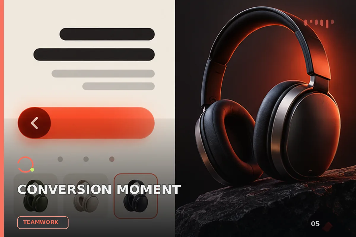
以“将任务拆成输入、决策、执行、验收和交接五个环节”处理试用注册 CTA,输出语义明确、有信任支撑的行动号召区域
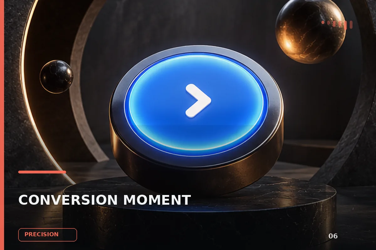
以“先澄清目标与边界,再按优先级完成单一最佳方案”处理预约演示 CTA,输出语义明确、有信任支撑的行动号召区域;
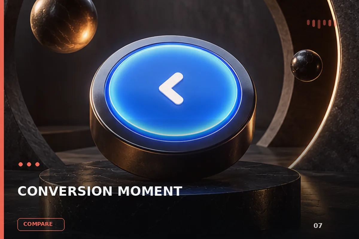
以“从稳妥、平衡、突破三个方向并行推演”处理预约演示 CTA,输出语义明确、有信任支撑的行动号召区域;包含输入澄
以“先产出草案,再从事实、逻辑、语气和风险四层审校”处理预约演示 CTA,输出语义明确、有信任支撑的行动号召区域
以“建立评价量表,对初稿评分并针对最低分项定向重写”处理预约演示 CTA,输出语义明确、有信任支撑的行动号召区域
以“将任务拆成输入、决策、执行、验收和交接五个环节”处理预约演示 CTA,输出语义明确、有信任支撑的行动号召区域
查看完整提示词,复制后粘贴到任意 AI 平台使用。
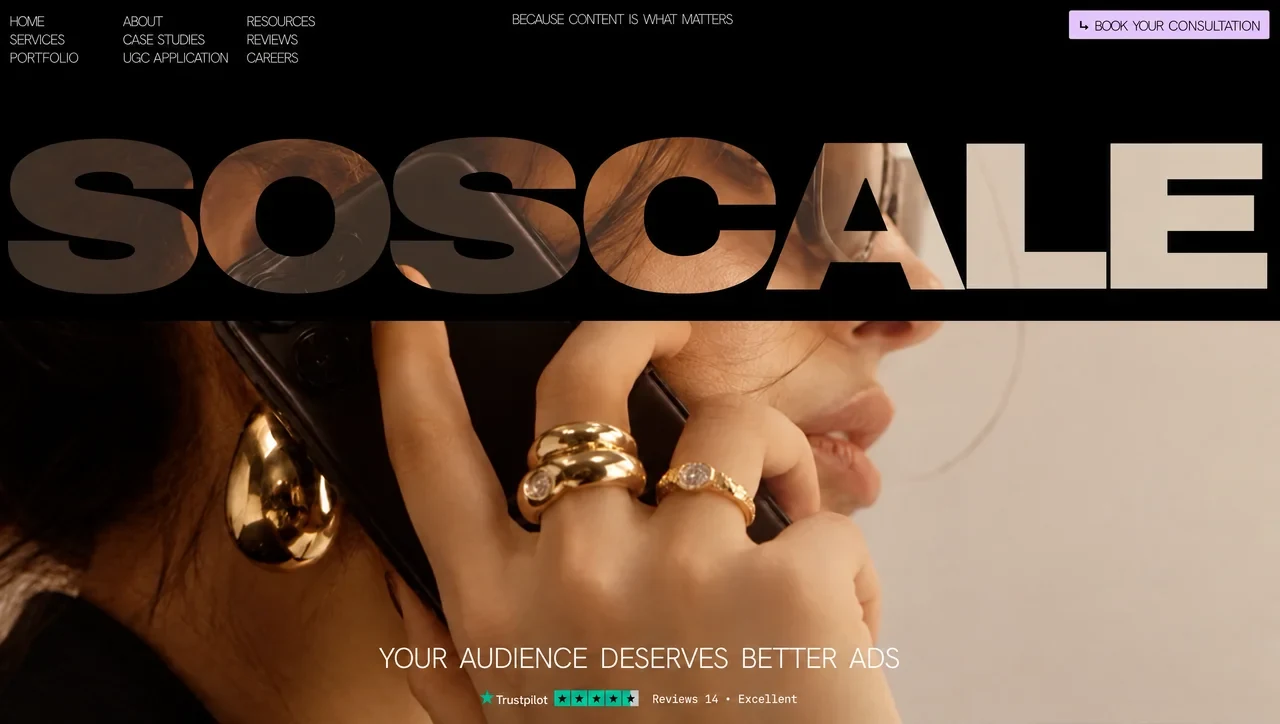
# Prompt: recreate the SOSCALE hero landing page exactly

Build a single-file, zero-dependency static landing page (`index.html`, with inline `<style>` and two inline `<script>` blocks plus one tiny `<head>` script). The page is one full-viewport hero with no scrolling. Every size and position below is exact. Don't add or remove elements, rename classes or "improve" the design. Reproduce it one to one.

---

## 1. Assets

| Asset | Source | Notes |
|---|---|---|
| Hero background video | `https://d8j0ntlcm91z4.cloudfront.net/user_38xzZboKViGWJOttwIXH07lWA1P/hf_20260930_000857_e98f4291-826d-46eb-9a28-8022b5fb7e62.mp4` | 1920×1080, 10.04 s, 16:9, no audio track, seamless loop (last frame ≈ first frame). Content: warm-toned editorial close-up, woman in profile facing right, dark hair in a loose bun, tortoiseshell sunglasses, black phone held to her left ear, chunky gold dome rings + thin gold diamond ring, gold teardrop earring, stacked gold bangles, black blazer, plain warm-beige wall on the right. Gentle motion: lips moving, hair drift, light glinting on gold. **This CloudFront file is HEVC/H.265**. Download it and re-encode to H.264 for cross-browser playback: `ffmpeg -i in.mp4 -an -c:v libx264 -crf 20 -preset slow -pix_fmt yuv420p -movflags +faststart assets/hero.mp4`. Point `<source>` at the CloudFront URL only if you accept that Firefox won't play it. |
| Poster frame | first frame of the video | `ffmpeg -i assets/hero.mp4 -frames:v 1 -q:v 3 assets/hero-poster.jpg` |
| Sans font | **Hanken Grotesk**, variable, `wght` 100–900 | Self-host as `assets/hanken-variable.woff2`, family name `"Hanken"` |
| Mono font | **JetBrains Mono**, variable, `wght` 100–800 | Self-host as `assets/jb-mono-variable.woff2`, family name `"JBMono"` |

Both fonts are free on Google Fonts. Download the variable woff2 files and self-host them. Don't link them from Google's CDN, because `font-display:block` plus the entrance timing depend on local loading.

```css
@font-face{font-family:"Hanken";src:url(assets/hanken-variable.woff2) format("woff2");font-weight:100 900;font-display:block}
@font-face{font-family:"JBMono";src:url(assets/jb-mono-variable.woff2) format("woff2");font-weight:100 800;font-display:block}
```

Note the unusual, precise variable weights used throughout: **250** (nav, tagline, menu), **280** (CTA label), **290** (headline), **500** (Trustpilot word), **400** (mono meta).

---

## 2. `<head>`

```html
<!doctype html>
<html lang="en">
<meta charset="utf-8">
<meta name="viewport" content="width=device-width, initial-scale=1, viewport-fit=cover">
<meta name="theme-color" content="#000000">
<title>SOSCALE — Your audience deserves better ads</title>
```

Put the **entrance gate** script *before* the `<style>` so it runs before first paint:

```js
/* adds .is-entering only when the entrance can actually run; failsafe shows the static page after 2.6 s */
(function(d){try{if(!matchMedia('(prefers-reduced-motion: reduce)').matches&&'animate' in Element.prototype){d.classList.add('is-entering');setTimeout(function(){if(!window.__soscaleEntrance)d.classList.remove('is-entering')},2600);}}catch(e){}})(document.documentElement);
```

---

## 3. Scale system (the core idea)

The layout is authored in **reference pixels of a 1280-wide canvas**. One reference px is `--u`, which is width-driven but capped by height so the black band never exceeds half the screen:

```css
:root{
  --u:min(calc(100vw / 1280),calc(100vh / 640));
  --u:min(calc(100vw / 1280),calc(100svh / 640));   /* svh override where supported */
  --frame-w:calc(1280 * var(--u));
  --frame-x:calc(50% - 640 * var(--u));
  --cu:var(--u);--hb:var(--u);--tb:var(--u);--nu:var(--u);   /* CTA / headline / trustpilot / nav units */
  --layout:desktop;                                          /* read by JS via getComputedStyle */
  --strip-top:calc(120 * var(--u));
  --strip-w:var(--frame-w);
  --strip-bot:calc(10 * var(--u));
  --lilac:#DEC1FC;--green:#00B67A;--nav:#c2c2c2;--ink:#1a0b1f;
}
```

Every desktop dimension is `calc(N * var(--u))` (or `--nu`, `--cu`, `--hb`, `--tb` for that component). Letter-spacing values are also in reference px × unit.

Global reset:
```css
*,*::before,*::after{box-sizing:border-box;margin:0;padding:0}
html,body{height:100%;background:#000;overflow:hidden;overscroll-behavior:none}
body{font-family:"Hanken",system-ui,-apple-system,"Segoe UI",Arial,sans-serif;color:#fff;-webkit-font-smoothing:antialiased;-moz-osx-font-smoothing:grayscale;text-rendering:geometricPrecision}
a{color:inherit;text-decoration:none}
ul{list-style:none}
:focus-visible{outline:2px solid var(--lilac);outline-offset:3px;border-radius:2px}
```

---

## 4. DOM (exact structure and order)

```html
<main class="stage" id="stage">
  <video class="photo" id="photo" width="1920" height="1080" poster="assets/hero-poster.jpg"
         autoplay muted loop playsinline preload="auto" aria-hidden="true" disablepictureinpicture>
    <source src="assets/hero.mp4" type="video/mp4">
  </video>
  <div class="lift" aria-hidden="true"></div>
  <div class="shade" aria-hidden="true"></div>

  <header class="band" aria-label="SOSCALE">
    <span class="band-top"></span>
    <span></span>
    <h1><span class="sr">SOSCALE</span>
      <svg viewBox="0 120 1280 190" preserveAspectRatio="none" aria-hidden="true" focusable="false">
        <path fill="#000" fill-rule="evenodd" d="…WORDMARK PATH (section 9)…"/>
        <g fill="#000" aria-hidden="true">
          <rect class="lid" x="6"    y="136" width="192" height="160"/>
          <rect class="lid" x="198"  y="136" width="192" height="160"/>
          <rect class="lid" x="388"  y="136" width="192" height="160"/>
          <rect class="lid" x="581"  y="136" width="193" height="160"/>
          <rect class="lid" x="762"  y="136" width="202" height="160"/>
          <rect class="lid" x="962"  y="136" width="144" height="160"/>
          <rect class="lid" x="1106" y="136" width="161" height="160"/>
        </g>
      </svg>
    </h1>
    <span></span>
    <span class="band-bot"></span>
  </header>

  <nav class="nav" aria-label="Main">
    <button class="menu-btn" id="menuBtn" type="button" aria-expanded="false" aria-controls="navLinks"><i aria-hidden="true"></i><span class="menu-label">MENU</span></button>
    <div class="nav-links" id="navLinks">
      <ul class="col" style="left:calc(7 * var(--u));top:calc(10.5 * var(--u))">
        <li><a href="#" style="--ls:-1.966">HOME</a></li>
        <li><a href="#" style="--ls:-1.139">SERVICES</a></li>
        <li><a href="#" style="--ls:-0.816">PORTFOLIO</a></li>
      </ul>
      <ul class="col" style="left:calc(117 * var(--u));top:calc(10.5 * var(--u))">
        <li><a href="#" style="--ls:-1.399">ABOUT</a></li>
        <li><a href="#" style="--ls:-1.083">CASE STUDIES</a></li>
        <li><a href="#" style="--ls:-0.581">UGC APPLICATION</a></li>
      </ul>
      <ul class="col" style="left:calc(241 * var(--u));top:calc(10.5 * var(--u))">
        <li><a href="#" style="--ls:-1.152">RESOURCES</a></li>
        <li><a href="#" style="--ls:-1.471">REVIEWS</a></li>
        <li><a href="#" style="--ls:-1.154">CAREERS</a></li>
      </ul>
    </div>
    <p class="tagline">BECAUSE CONTENT IS WHAT MATTERS</p>
    <a class="cta" href="#consultation">
      <svg viewBox="0 0 9 9" aria-hidden="true"><path d="M1.6 .4V6H6.2" fill="none" stroke="currentColor" stroke-width="1.35"/><path d="M5.6 3.6 8.6 6 5.6 8.4Z" fill="currentColor"/></svg>
      <span><b style="letter-spacing:calc(-1.877 * var(--cu))">BOOK</b> <b style="letter-spacing:calc(-1.519 * var(--cu))">YOUR</b> <b style="letter-spacing:calc(-0.564 * var(--cu))">CONSULTATION</b></span>
    </a>
  </nav>

  <section class="copy" aria-label="Introduction">
    <p class="headline">YOUR AUDIENCE DESERVES BETTER ADS</p>
    <a class="tp" href="#reviews" aria-label="Trustpilot: rated Excellent, 4.5 out of 5 from 14 reviews">
      <svg viewBox="0 0 160 19" aria-hidden="true">
        <path fill="#00B67A" d="M8 0.9L9.796 6.428L15.608 6.428L10.906 9.844L12.702 15.372L8 11.956L3.298 15.372L5.094 9.844L0.392 6.428L6.204 6.428Z"/>
        <rect x="75" y="1.7" width="15.6" height="15.4" fill="#00B67A"/><rect x="92" y="1.7" width="15.6" height="15.4" fill="#00B67A"/><rect x="109" y="1.7" width="15.6" height="15.4" fill="#00B67A"/><rect x="126" y="1.7" width="15.6" height="15.4" fill="#00B67A"/><rect x="143" y="1.7" width="8" height="15.4" fill="#00B67A"/><rect x="151" y="1.7" width="7.6" height="15.4" fill="#fff" fill-opacity="0.3"/>
        <path fill="#000" d="M82.8 5.1L83.855 8.347L87.27 8.348L84.508 10.355L85.563 13.602L82.8 11.595L80.037 13.602L81.092 10.355L78.33 8.348L81.745 8.347ZM99.8 5.1L100.855 8.347L104.27 8.348L101.508 10.355L102.563 13.602L99.8 11.595L97.037 13.602L98.092 10.355L95.33 8.348L98.745 8.347ZM116.8 5.1L117.855 8.347L121.27 8.348L118.508 10.355L119.563 13.602L116.8 11.595L114.037 13.602L115.092 10.355L112.33 8.348L115.745 8.347ZM133.8 5.1L134.855 8.347L138.27 8.348L135.508 10.355L136.563 13.602L133.8 11.595L131.037 13.602L132.092 10.355L129.33 8.348L132.745 8.347ZM150.8 5.1L151.855 8.347L155.27 8.348L152.508 10.355L153.563 13.602L150.8 11.595L148.037 13.602L149.092 10.355L146.33 8.348L149.745 8.347Z"/>
      </svg>
      <span class="tp-word" aria-hidden="true">Trustpilot</span>
      <span class="tp-meta" aria-hidden="true">Reviews 14 • Excellent</span>
    </a>
  </section>
</main>
```

Visual summary of the Trustpilot row: one green 5-point star logo mark at the left, the word "Trustpilot" in white next to it, then 4½ green square rating tiles with black stars (the last half tile is 30% white), then the mono meta text "Reviews 14 • Excellent".

---

## 5. Desktop CSS (exact)

### Stage and video layers
```css
.stage{position:relative;width:100%;height:100vh;height:100svh;overflow:hidden;background:#000;isolation:isolate}
.photo{position:absolute;inset:0;width:100%;height:100%;object-fit:cover;object-position:54% 50%;z-index:0;user-select:none;-webkit-user-drag:none;pointer-events:none}
.photo.is-placed{inset:auto;object-fit:fill;max-width:none}   /* JS takes over sizing/positioning */
.lift{position:absolute;left:0;right:0;top:0;height:var(--band-h,calc(320 * var(--u)));z-index:1;pointer-events:none;background:rgba(150,118,104,.30);mix-blend-mode:screen}
.shade{position:absolute;inset:0;z-index:1;pointer-events:none;background:none}
```
`.lift` is a warm screen-blend wash over only the top band height. It brightens the video where it shows through the letters.

### Black band with the knocked-out wordmark
The band is a 3×3 CSS grid of black `<span>`s around the `<h1>`. The SVG path is a black rectangle with the SOSCALE letters cut out (`fill-rule:evenodd`), so **the video shows through the letters** while everything around them is black.
```css
.band{position:absolute;left:0;right:0;top:0;z-index:2;display:grid;
  grid-template-columns:1fr var(--strip-w) 1fr;
  grid-template-rows:var(--strip-top) calc(var(--strip-w) * 190 / 1280) var(--strip-bot)}
.band>span{background:#000}
.band .band-top,.band .band-bot{grid-column:1/-1}
.band h1{grid-column:2;grid-row:2;position:relative;font-size:0;line-height:0}
.band svg{position:absolute;inset:0;width:100%;height:100%;overflow:visible;display:block}
```
Desktop result: 120 u black above the letters, a 190 u-tall wordmark strip spanning the full 1280 u frame, 10 u black below.

### Navigation (absolute, reference coordinates)
```css
.nav{position:absolute;top:0;left:var(--frame-x);width:var(--frame-w);height:calc(100 * var(--u));z-index:4}
.nav .col{position:absolute;font-weight:250;font-size:calc(14.286 * var(--nu));line-height:calc(18 * var(--nu));white-space:nowrap;color:var(--nav)}
.nav .col a{display:inline-block;letter-spacing:calc(var(--ls) * var(--nu));transition:opacity .15s}
.nav .col a:hover{opacity:.6}
.tagline{position:absolute;left:calc(509 * var(--u));top:calc(11.357 * var(--u));font-weight:250;font-size:calc(14.286 * var(--nu));line-height:calc(14.286 * var(--nu));letter-spacing:calc(-1.532 * var(--nu));word-spacing:calc(3.44 * var(--nu));white-space:nowrap;color:var(--nav)}
.cta{position:absolute;left:calc(1067.5 * var(--u));top:calc(9.5 * var(--u));width:calc(199.5 * var(--cu));height:calc(28.5 * var(--cu));background:var(--lilac);color:var(--ink);border-radius:calc(2 * var(--cu));white-space:nowrap;transition:filter .15s}
.cta b{font-weight:inherit}
.cta:hover{filter:brightness(1.06)}
.cta svg{position:absolute;left:calc(10 * var(--cu));top:calc(10 * var(--cu));width:calc(10 * var(--cu));height:calc(10 * var(--cu))}
.cta span{position:absolute;left:calc(25.5 * var(--cu));top:calc(8.357 * var(--cu));font-weight:280;font-size:calc(14.286 * var(--cu));line-height:calc(14.286 * var(--cu));letter-spacing:calc(-1.042 * var(--cu));word-spacing:calc(3.2 * var(--cu))}
.menu-btn{display:none}
.nav-links{display:contents}
```
The CTA is a lilac `#DEC1FC` pill (2 u radius) with dark-plum `#1a0b1f` text and a small "corner-down-right" arrow icon.

### Hero copy (anchored to the bottom)
```css
.copy{position:absolute;left:var(--frame-x);width:var(--frame-w);bottom:0;height:calc(100 * var(--u));z-index:3}
.headline{position:absolute;left:calc(378 * var(--u));top:calc(21.715 * var(--u));font-weight:290;font-size:calc(28.571 * var(--hb));line-height:calc(28.571 * var(--hb));letter-spacing:calc(-0.896 * var(--hb));word-spacing:calc(5.62 * var(--hb));white-space:nowrap}
.tp{position:absolute;left:calc(478 * var(--u));top:calc(66 * var(--u));width:calc(320 * var(--tb));height:calc(19 * var(--tb));display:block}
.tp svg{position:absolute;left:0;top:0;width:calc(160 * var(--tb));height:calc(19 * var(--tb));overflow:visible}
.tp .tp-word{position:absolute;left:calc(17 * var(--tb));top:calc(5.257 * var(--tb));font-weight:500;font-size:calc(12.286 * var(--tb));line-height:calc(12.286 * var(--tb));letter-spacing:calc(-0.149 * var(--tb));white-space:nowrap;color:#fff}
.tp .tp-meta{position:absolute;left:calc(172.5 * var(--tb));top:calc(4.015 * var(--tb));font-family:"JBMono",ui-monospace,Menlo,monospace;font-weight:400;font-size:calc(11.37 * var(--tb));line-height:calc(11.37 * var(--tb));letter-spacing:calc(-0.268 * var(--tb));white-space:nowrap;color:#FFFEF7}
.sr{position:absolute;width:1px;height:1px;overflow:hidden;clip:rect(0 0 0 0);white-space:nowrap}
```

### Entrance pre-state
```css
.lid{opacity:0;transform-box:fill-box;transform-origin:50% 0}
.is-entering .lid{opacity:1}
.is-entering :is(.nav .col,.menu-btn,.tagline,.cta,.headline,.tp){opacity:0}
```

---

## 6. Responsive architectures

### Tablet: `@media (max-width:1074.98px),(max-height:537.98px)`
Rationale: below u = 0.84 the desktop text would drop under 12 px and collide. Chrome goes back to 1:1 px, the links move behind a MENU button and drop down as an extension of the black band, and the copy is bottom-centred.
```css
:root{
  --layout:tablet;
  --pad:clamp(20px,3.2vw,32px);
  --nu:1px;--cu:1px;--hb:1px;--tb:1px;
  --head-h:72px;
  --strip-top:var(--head-h);
  --strip-w:min(100vw,calc((100svh - var(--head-h)) * .3 * 1280 / 190));
  --strip-bot:calc(var(--strip-w) * 10 / 1280);
}
.nav{left:0;width:100%;height:var(--head-h);padding:0 var(--pad);display:grid;grid-template-columns:1fr auto 1fr;align-items:center;column-gap:16px}
.menu-btn{display:inline-flex;justify-self:start;align-items:center;gap:10px;min-height:44px;background:none;border:0;color:var(--nav);font-family:inherit;font-weight:250;font-size:calc(14.286 * var(--nu));line-height:1;letter-spacing:calc(-1.252 * var(--nu));cursor:pointer;padding:0 8px 0 0;-webkit-tap-highlight-color:transparent}
.menu-btn i{position:relative;display:block;width:18px;height:7px}
.menu-btn i::before,.menu-btn i::after{content:"";position:absolute;left:0;right:0;height:1px;background:currentColor;transition:transform .22s ease}
.menu-btn i::before{top:0}
.menu-btn i::after{bottom:0}
.nav.is-open .menu-btn i::before{transform:translateY(3px) rotate(45deg)}
.nav.is-open .menu-btn i::after{transform:translateY(-3px) rotate(-45deg)}
.tagline{position:static;justify-self:center}
.cta{position:relative;left:auto;top:auto;justify-self:end;flex:none}
.cta::after{content:"";position:absolute;inset:-8px -6px}
.nav-links{display:grid;position:absolute;top:var(--head-h);left:0;right:0;z-index:5;grid-template-columns:repeat(3,max-content);column-gap:clamp(40px,7vw,88px);padding:0 var(--pad) 24px;background:#000;
  visibility:hidden;clip-path:inset(0 0 100% 0);transition:clip-path .26s cubic-bezier(.2,.7,.2,1),visibility 0s linear .26s}
.nav.is-open .nav-links{visibility:visible;clip-path:inset(0);transition:clip-path .26s cubic-bezier(.2,.7,.2,1)}
.nav .col{position:static}
.nav .col a{padding:12px 0}
.copy{left:0;width:100%;height:auto;bottom:calc(15 * var(--tb) + env(safe-area-inset-bottom));display:flex;flex-direction:column;align-items:center;gap:calc(15.7 * var(--hb));padding:0 var(--pad)}
.headline,.tp{position:relative;left:auto;top:auto}
.tp{width:calc(320 * var(--tb));margin-left:calc(-2 * var(--tb))}
```
The hamburger is two 1 px lines (18×7 box) that rotate into an X when open. The label text swaps MENU ↔ CLOSE.

### Mobile: `@media (max-width:559.98px)`
```css
:root{
  --layout:mobile;
  --pad:clamp(14px,4.2vw,22px);
  --head-h:64px;
  --tag-row:30px;
  --cu:min(1px,calc((100vw - 2 * var(--pad) - 88px) / 199.5));
  --hb:min(1.1px,calc((100vw - 2 * var(--pad)) / 300));
  --tb:min(1px,calc((100vw - 2 * var(--pad)) / 322));
  --strip-top:calc(var(--head-h) + var(--tag-row));
  --strip-w:calc((100vw - 2 * var(--pad)) * 1280 / 1259);
  --strip-bot:10px;
}
.nav{height:auto;grid-template-columns:1fr auto;grid-template-rows:var(--head-h) var(--tag-row);column-gap:12px}
.menu-btn{grid-column:1;grid-row:1}
.cta{grid-column:2;grid-row:1}
.tagline{grid-column:1/-1;grid-row:2;align-self:start;justify-self:center;margin-top:2px}
.nav-links{column-gap:clamp(12px,5vw,40px);padding-bottom:20px}
.copy{bottom:calc(max(18px,env(safe-area-inset-bottom)) + 6px);gap:16px}
.headline{white-space:normal;text-align:center;text-wrap:balance;max-width:calc(318 * var(--hb));line-height:1.08}
.lift{background:rgba(150,118,104,.52)}
```
Mobile layout: MENU on the left and the CTA on the right, the tagline on its own centred row inside the black band, the wordmark spanning exactly the content column, and the headline balanced over two lines.

### Hover and reduced motion
```css
@media (hover:none){ .nav .col a:hover{opacity:1} .cta:hover{filter:none} }
@media (prefers-reduced-motion:reduce){ .nav-links,.nav.is-open .nav-links,.menu-btn i::before,.menu-btn i::after{transition:none} }
```

---

## 7. Script 1: focal-point cover, menu and reduced-motion video

Place this after `</main>`. It sizes and positions the video in JS (not `object-fit`) so the **ring cluster (video px 1041, 545)** always lands at x = 700 u across the 1280 frame and 37.5% of the way down the area below the band, with at least 0.95× video-px zoom (equal to 1.15× on the original 1586×992 photo). It always covers the stage, and on tablet and mobile it never lets the bangles (video rows > 956) sit under the headline.

```js
(function(){
  var stage=document.getElementById('stage'),img=document.getElementById('photo'),band=document.querySelector('.band');
  var IW=1920,IH=1080,FX=1041,FY=545,ZOOM=0.95,TX=700,BANGLES=956;
  var root=document.documentElement,nav=document.querySelector('.nav'),btn=document.getElementById('menuBtn'),
      links=document.getElementById('navLinks'),label=btn.querySelector('.menu-label');
  function layout(){return getComputedStyle(root).getPropertyValue('--layout').trim()||'desktop';}
  function place(){
    var W=stage.clientWidth,H=stage.clientHeight; if(!W||!H) return;
    var u=Math.min(W/1280,H/640), bh=band.getBoundingClientRect().height, mode=layout();
    var compact=mode!=='desktop', tablet=compact;
    var s=Math.max(W/IW,H/IH,compact?(tablet?Math.max(ZOOM*W/1280,H/BANGLES):0):ZOOM*u);
    var tx=tablet?W*TX/1280:compact?W*0.55:(W-1280*u)/2+TX*u, ty=bh+0.375*(H-bh);
    var l=tx-FX*s,t=ty-FY*s;
    l=Math.min(0,Math.max(W-IW*s,l)); t=Math.min(0,Math.max(H-IH*s,tablet?H-BANGLES*s:-Infinity,t));
    img.style.width=IW*s+'px';img.style.height=IH*s+'px';img.style.left=l+'px';img.style.top=t+'px';
    img.classList.add('is-placed'); stage.style.setProperty('--band-h',bh+'px');
    if(!compact&&nav.classList.contains('is-open')) setMenu(false,false);
  }
  function setMenu(open,moveFocus){
    nav.classList.toggle('is-open',open); btn.setAttribute('aria-expanded',String(open)); label.textContent=open?'CLOSE':'MENU';
    if(moveFocus!==false){ if(open){var first=links.querySelector('a'); if(first) requestAnimationFrame(function(){first.focus({preventScroll:true})});} else btn.focus(); }
  }
  btn.addEventListener('click',function(){setMenu(!nav.classList.contains('is-open'))});
  links.addEventListener('click',function(e){if(e.target.closest('a')&&layout()!=='desktop')setMenu(false,false)});
  document.addEventListener('keydown',function(e){if(e.key==='Escape'&&nav.classList.contains('is-open'))setMenu(false)});
  document.addEventListener('pointerdown',function(e){if(nav.classList.contains('is-open')&&!nav.contains(e.target))setMenu(false,false)});
  if(matchMedia('(prefers-reduced-motion: reduce)').matches){img.removeAttribute('autoplay');img.pause();}
  place(); addEventListener('resize',place); if(window.ResizeObserver) new ResizeObserver(place).observe(stage);
  if(document.fonts) document.fonts.ready.then(place);
})();
```
Menu behaviour: toggles with the button, closes on Escape, on an outside pointerdown and on a link click (non-desktop only), and auto-closes when resizing back to desktop. Focus moves to the first link on open and returns to the button on close.

---

## 8. Script 2: the entrance animation (Web Animations API, runs once)

Motion vocabulary: "everything rises". Two easings: `EXPO = cubic-bezier(0.16,1,0.3,1)` (default) and `QUART = cubic-bezier(0.76,0,0.24,1)` (letter lids). It waits for `document.fonts.ready` (race with a 700 ms timeout), then:

| Time (s) | Element | Keyframes | Duration | Easing |
|---|---|---|---|---|
| 0.06 + i×0.06 (i = 0..6) | each `.lid` rect over each letter | `scaleY(1)` → `scaleY(0)` from `transform-origin:50% 0` (lids retract **upward**, so the video fills each letter bottom to top, left to right) | 1.0 | QUART |
| 0.50 + i×0.06 | desktop: the 3 `.nav .col`; tablet/mobile: `.menu-btn` | opacity 0 → 1, translateY(**6px** desktop / **4px** compact) → none | 0.6 | EXPO |
| 0.70 | `.tagline` | same rise | 0.6 | EXPO |
| 0.85 | `.headline` | masked rise: `translateY(100%)` + `clip-path:inset(-100% -8px 100% -8px)` → `none` + `inset(0 -8px 0 -8px)` | 1.0 | EXPO |
| 1.10 | `.cta` | wipe left to right: `clip-path:inset(0 100% 0 0)` → `inset(0 0 0 0)` | 0.75 | EXPO |
| 1.20 | `.tp` | rise with lift + 2 px (8 px desktop / 6 px compact) | 0.7 | EXPO |

All animations use `fill:'both'`. Right after scheduling them, remove `.is-entering` (the first keyframes hold the start state). When every animation has finished, `cancel()` them all so the page rests on its authored styles. Set `window.__soscaleEntrance=true` when it starts so the head-script failsafe doesn't fire.

```js
(function(){
  var root=document.documentElement;
  if(!root.classList.contains('is-entering')) return;
  var EXPO='cubic-bezier(0.16,1,0.3,1)', QUART='cubic-bezier(0.76,0,0.24,1)';
  var img=document.getElementById('photo');
  var waits=[document.fonts?document.fonts.ready:null,img&&img.decode?img.decode().catch(function(){}):null].filter(Boolean);
  Promise.race([Promise.all(waits),new Promise(function(r){setTimeout(r,700)})]).then(function(){
    if(!root.classList.contains('is-entering')) return;
    window.__soscaleEntrance=true;
    var desk=(getComputedStyle(root).getPropertyValue('--layout').trim()||'desktop')==='desktop';
    var lift=desk?6:4, anims=[];
    function play(el,kf,t,d,e){ if(el) anims.push(el.animate(kf,{delay:t*1000,duration:d*1000,easing:e||EXPO,fill:'both'})); }
    function rise(px){ return [{opacity:0,transform:'translateY('+px+'px)'},{opacity:1,transform:'none'}]; }
    var q=function(s){return document.querySelector(s)};
    [].forEach.call(document.querySelectorAll('.lid'),function(l,i){
      play(l,[{opacity:1,transform:'scaleY(1)'},{opacity:1,transform:'scaleY(0)'}],.06+i*.06,1.0,QUART);
    });
    (desk?[].slice.call(document.querySelectorAll('.nav .col')):[q('.menu-btn')]).forEach(function(el,i){ play(el,rise(lift),.50+i*.06,.6); });
    play(q('.tagline'),rise(lift),.70,.6);
    play(q('.headline'),[{transform:'translateY(100%)',clipPath:'inset(-100% -8px 100% -8px)'},{transform:'none',clipPath:'inset(0 -8px 0 -8px)'}],.85,1.0);
    play(q('.cta'),[{clipPath:'inset(0 100% 0 0)'},{clipPath:'inset(0 0 0 0)'}],1.10,.75);
    play(q('.tp'),rise(lift+2),1.20,.7);
    root.classList.remove('is-entering');
    Promise.all(anims.map(function(a){return a.finished})).then(function(){ anims.forEach(function(a){a.cancel()}); },function(){});
  });
})();
```

---

## 9. Wordmark SVG path (verbatim, don't simplify)

This is a black rectangle `M-4 116H1284V314H-4Z` with the letters **S O S C A L E** cut out as evenodd holes (a heavy, wide geometric grotesk). The `viewBox` is `0 120 1280 190` with `preserveAspectRatio="none"`. Use it exactly:

```
M-4 116H1284V314H-4ZM105.12 293Q105.46 293 105.8 293Q106.23 293 106.66 293Q107 293 107.34 293Q107.77 293 108.19 293Q108.54 293 108.88 293Q109.3 293 109.73 293Q134.67 293 154.41 287.7Q174.14 282.4 185.57 270.94Q197 259.47 197 241.09Q197 229.41 191.81 221.41Q186.61 213.4 177.72 208.21Q168.83 203.02 157.87 200.1Q146.9 197.18 135.13 195.56Q123.35 193.94 112.39 192.86Q101.42 191.78 92.53 190.59Q83.65 189.4 78.45 187.23Q73.26 185.07 73.26 181.18Q73.26 178.58 76.84 176.31Q80.41 174.04 87.8 172.74Q94.31 171.6 103.68 171.46Q113.14 171.64 119.2 173.5Q125.89 175.55 128.9 178.91Q131.9 182.26 131.9 186.58V187.45H191.69V184.85Q191.69 172.31 184.76 163.55Q177.84 154.79 165.72 149.38Q153.6 143.97 137.78 141.49Q121.97 139 103.96 139Q103.58 139 103.21 139Q102.82 139 102.42 139Q102.05 139 101.67 139Q101.28 139 100.88 139Q100.51 139 100.13 139Q99.74 139 99.35 139Q81.8 139 65.64 141.6Q49.48 144.19 37.01 149.81Q24.55 155.44 17.27 164.52Q10 173.61 10 186.58Q10 198.7 15.2 207.13Q20.39 215.57 29.28 220.97Q38.17 226.38 49.13 229.52Q60.1 232.65 71.87 234.38Q83.65 236.12 94.61 237.2Q105.58 238.28 114.47 239.47Q123.35 240.66 128.55 242.82Q133.74 244.98 133.74 248.88Q133.74 251.69 131.55 253.53Q129.36 255.37 125.78 256.45Q122.2 257.53 117.7 258.07Q113.2 258.61 108.46 258.72Q105.15 258.79 102.02 258.82Q92.36 258.72 84.8 257.64Q76.49 256.45 71.87 252.99Q67.26 249.53 67.26 243.04V241.63Q67.26 240.87 67.49 240.01H7.23Q7 240.87 7 241.63V242.82Q7 257.74 14.62 267.59Q22.24 277.43 35.63 282.94Q49.02 288.46 66.79 290.73Q84.57 293 105.12 293ZM291.89 293Q292.23 293 292.57 293Q292.91 293 293.24 293Q293.58 293 293.92 293Q294.26 293 294.59 293Q294.93 293 295.27 293Q295.61 293 295.94 293Q324.79 293 345.55 283.7Q366.31 274.4 377.66 257.2Q389 240.01 389 216.1Q389 191.99 377.66 174.69Q366.31 157.38 345.55 148.19Q324.79 139 295.94 139Q295.61 139 295.27 139Q294.94 139 294.59 139Q294.26 139 293.92 139Q293.59 139 293.24 139Q292.91 139 292.57 139Q292.23 139 291.89 139Q263.51 139 242.6 148.19Q221.69 157.38 210.34 174.69Q199 191.99 199 216.1Q199 240.01 210.34 257.2Q221.69 274.4 242.6 283.7Q263.51 293 291.89 293ZM294 176.02Q302.32 176.28 309.19 178.69Q316.89 181.39 322.36 186.37Q327.83 191.34 330.66 198.2Q333.5 205.05 333.5 213.19V218.38Q333.5 226.56 330.66 233.5Q327.83 240.44 322.36 245.52Q316.89 250.61 309.19 253.31Q302.32 255.72 294 255.98Q285.68 255.72 278.81 253.31Q271.11 250.61 265.64 245.52Q260.17 240.44 257.34 233.5Q254.5 226.56 254.5 218.38V213.19Q254.5 205.05 257.34 198.2Q260.17 191.34 265.64 186.37Q271.11 181.39 278.81 178.69Q285.68 176.28 294 176.02ZM484.79 293Q485.19 293 485.59 293Q486.09 293 486.59 293Q486.99 293 487.39 293Q487.89 293 488.4 293Q488.79 293 489.19 293Q489.69 293 490.2 293Q490.6 293 491 293Q491.5 293 492 293Q492.4 293 492.8 293Q493.3 293 493.8 293Q518.15 293 537.42 287.7Q556.69 282.4 567.84 270.94Q579 259.47 579 241.09Q579 229.41 573.93 221.41Q568.86 213.4 560.18 208.21Q551.5 203.02 540.8 200.1Q530.09 197.18 518.6 195.56Q507.1 193.94 496.4 192.86Q485.69 191.78 477.01 190.59Q468.34 189.4 463.26 187.23Q458.19 185.07 458.19 181.18Q458.19 178.58 461.69 176.31Q465.18 174.04 472.39 172.74Q477.85 171.76 485.36 171.52Q493.27 171.84 498.54 173.5Q505.07 175.55 508 178.91Q510.93 182.26 510.93 186.58V187.45H573.82V184.85Q573.82 172.31 567.05 163.55Q560.29 154.79 548.46 149.38Q536.63 143.97 521.19 141.49Q505.75 139 488.17 139Q487.73 139 487.29 139Q486.83 139 486.37 139Q485.93 139 485.49 139Q485.03 139 484.56 139Q484.12 139 483.68 139Q483.22 139 482.76 139Q482.32 139 481.88 139Q481.42 139 480.96 139Q480.52 139 480.08 139Q479.62 139 479.15 139Q462.02 139 446.25 141.6Q430.47 144.19 418.3 149.81Q406.13 155.44 399.03 164.52Q391.93 173.61 391.93 186.58Q391.93 198.7 397 207.13Q402.07 215.57 410.75 220.97Q419.43 226.38 430.13 229.52Q440.84 232.65 452.33 234.38Q463.83 236.12 474.53 237.2Q485.24 238.28 493.92 239.47Q502.59 240.66 507.67 242.82Q512.74 244.98 512.74 248.88Q512.74 251.69 510.6 253.53Q508.45 255.37 504.96 256.45Q501.47 257.53 497.07 258.07Q492.68 258.61 488.06 258.72Q486.21 258.76 484.42 258.79Q476.11 258.61 469.46 257.64Q461.35 256.45 456.84 252.99Q452.33 249.53 452.33 243.04V241.63Q452.33 240.87 452.56 240.01H389.23Q389 240.87 389 241.63V242.82Q389 257.74 396.44 267.59Q403.88 277.43 416.95 282.94Q430.02 288.46 447.37 290.73Q464.73 293 484.79 293ZM679.15 293Q679.49 293 679.84 293Q680.23 293 680.61 293Q680.96 293 681.3 293Q681.69 293 682.08 293Q682.43 293 682.77 293Q683.16 293 683.54 293Q711.68 293 731.68 284.98Q751.68 276.96 762.34 262.84Q773 248.73 773 230.76H772.98Q773 229.91 773 229.05H717.39Q717.39 236.75 712.67 242.52Q707.94 248.3 699.04 251.51Q690.99 254.41 679.97 254.68Q667.71 254.33 659.59 249.58Q650.8 244.45 646.51 236Q642.22 227.55 642.22 217.71V214.07Q642.22 203.81 646.51 195.47Q650.8 187.12 659.92 182.21Q668.3 177.68 680.86 177.32Q690.73 177.62 698.27 180.71Q706.62 184.13 711.24 190.12Q715.85 196.11 715.85 203.81H773Q773 202.95 772.98 202.1H773Q773 183.49 761.68 169.27Q750.36 155.04 730.36 147.02Q710.36 139 683.98 139Q683.59 139 683.2 139Q682.86 139 682.52 139Q682.12 139 681.73 139Q681.39 139 681.05 139Q680.66 139 680.27 139Q679.93 139 679.59 139Q631.67 139 606.84 158.78Q582 178.57 582 215.14Q582 215.58 582 216.02Q582 216.44 582 216.86Q582 241.88 592.66 258.78Q603.32 275.68 624.86 284.34Q646.4 293 679.15 293ZM821.45 143.84L903.93 143.84L962.54 288L908.32 288L897.48 261.34L827.94 261.34L817.22 288L763.47 288ZM861.87 178.2L863.95 178.2L884.84 229.65L841.15 229.65ZM964 143.84L1022 143.84L1022 249.84L1104.02 249.84L1104.02 288L964 288ZM1107.75 143.84L1259.01 143.84L1259.01 178.6L1165 178.6L1165 195L1251.01 195L1251.01 230.01L1165 230.01L1165 252.51L1265.01 252.51L1265.01 288L1107.75 288Z
```

---

## 10. Acceptance checklist

- The page never scrolls. It's black everywhere except the video visible through the SOSCALE letters and the lower hero area.
- At 1280×800: 120 px of black above the letters, a 190 px wordmark strip, 10 px of black below. The three nav columns sit at x = 7, 117 and 241, the tagline at x = 509, the CTA at x = 1067.5 (199.5×28.5), the headline at x = 378 (100 px from the bottom) and the Trustpilot row at x = 478.
- Nav and tagline text are `#c2c2c2`, weight 250, 14.286 px. The headline is white, weight 290, 28.571 px, uppercase.
- The video autoplays muted and loops seamlessly, and stays paused on the poster under reduced motion.
- On load, letters fill left to right, then the nav, tagline, headline, CTA and Trustpilot row, and everything has settled by about 2.1 s. The entrance is skipped entirely under reduced motion.
- Tablet (< 1075 px wide or < 538 px tall): MENU / tagline / CTA header, drop-down links. Mobile (< 560 px): tagline on its own row and a two-line headline.
提示词已复制,选择一个常用平台继续。
