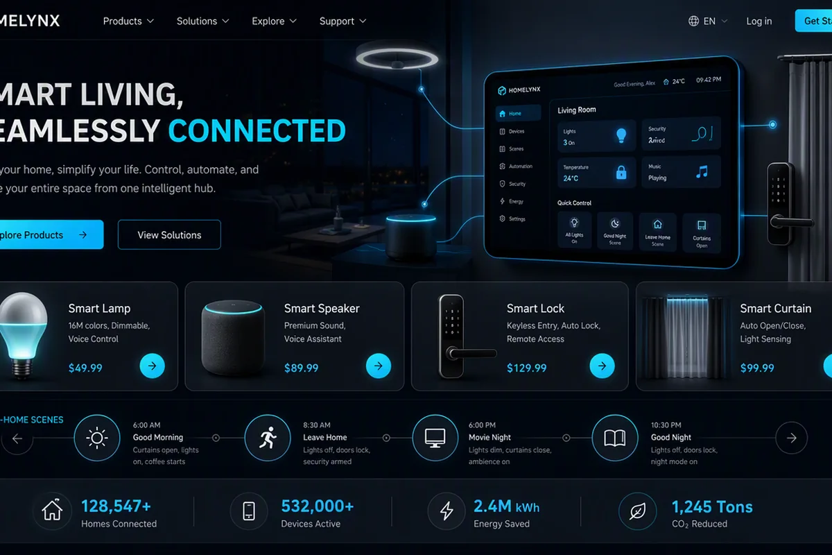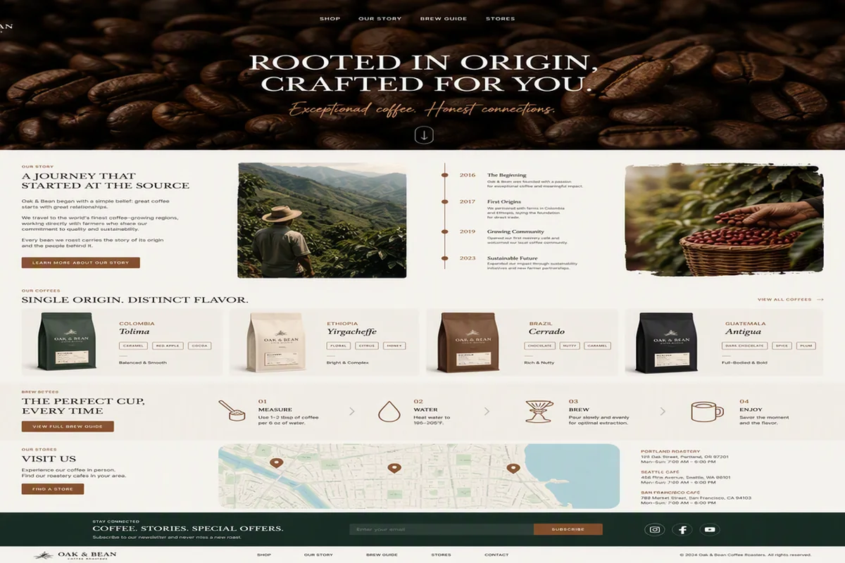

通过机器人视觉、机械结构和未来感动效呈现研发实力,适合机器人公司和硬件实验室。
未来机器人工坊首屏
效果案例

READY TO USE
直接开始使用
这条提示词无需补充变量,可查看并复制完整提示词。
复制后粘贴到任意 AI 平台即可直接使用
更新于 2026.10.14 · 持续复测
通过机器人视觉、机械结构和未来感动效呈现研发实力,适合机器人公司和硬件实验室。
查看完整提示词,复制后粘贴到任意 AI 平台使用。
Build a single, standalone, production-ready HTML file for a full-screen hero landing page for a brand called "Future Machine™ — Robotics Studio". Everything (CSS, JavaScript, SVG artwork, favicon) must be inlined in that one file. No build tools, no frameworks, no external requests, no libraries, no web fonts, no images, no video. It must work by double-clicking the file.

=== DOCUMENT HEAD ===
- <!doctype html>, lang="en", charset utf-8
- viewport: width=device-width, initial-scale=1
- meta theme-color: #055bd3
- meta description: "Future Machine Robotics Studio"
- title: Future Machine™ — Robotics Studio
- Favicon inlined as a URL-encoded data: URI (NOT base64), type image/svg+xml. The favicon is a 32x32 SVG: a rounded square rect (width 32, height 32, rx 6) filled #045fd8; a white helmet path d="M8 12l4-6h8l4 6-2 13H10z"; a visor path d="M9 13h14l-2 7H11z" filled #091f39.

=== FONTS ===
System stack only: Arial, Helvetica, sans-serif — declared once on :root. Do not load any web font.

=== PAGE STRUCTURE ===
<main class="stage" aria-label="Future Machine Robotics Studio"> containing exactly four children, in this order:
1. <h1 class="brand">Future Machine<sup>TM</sup></h1>
2. An inline <svg class="robot"> (the helmet — full spec below). Do NOT use <img>.
3. <p class="studio">Robotics Studio</p>
4. <span class="edge-line" aria-hidden="true"></span>

=== GLOBAL CSS ===
:root { color-scheme: dark; font-family: Arial, Helvetica, sans-serif; background: #055bd3; }
* { box-sizing: border-box; }
html, body { width: 100%; min-width: 320px; height: 100%; margin: 0; overflow: hidden; }
body {
  color: #fff;
  background:
    radial-gradient(circle at 50% 46%, rgba(0,119,255,.48) 0%, rgba(0,102,235,.28) 35%, rgba(0,73,183,.15) 72%, rgba(0,58,150,.06) 100%),
    linear-gradient(128deg, #0753bf 0%, #0069e9 48%, #0755c4 100%);
}

.stage { position: relative; width: 100vw; height: 100svh; min-height: 100%; isolation: isolate; overflow: hidden; }
.stage::before {
  content: ""; position: absolute; inset: -15%; z-index: -1;
  background:
    radial-gradient(ellipse at 51% 45%, rgba(0,127,255,.35), transparent 54%),
    radial-gradient(ellipse at 5% 15%, rgba(13,72,174,.24), transparent 44%),
    radial-gradient(ellipse at 92% 86%, rgba(7,63,162,.28), transparent 45%);
  filter: blur(28px);
}

=== DESKTOP COMPOSITION (three-point layout; all values exact) ===
.brand {
  position: absolute; top: 6.05%; left: 3.45%; margin: 0; white-space: nowrap;
  font-size: clamp(2.15rem, 4.92vw, 5rem); font-weight: 700; line-height: 1; letter-spacing: -0.025em;
  text-shadow: 0 1px 3px rgba(255,255,255,.25), 0 2px 5px rgba(0,24,68,.14);
}
.brand sup {
  display: inline-block; margin-left: .03em; font-size: .43em; line-height: 1;
  letter-spacing: -.04em; vertical-align: top; transform: translateY(-.02em);
}
.robot {
  position: absolute; top: 13.1%; left: 29.37%; width: 41.35%; height: auto; display: block;
  filter: drop-shadow(0 2px 4px rgba(0,20,68,.08)); user-select: none; -webkit-user-drag: none;
}
.studio {
  position: absolute; right: 3.05%; bottom: 6.45%; margin: 0; white-space: nowrap;
  font-size: clamp(2rem, 4.9vw, 4.9rem); font-weight: 300; font-style: italic; line-height: 1;
  letter-spacing: -.035em; text-shadow: 0 1px 4px rgba(0,28,75,.18);
}
.edge-line {
  position: absolute; top: 1.6%; right: .48%; width: 2px; height: 9.8%; border-radius: 2px;
  background: rgba(202,226,249,.73); box-shadow: 0 0 6px rgba(197,227,255,.16);
}

=== RESPONSIVE RULES ===
Critical: this layout is driven by ASPECT RATIO, not pixel width, because every element is sized from viewport width — so a 1280x1024 monitor must degrade the same way an 11" tablet does. Write these five media queries in exactly this order:

1) Phone / any portrait — @media (max-aspect-ratio: 1/1)
   .brand { top: 5.5%; left: 7%; font-size: clamp(2.25rem, 10vw, 4rem); }
   .robot { top: 50%; left: 50%; width: min(90%, 52svh); transform: translate(-50%, -50%); }
   .studio { right: 7%; bottom: 7%; font-size: clamp(2.2rem, 9.5vw, 4rem); }

2) Tablet landscape / near-square — @media (min-aspect-ratio: 1/1) and (max-aspect-ratio: 7/5)
   .brand { font-size: clamp(2.15rem, max(4.92vw, 6.9svh), 5rem); }
   .robot { top: 50%; left: 50%; width: min(52%, 58svh); transform: translate(-50%, -50%); }
   .studio { font-size: clamp(2rem, max(4.9vw, 6.85svh), 4.9rem); }
   Tuned so that at exactly 7/5 nothing jumps: 58svh equals 41.35% of width and 6.9svh equals 4.92vw at that ratio, so only the robot's anchor changes.

3) Tablet portrait — @media (max-aspect-ratio: 1/1) and (min-width: 600px)
   Restores the three-point composition that rule 1 collapses.
   .brand { top: 5.5%; left: 4.5%; font-size: clamp(2.35rem, 7.4vw, 4.6rem); }
   .robot { top: 50%; left: 50%; width: min(70%, 52svh); transform: translate(-50%, -50%); }
   .studio { right: 4.5%; bottom: 6.5%; font-size: clamp(2.15rem, 7.2vw, 4.4rem); }

4) Mobile viewport pinning (both orientations) —
   @media (max-aspect-ratio: 1/1) and (max-width: 599.98px), (min-aspect-ratio: 7/5) and (max-height: 500px)
   html, body { height: 100dvh; overscroll-behavior: none; }
   .stage { height: 100dvh; min-height: 0; }
   Reason: .stage asks for 100svh but also carries min-height:100%, which resolves against the initial containing block; where that resolves large, the stage outgrows the visible area and the document genuinely scrolls with overflow:hidden merely hiding the bar. Pinning to 100dvh removes the ambiguity — nothing scrolls, so browser UI never retracts, so dvh never changes.

5) Phone landscape — @media (min-aspect-ratio: 7/5) and (max-height: 500px)
   .brand { font-size: clamp(1.75rem, min(4.92vw, 7.6svh), 5rem); }
   .robot { top: 50%; left: 50%; width: min(41.35%, 60svh); transform: translate(-50%, -50%); }
   .studio { font-size: clamp(1.7rem, min(4.9vw, 7.55svh), 4.9rem); }
   Bound by max-height so tablet landscape and full displays are untouched. Height is the constraint here, so both type sizes and the robot take an svh ceiling.

Nothing may ever scroll in any orientation. No horizontal overflow at any width down to 320px.

=== PAGE-LEVEL ENTRANCE ANIMATION ===
Wrap ALL of this in @media (prefers-reduced-motion: no-preference). Animations are gated behind a .is-entering class on .stage, and each uses fill-mode `backwards` so the pre-entry state holds during the delay:
.stage.is-entering .brand { will-change: transform, opacity, clip-path; animation: brand-reveal 1s cubic-bezier(.16,1,.3,1) .12s backwards; }
.stage.is-entering .studio { will-change: transform, opacity, clip-path; animation: studio-reveal .86s cubic-bezier(.16,1,.3,1) 1.08s backwards; }
.stage.is-entering .edge-line { transform-origin: 50% 0; will-change: transform, opacity; animation: edge-reveal .62s cubic-bezier(.22,1,.36,1) .22s backwards; }
@keyframes brand-reveal  { from { opacity: 0; clip-path: inset(0 0 100% 0); transform: translateY(28px); } }
@keyframes studio-reveal { from { opacity: 0; clip-path: inset(100% 0 0 0); transform: translateY(22px); } }
@keyframes edge-reveal   { from { opacity: 0; transform: scaleY(0); } }
The background and gradients are never animated.

=== THE ROBOT HELMET SVG (inline, exact) ===
Root: <svg class="robot" viewBox="0 0 660 680" role="img" aria-labelledby="robotTitle robotDescription">
 <title id="robotTitle">Future Machine robotic helmet</title>
 <desc id="robotDescription">A crisp white futuristic robot helmet with a deep navy visor and blue panel seams.</desc>

defs:
 - linearGradient id="shell" x1="0" y1="0" x2="1" y2="1": stops 0 #ffffff, 0.56 #fbfbfb, 1 #f0f1f2
 - linearGradient id="visor" x1="0.1" y1="0" x2="0.9" y2="1": stops 0 #0c2b4e, 1 #071d35
 - filter id="softEdge" x="-8%" y="-8%" width="116%" height="116%":
     feGaussianBlur in="SourceAlpha" stdDeviation="1.15" result="blur"
     feOffset dy="1" result="offset"
     feColorMatrix in="offset" type="matrix" values="0 0 0 0 0.02 0 0 0 0 0.17 0 0 0 0 0.39 0 0 0 .14 0"
     feMerge with feMergeNode then feMergeNode in="SourceGraphic"

Artwork — one <g filter="url(#softEdge)"> wrapping, in this order:
 Rear crown panels:
  <path class="piece rear-left" fill="url(#shell)" d="M72 256c-9-36-5-55 10-76l47-63c15-14 35-20 59-12l49-15 31 152-4 46-177 12z"/>
  <path class="piece rear-right" fill="url(#shell)" d="M588 256c9-36 5-55-10-76l-47-63c-15-14-35-20-59-12l-49-15-31 152 4 46 177 12z"/>
 Side ear housings:
  <g class="piece ear-left">
    <path fill="url(#shell)" d="M63 251c-19 6-40 20-51 37C4 300 0 314 0 330v108c0 26 13 47 36 60l25 14 10-50 7-87z"/>
    <path fill="#0864d9" d="M14 322c0-8 5-14 10-14s10 6 10 14v101c0 8-5 14-10 14s-10-6-10-14z"/>
  </g>
  <g class="piece ear-right">
    <path fill="url(#shell)" d="M597 251c19 6 40 20 51 37 8 12 12 26 12 42v108c0 26-13 47-36 60l-25 14-10-50-7-87z"/>
    <path fill="#0864d9" d="M626 322c0-8 5-14 10-14s10 6 10 14v101c0 8-5 14-10 14s-10-6-10-14z"/>
  </g>
 Lower cheek and jaw armor:
  <path class="piece jaw-left" fill="url(#shell)" d="M69 385l82 61 48 178-101-65c-22-14-33-35-35-63z"/>
  <path class="piece jaw-right" fill="url(#shell)" d="M591 385l-82 61-48 178 101-65c22-14 33-35 35-63z"/>
  <path class="piece jaw-center" fill="url(#shell)" d="M151 437l45 27 24 170 30 28q7 11 20 11h120q13 0 20-11l30-28 24-170 45-27-6-34-88 38H265l-108-38z"/>
 Blue seams:
  <g class="piece seams">
    <path fill="#0763d9" d="M70 407l91 61 54 166-10-7-53-153-82-55z"/>
    <path fill="#0763d9" d="M590 407l-91 61-54 166 10-7 53-153 82-55z"/>
  </g>
 Visor:
  <path class="piece visor" fill="url(#visor)" d="M91 227c-18-4-30 8-28 28l15 111c2 14 8 24 20 32l73 45c5 4 12 6 19 6h280c7 0 14-2 19-6l73-45c12-8 18-18 20-32l15-111c2-20-10-32-28-28l-145 31c-35 7-60 11-94 11s-59-4-94-11z"/>
 Crown fin:
  <g class="piece crown-fin">
    <g transform="translate(26.4 0) scale(.92 1)">
      <path fill="url(#shell)" stroke="#0763d9" stroke-width="7" stroke-linejoin="round" d="M309 0h42c14 0 23 7 29 20l34 70c5 10 6 18 4 30l-28 141c-3 15-10 20-24 20h-72c-14 0-21-5-24-20l-28-141c-2-12-1-20 4-30l34-70c6-13 15-20 29-20z"/>
      <path fill="#0763d9" d="M309 0h42v201c0 14-9 23-21 23s-21-9-21-23z"/>
    </g>
  </g>
 Expression and chin vents:
  <g class="piece face-details">
    <path fill="#ffffff" d="M151 354h109v20H151z"/>
    <path fill="#ffffff" d="M399 360l105-28 5 20-105 28z"/>
    <rect x="276" y="522" width="108" height="18" rx="9" fill="url(#visor)"/>
    <rect x="276" y="549" width="108" height="18" rx="9" fill="url(#visor)"/>
  </g>

=== ROBOT ASSEMBLY ANIMATION (a <style> block INSIDE the svg) ===
The helmet must enter as a coordinated mechanical assembly — pieces fly in from their own directions and seat into place. Wrap in @media (prefers-reduced-motion: no-preference). Every animation runs once with `backwards` fill.
.piece { transform-box: fill-box; transform-origin: center; }
.rear-left    { animation: assemble-left   .9s  cubic-bezier(.16,1,.3,1) .24s backwards; }
.rear-right   { animation: assemble-right  .9s  cubic-bezier(.16,1,.3,1) .24s backwards; }
.ear-left     { animation: dock-left       .82s cubic-bezier(.16,1,.3,1) .34s backwards; }
.ear-right    { animation: dock-right      .82s cubic-bezier(.16,1,.3,1) .34s backwards; }
.jaw-left     { animation: jaw-left-in     .88s cubic-bezier(.16,1,.3,1) .43s backwards; }
.jaw-right    { animation: jaw-right-in    .88s cubic-bezier(.16,1,.3,1) .43s backwards; }
.jaw-center   { animation: jaw-center-in   .92s cubic-bezier(.16,1,.3,1) .5s  backwards; }
.visor        { animation: visor-seat      .92s cubic-bezier(.16,1,.3,1) .56s backwards; }
.crown-fin    { animation: fin-seat        .96s cubic-bezier(.16,1,.3,1) .62s backwards; }
.seams        { animation: detail-reveal   .62s cubic-bezier(.22,1,.36,1) .92s backwards; }
.face-details { animation: detail-reveal   .68s cubic-bezier(.22,1,.36,1) 1.02s backwards; }
@keyframes assemble-left  { from { opacity: 0; transform: translate(-20px,-9px) rotate(-1.2deg) scale(.985); } }
@keyframes assemble-right { from { opacity: 0; transform: translate(20px,-9px) rotate(1.2deg) scale(.985); } }
@keyframes dock-left      { from { opacity: 0; transform: translateX(-25px) scale(.98); } }
@keyframes dock-right     { from { opacity: 0; transform: translateX(25px) scale(.98); } }
@keyframes jaw-left-in    { from { opacity: 0; transform: translate(-15px,15px) rotate(-.8deg); } }
@keyframes jaw-right-in   { from { opacity: 0; transform: translate(15px,15px) rotate(.8deg); } }
@keyframes jaw-center-in  { from { opacity: 0; transform: translateY(18px) scale(.985); } }
@keyframes visor-seat     { from { opacity: 0; transform: translateY(7px) scale(.955,.98); } }
@keyframes fin-seat       { from { opacity: 0; transform: translateY(-24px) scaleY(.96); } }
@keyframes detail-reveal  { from { opacity: 0; } }

Full choreography reads: rear crown panels -> ear housings -> jaw plates -> center jaw -> visor seats -> crown fin drops -> seams and face details fade in, overlapping with the headline wipe-up at .12s and the "Robotics Studio" wipe-down at 1.08s.

=== JAVASCRIPT ===
A single IIFE at the end of <body>:
- Grab .stage and .studio; const reduceMotion = matchMedia('(prefers-reduced-motion: reduce)').
- playEntrance(): return immediately if reduceMotion.matches. Otherwise remove 'is-entering' from .stage; re-query .robot and call robot.replaceWith(robot.cloneNode(true)) so every animation inside the SVG restarts from scratch (replacing the node with a fresh clone is what re-triggers CSS animations — do NOT swap an image src or append cache-busting query params); force a reflow with `void stage.offsetWidth`; add 'is-entering' back; then attach a one-shot 'animationend' listener on .studio that removes 'is-entering' when the last reveal finishes.
- Call playEntrance() immediately, and also on window 'pageshow' when event.persisted is true, so the animation replays on bfcache back/forward restores.

=== ACCESSIBILITY & QUALITY ===
- .stage carries aria-label; the SVG has role="img" with <title>/<desc> via aria-labelledby; .edge-line is aria-hidden="true".
- Respect prefers-reduced-motion fully: with reduced motion, everything renders in its final state instantly with zero animation.
- Semantic h1 for the brand.
- Comment the non-obvious CSS only — specifically why the breakpoints are aspect-ratio-bound and why 100dvh is used on mobile. No other commentary.

Deliver the complete file, ready to open in a browser.
提示词已复制,选择一个常用平台继续。