

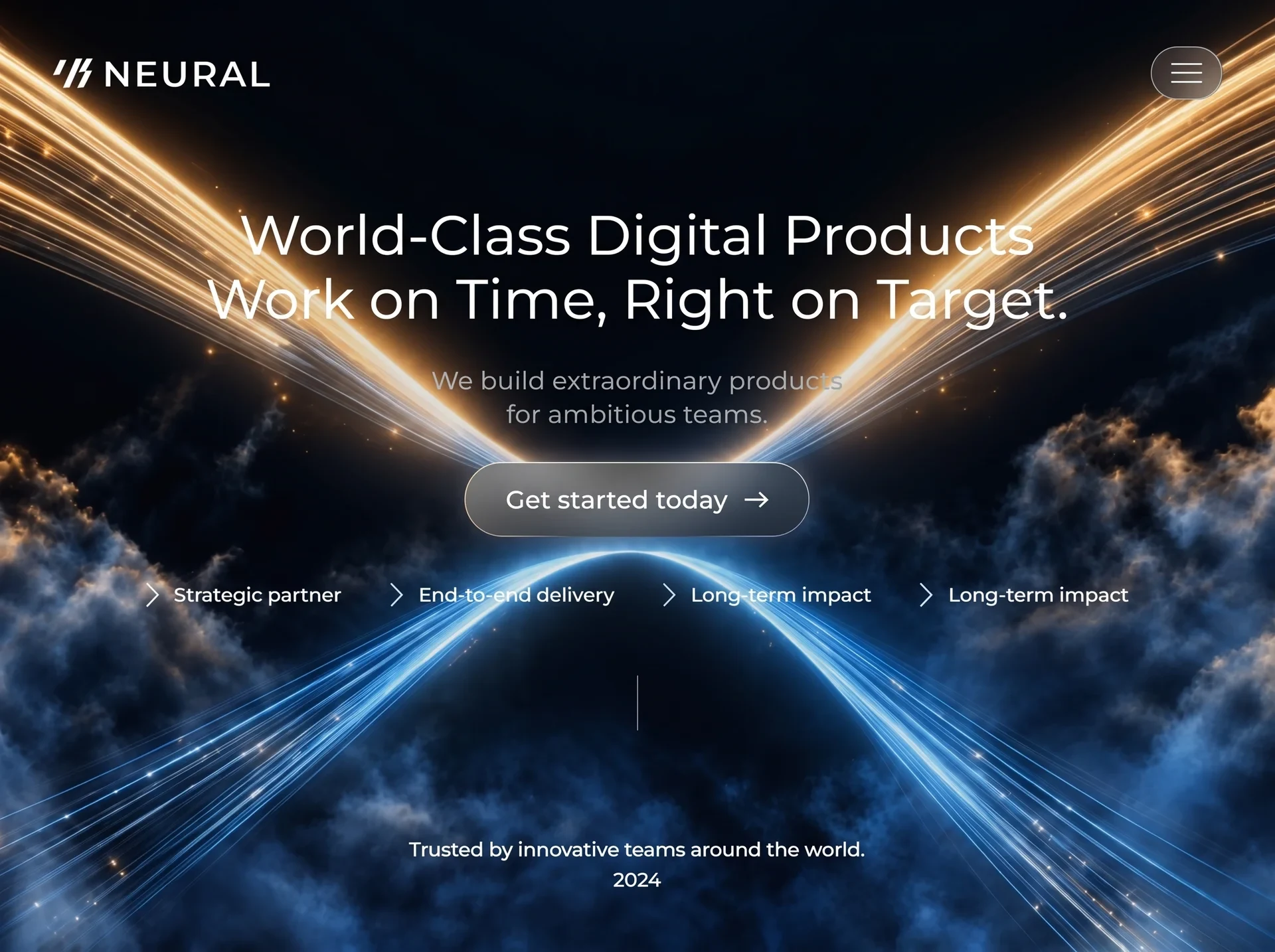
以神经网络路径、循环影像与锋利排版塑造数字机构形象,适合科技创意和互动设计团队。
神经通路创意机构首屏
效果案例
READY TO USE
直接开始使用
这条提示词无需补充变量,可查看并复制完整提示词。
复制后粘贴到任意 AI 平台即可直接使用
更新于 2026.10.14 · 持续复测
以神经网络路径、循环影像与锋利排版塑造数字机构形象,适合科技创意和互动设计团队。
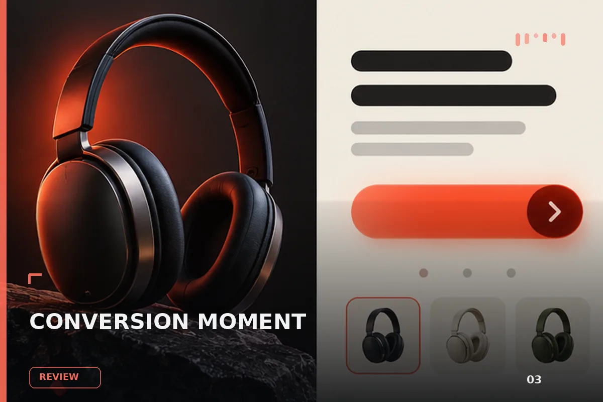
面向现代品牌的行动号召效果,以玻璃拟态、悬停反馈、沉浸式视频组织视觉层次;适合用于网页原型、品牌展示与交互动效参
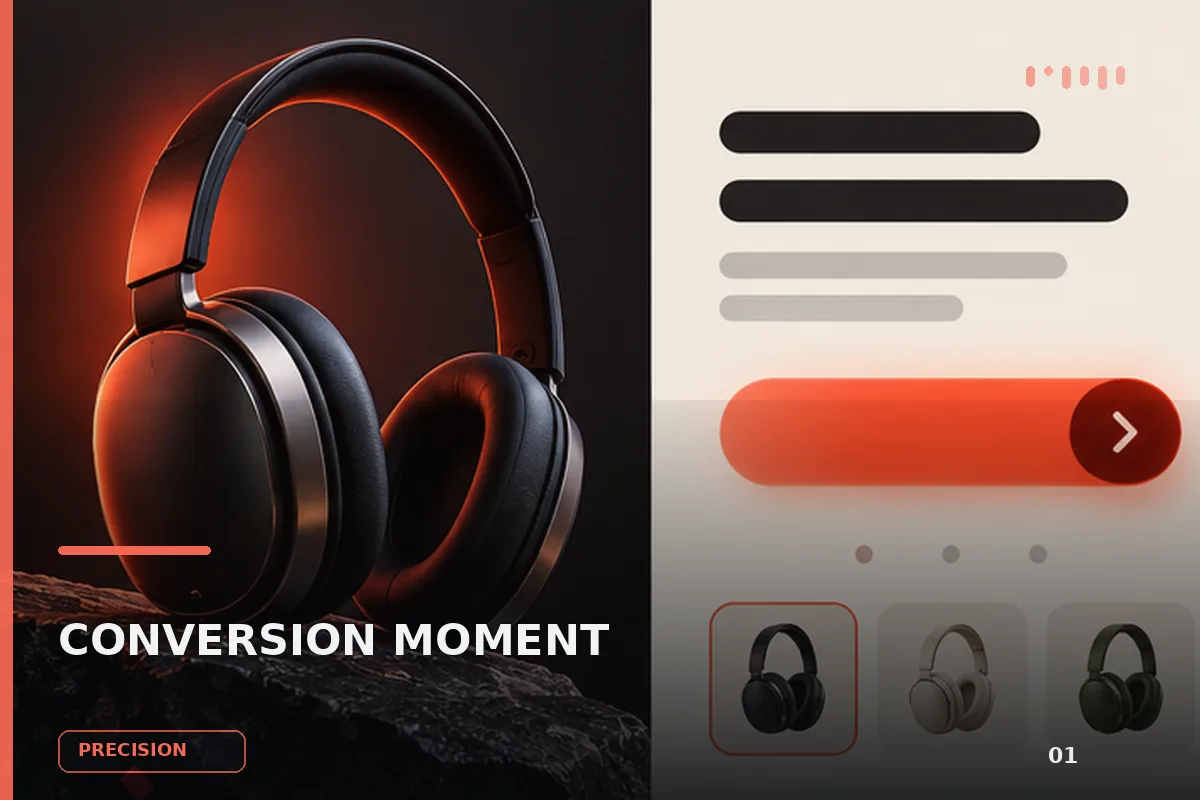
以“先澄清目标与边界,再按优先级完成单一最佳方案”处理试用注册 CTA,输出语义明确、有信任支撑的行动号召区域;
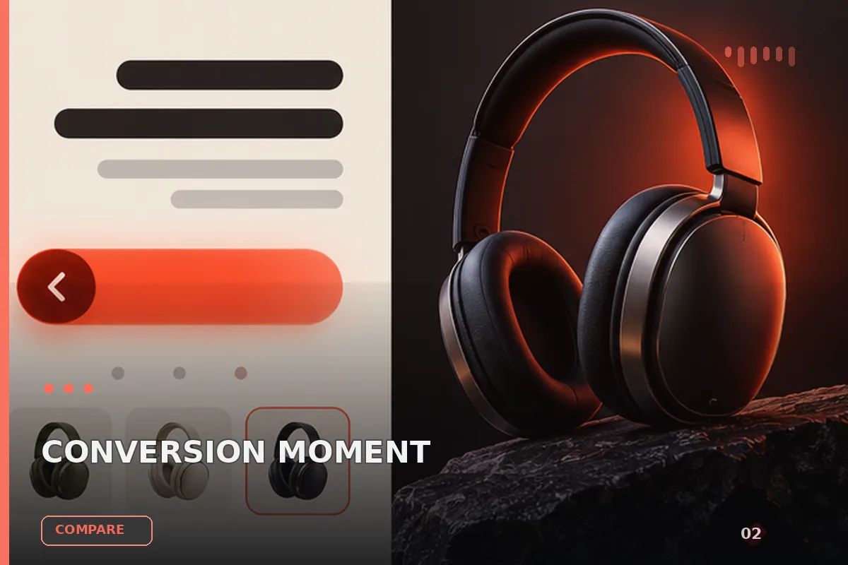
以“从稳妥、平衡、突破三个方向并行推演”处理试用注册 CTA,输出语义明确、有信任支撑的行动号召区域;包含输入澄
以“先产出草案,再从事实、逻辑、语气和风险四层审校”处理试用注册 CTA,输出语义明确、有信任支撑的行动号召区域
以“建立评价量表,对初稿评分并针对最低分项定向重写”处理试用注册 CTA,输出语义明确、有信任支撑的行动号召区域
以“将任务拆成输入、决策、执行、验收和交接五个环节”处理试用注册 CTA,输出语义明确、有信任支撑的行动号召区域
查看完整提示词,复制后粘贴到任意 AI 平台使用。
Build a single, self-contained HTML file: a full-viewport dark hero landing page
for a studio called NEURAL, with a looping video background. No frameworks, no
build step, no external CSS or JS files, no CDN scripts. One <style> block in
<head>, one <script> block before </body>. Output the complete file only.

===============================================================================
0. ASSETS — USE THESE EXACT REMOTE URLS. DO NOT DOWNLOAD, PROXY, OR LOCALISE.
===============================================================================

Background video (1920x1080, 16:9, 10.04s, silent, H.264 MP4):
https://d8j0ntlcm91z4.cloudfront.net/user_38xzZboKViGWJOttwIXH07lWA1P/hf_20260912_104303_0c6d60b2-9353-408e-9449-585108a22fb5.mp4

Poster still (the video's own first frame, so there is no flash before playback):
https://d2ol7oe51mr4n9.cloudfront.net/user_38xzZboKViGWJOttwIXH07lWA1P/130837c4-0244-4f37-9c61-8d801d93fd29.jpg

The footage: a symmetrical abstract light-painting. Golden fibre-optic strands
sweep down from the upper-left and upper-right corners and converge at a
white-hot point in the dead centre of frame; blue strands sweep up from the
lower corners to the same point. Deep navy volumetric clouds roll slowly across
the lower half. Very slow push-in; the centre flare blooms brighter toward the
end. Composition holds for all 10 seconds, so the centre of frame is always the
brightest region — every type treatment below assumes that.

FONT — Sora, variable weight 100..900. Declare:

  @font-face{
    font-family:'Sora';
    src:url(assets/fonts/sora-variable.ttf) format('truetype-variations');
    font-weight:100 900;font-style:normal;font-display:block;
  }

and place the variable TTF at assets/fonts/sora-variable.ttf. If that file is
not available, substitute the Sora variable font from Google Fonts — but it MUST
be the variable axis build, because the design sets fractional weights through
font-variation-settings:'wght' (values like 424, 506, 531, 581) and static
weights will not reproduce it. Body stack:
'Sora',system-ui,-apple-system,'Segoe UI',sans-serif.

===============================================================================
1. DOM — EXACT STRUCTURE AND COPY
===============================================================================

<head>: charset utf-8; viewport
"width=device-width, initial-scale=1, viewport-fit=cover";
title "Neural — World-Class Digital Products".

<body> children, in this order:

1) <video class="art" autoplay muted loop playsinline preload="auto"
   aria-hidden="true" poster="[POSTER URL]" src="[VIDEO URL]"></video>
2) <div class="veil"></div>
3) <header class="bar">
     <a class="brand" href="#">
       inline SVG viewBox "0 0 23 17", aria-hidden, four <path> elements
       forming a stylised double-slash mark:
         M8.15 0.9 L4.55 0.9 L0.5 9.3 L4.1 9.3 Z
         M17.0 0 L13.4 0 L6.15 16.4 L9.75 16.4 Z
         M22.9 0 L19.3 0 L15.0 7.6 L18.6 7.6 Z
         M22.6 6.9 L19.0 6.9 L14.05 16.4 L17.65 16.4 Z
       then <span id="word">NEURAL</span>
     </a>
     <input class="navtoggle" type="checkbox" id="nav-open">
     <label class="scrim" for="nav-open" aria-hidden="true"></label>
     <label class="burger" for="nav-open" aria-label="Menu">
       SVG viewBox "0 0 22 14", three paths classed b1/b2/b3:
       "M1 1 H21", "M1 7 H21", "M1 13 H21"
     </label>
     <div class="navpanel">
       <nav class="menu">
         <a href="#"><span id="about">About</span></a>
         <a href="#"><span id="product">Product</span></a>
         <a href="#"><span id="solutions">Solutions</span>
            <svg class="caret" viewBox="0 0 9 6" aria-hidden="true">
              <path d="M0.7 1.1 L4.5 4.6 L8.3 1.1"/></svg></a>
       </nav>
       <a class="login" href="#"><span id="login">Log in / Request access</span>
          <svg class="navarrow" viewBox="0 0 10 9" aria-hidden="true">
            <path d="M0 4.5 H9.1 M5.4 0.9 L9.2 4.5 L5.4 8.1"/></svg></a>
       <a class="pill" href="#"><span id="contact">Contact sales</span></a>
     </div>
   </header>
4) <main class="hero">
     <h1 class="title"><span id="h1a">World-Class Digital Products</span>
        <span id="h1b">Work on Time, Right on Target.</span></h1>
     <p class="sub"><span id="sub1">We build extraordinary products</span>
        <span id="sub2">for ambitious teams.</span></p>
     <a class="cta" href="#"><span id="cta">Get started today</span>
        <svg class="arrow" viewBox="0 0 16 11" aria-hidden="true">
          <path d="M0 5.5 H14.6 M10.3 1.2 L14.9 5.5 L10.3 9.8"/></svg></a>
     <ul class="feats"> four <li>, each = chevron SVG then span:
        SVG class="chev" viewBox "0 0 11 20", path "M1.15 1.15 L9.6 10 L1.15 18.85"
        spans id f1..f4: "Strategic partner", "End-to-end delivery",
        "Long-term impact", "Long-term impact"
     </ul>
     <span class="rule" aria-hidden="true"></span>
   </main>
5) <footer class="foot">
     <span id="foot1">Trusted by innovative teams around the world.</span>
     <span id="foot2">2024</span>
   </footer>

Note: the ONE markup tree serves every layout. Nav items are laid out along the
bar on desktop and collected into a panel behind the burger below that — driven
purely by the checkbox + CSS, never by JS.

===============================================================================
2. DESIGN TOKENS  (:root)
===============================================================================

  --ink:#ffffff;  --sub:#a2a9b8;  --nav:#fbfdff;  --foot:#f4f8fd;
  --hair:rgba(196,214,232,.72);   --chev:rgba(214,232,250,.90);
  --navdim:#e8ecf0;               --feat:#e2ebf5;
  --veil:6,10,18;                 /* raw RGB triplet, used inside rgba() */

===============================================================================
3. SCALE SYSTEM — the whole page is driven by ONE unit, never by px
===============================================================================

Desktop unit --u maps the design's 1536x1024 artboard onto the viewport:

  :root{
    --cover:max(calc(100vw / 1536), calc(100vh / 1024));
    --fit:calc(100vh / 910);
    --u:min(var(--cover), var(--fit));
    --blur:calc(var(--u)*26);
    --glow:calc(var(--u)*34);
    --hairline:max(1px, calc(var(--u)*1.6));
  }
  @supports (height:100dvh){
    :root{--cover:max(calc(100vw / 1536), calc(100dvh / 1024));
          --fit:calc(100dvh / 910);}
  }

Flow unit --c is redefined per canvas (see section 8). Glass blur and glow are
design measurements, so they scale with the unit rather than sitting at fixed px.


  html,body{height:100%;background:#02060f;overflow:hidden}
  body{font-family:'Sora',...;color:var(--ink);
       -webkit-font-smoothing:antialiased;-moz-osx-font-smoothing:grayscale;
       text-rendering:geometricPrecision}
  a{color:inherit;text-decoration:none}  li{list-style:none}
  a:focus-visible{outline:2px solid #9fe0ff;outline-offset:3px;border-radius:4px}

The page never scrolls — overflow:hidden, one viewport, always.

===============================================================================
4. BACKGROUND LAYERS
===============================================================================

  .art{position:fixed;inset:0;width:100%;height:100%;object-fit:cover;
       object-position:50% 50%;z-index:0;user-select:none;
       -webkit-user-drag:none;pointer-events:none;background:#03060c}

object-fit:cover on the <video> — its only job is to fill the viewport, so it
may crop freely. The background colour prevents a light flash before first paint.

  .veil{position:fixed;inset:0;z-index:0;pointer-events:none;
    background:
      radial-gradient(140% 60% at 50% 40%,
          rgba(var(--veil),.16) 0%, rgba(var(--veil),.057) 50%,
          rgba(var(--veil),0) 100%),
      linear-gradient(180deg, rgba(var(--veil),0) 45%,
          rgba(var(--veil),.10) 100%);}

  .bar,.hero,.foot{position:fixed;z-index:1}

===============================================================================
5. COMPONENT SKIN (shared across all layouts)
===============================================================================

  .brand svg{fill:var(--ink);display:block}
  .caret,.navarrow{fill:none;stroke:var(--nav);stroke-linecap:round;
                   stroke-linejoin:round}
  .navarrow{stroke-linecap:square;stroke-linejoin:miter}
  .pill{border:var(--hairline) solid var(--hair);border-radius:999px}
  .chev{fill:none;stroke:var(--chev);stroke-width:1.75;stroke-linecap:round;
        stroke-linejoin:round}
  .cta .arrow{fill:none;stroke:var(--ink);stroke-width:1.6;
              stroke-linecap:square;stroke-linejoin:miter}
  .rule{background:linear-gradient(180deg,
        rgba(186,200,214,.70) 0%,rgba(206,220,232,.92) 52%,
        rgba(182,198,212,.68) 100%)}

THE CTA GLASS — three stacked gradients, warm on the left edge and cool on the
right, echoing the gold/blue of the footage. Reproduce exactly:

  .cta{
    border-radius:999px;
    background:
      linear-gradient(180deg, rgba(6,12,22,0) 45%, rgba(6,12,22,.12) 78%,
                              rgba(6,12,22,.28) 100%),
      linear-gradient(90deg,
        rgba(255,226,178,.17) 0%,  rgba(255,236,208,.07) 22%,
        rgba(176,206,238,.03) 55%, rgba(150,196,244,.09) 100%),
      linear-gradient(90deg,
        rgba(255,255,255,.24) 0%,  rgba(255,255,255,.17) 12%,
        rgba(255,255,255,.11) 26%, rgba(255,255,255,.07) 42%,
        rgba(255,255,255,.05) 60%, rgba(255,255,255,.04) 80%,
        rgba(255,255,255,.04) 100%);
    -webkit-backdrop-filter:blur(var(--blur)) saturate(.45);
    backdrop-filter:blur(var(--blur)) saturate(.45);
    box-shadow:0 calc(var(--u)*-2) calc(var(--u)*20) rgba(255,224,176,.20),
               0 0 var(--glow) rgba(168,204,252,.16),
               inset 0 var(--hairline) 0 0 rgba(255,251,242,.45);
  }

Its gradient hairline border is a masked pseudo-element (NOT a border):

  .cta::before{
    content:'';position:absolute;inset:0;border-radius:inherit;
    padding:var(--hairline);pointer-events:none;
    background:
      linear-gradient(180deg, rgba(255,252,246,.95) 0%,
          rgba(255,252,246,.20) 45%, rgba(255,252,246,0) 78%),
      linear-gradient(90deg,
        rgba(255,228,182,.95) 0%,  rgba(250,236,210,.70) 12%,
        rgba(226,230,234,.03) 32%, rgba(214,226,240,.02) 62%,
        rgba(200,228,250,.70) 90%, rgba(186,224,247,.95) 100%);
    -webkit-mask:linear-gradient(#000 0 0) content-box,linear-gradient(#000 0 0);
    -webkit-mask-composite:xor;
    mask:linear-gradient(#000 0 0) content-box,linear-gradient(#000 0 0);
    mask-composite:exclude;
  }

PER-ELEMENT VARIABLE WEIGHTS — set on the ids, applying in every layout:

  #word     'wght' 531  colour var(--ink)
  #about    'wght' 506  var(--nav)      #product   'wght' 506  var(--nav)
  #solutions'wght' 506  var(--nav)      #login     'wght' 506  var(--nav)
  #contact  'wght' 581  var(--navdim)
  #h1a,#h1b 'wght' 424  var(--ink)
  #sub1,#sub2 'wght' 446 var(--sub)
  #cta      'wght' 497  var(--ink)
  #f1..#f4  'wght' 534  var(--feat)
  #foot1,#foot2 'wght' 521 var(--foot)

===============================================================================
6. ENTRANCE SEQUENCE — one timeline, runs once at load, ~2.1s
===============================================================================

Wrap the whole thing in @media (prefers-reduced-motion:no-preference).
Easing tokens inside that block:

  --ent-line:cubic-bezier(.16,1,.3,1);    /* long expo settle, for type */
  --ent-soft:cubic-bezier(.25,.8,.35,1);  /* quieter, for supporting content */
  --rise:9px;                             /* becomes 6px on the phone canvas */

Four keyframes:

  @keyframes en-wipe{   /* typographic reveal: the line opens downward */
    from{clip-path:inset(-.78em 0 calc(100% + .78em) 0);translate:0 var(--rise)}
    to  {clip-path:inset(-.78em 0 -.78em 0);translate:0 0}}
  @keyframes en-lift{from{opacity:0;translate:0 var(--rise)}}
  @keyframes en-settle{from{opacity:0;translate:0 calc(var(--rise)*.7);scale:.99}}
  @keyframes en-draw{from{scale:1 0}}

Every selector is prefixed html:not(.is-entered) and every animation uses
fill-mode BACKWARDS — the start state holds through the delay so nothing
flashes, and when it ends the element falls back to its authored style leaving
no held transform. CRITICAL: animate only the independent properties
(translate / scale / opacity / clip-path), NEVER the transform shorthand,
because the desktop layout uses transform for its own sub-pixel calibration
offsets and must not be overwritten.

  .brand        en-lift   .60s ent-soft  .12s
  #about        en-lift   .55s ent-soft  .20s
  #product      en-lift   .55s ent-soft  .25s
  #solutions,.caret       en-lift .55s ent-soft .30s
  #login,.navarrow        en-lift .55s ent-soft .35s
  .pill         en-settle .60s ent-soft  .40s
  .burger       en-lift   .60s ent-soft  .40s
  #h1a          en-wipe   .95s ent-line  .34s
  #h1b          en-wipe   .95s ent-line  .44s
  #sub1         en-lift   .70s ent-soft  .74s
  #sub2         en-lift   .70s ent-soft  .80s
  .cta          en-lift   .80s ent-line  .94s
  .feats li:nth-child(1..4) en-lift .60s ent-soft 1.08s / 1.15s / 1.22s / 1.29s
  .rule         en-draw   .55s ent-line 1.34s  (plus transform-origin:top)
  #foot1        en-lift   .60s ent-soft 1.42s
  #foot2        en-lift   .60s ent-soft 1.48s

===============================================================================
7. ARCHITECTURE A — LOCKED COMPOSITION (desktop)
===============================================================================

@media (min-width:1200px) and (min-height:560px) and (min-aspect-ratio:100/95)

Every element keeps its measured coordinate on the 1536x1024 grid; nothing
reflows, it only scales.

  .bar,.hero,.foot{left:50%;width:calc(var(--u)*1536);transform:translateX(-50%)}
  .bar{top:0;height:calc(var(--u)*120)}
  .foot{bottom:0;height:calc(var(--u)*140)}
  .hero{top:50%;height:calc(var(--u)*1024);transform:translate(-50%,-50%)}
  .navtoggle,.burger,.scrim{display:none}
  .navpanel{display:contents}   /* so its children take bar-space coordinates */
  .bar > *,.foot > *,.hero > *,.pill,.caret,.navarrow{position:absolute}
  .menu,.menu a,.login{position:static}
  .title,.sub,.feats{inset:0;font-weight:inherit}
  .bar span,.foot span,.title span,.sub span,.feats span,.cta span{
    position:absolute;line-height:0;white-space:nowrap}

BOX COORDINATES (all values calc(var(--u) * N)):

  .brand      left 221, top 55; flex, align-items:center, gap 7
  .brand svg  width 23, height 17;  #word{position:relative}
  .caret      left 744,   top 62.4,  w 9,   h 6,  stroke-width 1.25
  .navarrow   left 1163,  top 61.6,  w 10,  h 9,  stroke-width 1.2
  .pill       left 1191.5,top 43.5,  w 144, h 44
  .cta        left 625.8, top 555.2, w 279.6, h 46.6
  .cta .arrow position:absolute; left 230.8, top 17.8, w 16, h 11
  .feats li   position:absolute, w 220, h 20
  .feats .chev position:absolute, left 0, top 0, w 11, h 20
  .feats li:nth-child(1) left 360,  top 718
  .feats li:nth-child(2) left 590,  top 719
  .feats li:nth-child(3) left 803,  top 721
  .feats li:nth-child(4) left 1013, top 722
  .rule       left 767, top 792, w 1, h 57

TYPE COORDINATES — font-size / letter-spacing / position, all calc(var(--u)*N).
Centred items use left:0;right:0;text-align:center plus an X nudge:

  #word      size 23.4  ls  4.8    transform translate(0,0)
  #about     size 13.5  ls -0.5    left 477    top 65.66
  #product   size 13.5  ls -0.167  left 568.5  top 65.66
  #solutions size 13.5  ls -0.5    left 675    top 65.66
  #login     size 13.5  ls -0.227  left 1002.5 top 66.16
  #contact   size 13.5  ls  0.25   centred, top 21.66,   translateX -0.5
  #h1a       size 46.8  ls  0.532  centred, top 285.222, translateX -1
  #h1b       size 46.8  ls -0.398  centred, top 335.222, translateX -3
  #sub1      size 20.6  ls  0.367  centred, top 408.115, translateX -0.5
  #sub2      size 19.1  ls -0.632  centred, top 432.153, translateX -2
  #cta       size 22    ls -0.312  centred, top 23.113,  translateX -14.5
  #f1        size 14.6  ls -0.75   left 26  top 11.266
  #f2        size 14.6  ls -0.889  left 26  top 11.266
  #f3        size 14.6  ls -1.067  left 26  top 11.266
  #f4        size 14.6  ls -1.067  left 29  top 11.266
  #foot1     size 16.3  ls -0.256  centred, bottom 101.344, translateX -0.5
  #foot2     size 16.3  ls -0.667  centred, bottom 76.344,  translateX -2

The CTA label and arrow are re-centred on the button's own middle (the arrow by
its box, the label by its cap height) rather than by their design-tool boxes.

===============================================================================
8. ARCHITECTURE B — FLOW (large tablet down to phone)
===============================================================================

@media (max-width:1199px),(max-height:559px),(max-aspect-ratio:100/95)

Base canvas 430x860, scaled by whichever axis binds first so neither can
overflow:  :root{--c:min(calc(100vw / 430), calc(100vh / 860))}

  body{display:flex;flex-direction:column;height:100vh;
       padding:calc(env(safe-area-inset-top) + calc(var(--c)*24)) calc(var(--c)*22)
               calc(env(safe-area-inset-bottom) + calc(var(--c)*22))}
  .bar,.hero,.foot{position:static;width:100%}
  .bar{order:1;position:relative;z-index:5;display:flex;align-items:center;
       justify-content:space-between;gap:calc(var(--c)*16)}
  .brand{display:flex;align-items:center;gap:calc(var(--c)*8)}
  .brand svg{width:calc(var(--c)*22);height:auto}
  #word{font-size:calc(var(--c)*19);letter-spacing:.06em}

BURGER MENU — pure CSS, checkbox-driven, zero JS:

  .navtoggle{position:absolute;top:0;right:0;width:1px;height:1px;opacity:0;
             margin:0;pointer-events:none}   /* stays focusable */
  .burger{display:inline-flex;align-items:center;justify-content:center;
    width:calc(var(--c)*42);height:calc(var(--c)*30);border-radius:999px;
    cursor:pointer;border:var(--hairline) solid var(--hair);
    background:rgba(255,255,255,.03);
    backdrop-filter:blur(var(--blur)) saturate(.45) (+ -webkit- prefix)}
  .burger svg{width:calc(var(--c)*19);height:auto;fill:none;stroke:var(--nav);
              stroke-width:1.4;stroke-linecap:round}
  .burger svg path{transform-box:fill-box;transform-origin:center;
                   transition:transform .24s ease,opacity .18s ease}
  .navtoggle:focus-visible ~ .burger{outline:2px solid #9fe0ff;outline-offset:3px}
  .navtoggle:checked ~ .burger .b1{transform:translateY(6px) rotate(45deg)}
  .navtoggle:checked ~ .burger .b2{opacity:0}
  .navtoggle:checked ~ .burger .b3{transform:translateY(-6px) rotate(-45deg)}
  .scrim{display:none;position:fixed;inset:0;z-index:-1}
  .navtoggle:checked ~ .scrim{display:block}   /* click-away closes it */

PANEL — the CTA's glass recipe restated at panel scale:

  .navpanel{position:absolute;top:calc(100% + calc(var(--c)*12));right:0;
    display:flex;flex-direction:column;gap:calc(var(--c)*2);
    width:min(calc(var(--c)*268), 78vw);padding:calc(var(--c)*12);
    border-radius:calc(var(--c)*20);
    background:
      linear-gradient(180deg, rgba(255,255,255,.10) 0%,
                              rgba(255,255,255,.045) 100%),
      linear-gradient(90deg, rgba(255,226,178,.06) 0%,
                             rgba(150,196,244,.06) 100%),
      linear-gradient(180deg, rgba(6,12,22,.60) 0%, rgba(6,12,22,.70) 100%);
    backdrop-filter:blur(var(--blur)) saturate(.45) (+ -webkit- prefix);
    box-shadow:0 calc(var(--c)*14) calc(var(--c)*38) rgba(2,6,14,.45);
    opacity:0;transform:translateY(calc(var(--c)*-8)) scale(.985);
    transform-origin:100% 0;pointer-events:none;
    transition:opacity .2s ease,transform .2s ease}
  .navtoggle:checked ~ .navpanel{opacity:1;transform:none;pointer-events:auto}
  .navpanel .menu{display:flex;flex-direction:column}
  .navpanel .menu a,.navpanel .login{display:flex;align-items:center;
    gap:calc(var(--c)*8);padding:calc(var(--c)*10) calc(var(--c)*12);
    border-radius:calc(var(--c)*12);font-size:calc(var(--c)*16);
    color:var(--nav);transition:background .15s ease}
  .navpanel .menu a:hover,.navpanel .login:hover{background:rgba(255,255,255,.07)}
  .navpanel .caret,.navpanel .navarrow{margin-left:auto;height:auto}
  .navpanel .caret{width:calc(var(--c)*10)}
  .navpanel .navarrow{width:calc(var(--c)*11)}
  .navpanel .pill{margin-top:calc(var(--c)*8);text-align:center;
    white-space:nowrap;padding:calc(var(--c)*11) calc(var(--c)*16);
    font-size:calc(var(--c)*15)}

HERO (flow base):

  .hero{order:2;flex:1;display:flex;flex-direction:column;align-items:center;
        justify-content:center;text-align:center;gap:calc(var(--c)*20)}
  .title{font-size:calc(var(--c)*33);line-height:1.12;max-width:15ch}
  .sub{color:var(--sub);font-size:calc(var(--c)*17);line-height:1.32;max-width:26ch}
  .cta{position:relative;display:inline-flex;align-items:center;
       gap:calc(var(--c)*12);padding:calc(var(--c)*16) calc(var(--c)*26);
       font-size:calc(var(--c)*18)}
  .cta .arrow{width:calc(var(--c)*16);height:calc(var(--c)*11)}
  .feats{display:grid;grid-template-columns:repeat(2,minmax(0,1fr));
    gap:calc(var(--c)*15) calc(var(--c)*13);width:100%;
    max-width:calc(var(--c)*400);margin-top:calc(var(--c)*6)}
  .feats li{display:flex;align-items:center;gap:calc(var(--c)*9);
            font-size:calc(var(--c)*14)}
  .feats .chev{width:calc(var(--c)*9);height:calc(var(--c)*16);flex:none}
  .rule{width:1px;height:calc(var(--c)*33);margin:calc(var(--c)*19) auto 0}
  .foot{order:3;text-align:center;color:var(--foot);
        font-size:calc(var(--c)*13);line-height:1.55}
  .foot span{display:block}

--- B1. PHONE CANVAS, nested: @media (max-width:599px),(max-height:429px) ---

Rationale to honour: below 600px the tablet canvas fails, because holding the
desktop's two-line headline drags every size down with the width. Mobile
releases the headline to wrap, which frees the type to GROW instead of shrink.

  :root{--c:min(calc(100vw / 360), calc(100vh / 770), 1px);--rise:6px}
  body{padding:calc(env(safe-area-inset-top) + calc(var(--c)*28)) calc(var(--c)*26)
               calc(env(safe-area-inset-bottom) + calc(var(--c)*26))}
  .brand svg{width:calc(var(--c)*24)}   #word{font-size:calc(var(--c)*19)}
  .burger{width:calc(var(--c)*46);height:calc(var(--c)*33);position:relative}
  .burger::after{content:'';position:absolute;left:50%;top:50%;
    transform:translate(-50%,-50%);width:max(44px,100%);height:max(44px,100%)}
      /* guarantees a 44px tap target without resizing the visible pill */
  .burger svg{width:calc(var(--c)*21)}
  .navpanel{width:min(calc(var(--c)*300), 82vw);padding:calc(var(--c)*15);
            border-radius:calc(var(--c)*22)}
  .navpanel .menu a,.navpanel .login{font-size:calc(var(--c)*16);
    padding:calc(var(--c)*13) calc(var(--c)*14);border-radius:calc(var(--c)*13);
    min-height:max(44px,calc(var(--c)*44))}
  .navpanel .pill{font-size:calc(var(--c)*16);
    padding:calc(var(--c)*13) calc(var(--c)*18);margin-top:calc(var(--c)*9)}

  /* The phone crop pushes the footage's bright arcs straight through the copy,
     so the veil is RE-AIMED for this composition — same scrim, new coordinates */
  .veil{background:
    radial-gradient(130% 44% at 50% 45%,
        rgba(var(--veil),.50) 0%, rgba(var(--veil),.26) 55%,
        rgba(var(--veil),0) 100%),
    linear-gradient(180deg,
        rgba(var(--veil),.34) 0%, rgba(var(--veil),0) 20%,
        rgba(var(--veil),0) 60%, rgba(var(--veil),.36) 100%)}

  .hero{gap:calc(var(--c)*22)}
  .title{font-size:calc(var(--c)*32);line-height:1.2;letter-spacing:-.002em;
         max-width:none;text-wrap:balance}
  .title span{display:block}    /* the two written lines stay two blocks */
  .sub{font-size:calc(var(--c)*16);line-height:1.45;max-width:none;
       text-wrap:balance}
  .sub span{display:block}
  .cta{font-size:calc(var(--c)*16.5);padding:calc(var(--c)*15) calc(var(--c)*28);
       gap:calc(var(--c)*12)}
  .cta .arrow{width:calc(var(--c)*17);height:calc(var(--c)*12)}
  .feats{grid-template-columns:repeat(2,max-content);justify-content:center;
    width:auto;max-width:none;gap:calc(var(--c)*16) calc(var(--c)*16);
    margin-top:calc(var(--c)*22)}
  .feats li{font-size:calc(var(--c)*13);gap:calc(var(--c)*10)}
  .feats .chev{width:calc(var(--c)*10);height:calc(var(--c)*18)}
  .rule{height:calc(var(--c)*30);margin:calc(var(--c)*28) auto 0}
  .foot{font-size:calc(var(--c)*13.5);line-height:1.65;text-wrap:balance}

--- LANDSCAPE PHONES: @media (max-height:429px) and (min-aspect-ratio:1/1) ---

The phone canvas is portrait-shaped, so re-proportion it to 760x430:

  :root{--c:min(calc(100vw / 760), calc(100vh / 430))}
  .hero{gap:calc(var(--c)*12)}
  .title{font-size:calc(var(--c)*31);line-height:1.2;max-width:26ch}
  .sub{font-size:calc(var(--c)*16);max-width:44ch}   .sub span{display:inline}
  .cta{font-size:calc(var(--c)*15.5);padding:calc(var(--c)*12) calc(var(--c)*24)}
  .feats{grid-template-columns:repeat(4,max-content);justify-content:center;
    max-width:none;gap:calc(var(--c)*24);margin-top:calc(var(--c)*2)}
  .feats li{font-size:calc(var(--c)*13.5)}
  .rule{height:calc(var(--c)*20);margin:calc(var(--c)*10) auto 0}
  .foot{font-size:calc(var(--c)*13)}

--- B2. TABLET CANVAS: @media (min-width:600px) and (min-height:430px) ---

860x1120 portrait — the composition's proportions, re-architected as flow:

  :root{--c:min(calc(100vw / 860), calc(100vh / 1120))}
  body{padding:calc(env(safe-area-inset-top) + calc(var(--c)*40)) calc(var(--c)*44)
               calc(env(safe-area-inset-bottom) + calc(var(--c)*36))}
  .brand svg{width:calc(var(--c)*34)}   #word{font-size:calc(var(--c)*30)}
  .burger{width:calc(var(--c)*60);height:calc(var(--c)*44)}
  .burger svg{width:calc(var(--c)*27);stroke-width:1.2}
  .navpanel{width:min(calc(var(--c)*330), 56vw);padding:calc(var(--c)*16);
            border-radius:calc(var(--c)*26);gap:calc(var(--c)*4)}
  .navpanel .menu a,.navpanel .login{font-size:calc(var(--c)*20);
    padding:calc(var(--c)*13) calc(var(--c)*15);border-radius:calc(var(--c)*15);
    gap:calc(var(--c)*10)}
  .navpanel .caret{width:calc(var(--c)*13)}
  .navpanel .navarrow{width:calc(var(--c)*14)}
  .navpanel .pill{margin-top:calc(var(--c)*10);
    padding:calc(var(--c)*14) calc(var(--c)*20);font-size:calc(var(--c)*19)}
  .hero{gap:calc(var(--c)*26)}
  .title{font-size:calc(var(--c)*46);line-height:1.15;max-width:none}
  .title span{display:block}     /* keeps the desktop line break */
  .sub{font-size:calc(var(--c)*21);line-height:1.34;max-width:none}
  .sub span{display:block}
  .cta{gap:calc(var(--c)*14);padding:calc(var(--c)*18) calc(var(--c)*34);
       font-size:calc(var(--c)*21)}
  .cta .arrow{width:calc(var(--c)*20);height:calc(var(--c)*14)}
  .feats{grid-template-columns:repeat(2,max-content);justify-content:center;
    gap:calc(var(--c)*22) calc(var(--c)*54);max-width:none;
    margin-top:calc(var(--c)*12)}
  .feats li{gap:calc(var(--c)*12);font-size:calc(var(--c)*16)}
  .feats .chev{width:calc(var(--c)*12);height:calc(var(--c)*21)}
  .rule{height:calc(var(--c)*46);margin:calc(var(--c)*30) auto 0}
  .foot{font-size:calc(var(--c)*16)}

  /* landscape tablets: width to spare, height to save — 1040x780 */
  @media (min-aspect-ratio:1/1){
    :root{--c:min(calc(100vw / 1040), calc(100vh / 780))}
    .feats{grid-template-columns:repeat(4,max-content);gap:calc(var(--c)*40)}
  }

===============================================================================
9. DYNAMIC VIEWPORT OVERRIDE — mobile browser chrome
===============================================================================

Restate every flow --c using 100dvh instead of 100vh, guarded so older browsers
keep the vh values. Mirror the exact nesting:

  @supports (height:100dvh){
    @media (max-width:1199px),(max-height:559px),(max-aspect-ratio:100/95){
      :root{--c:min(calc(100vw / 430), calc(100dvh / 860))}
      body{height:100dvh}
      @media (max-width:599px),(max-height:429px){
        :root{--c:min(calc(100vw / 360), calc(100dvh / 770), 1px)}}
      @media (max-height:429px) and (min-aspect-ratio:1/1){
        :root{--c:min(calc(100vw / 760), calc(100dvh / 430))}}
      @media (min-width:600px) and (min-height:430px){
        :root{--c:min(calc(100vw / 860), calc(100dvh / 1120))}
        @media (min-aspect-ratio:1/1){
          :root{--c:min(calc(100vw / 1040), calc(100dvh / 780))}}}
    }
  }

===============================================================================
10. REDUCED MOTION
===============================================================================

Last rule in the stylesheet:

  @media (prefers-reduced-motion:reduce){
    *{animation:none!important;transition:none!important}}

===============================================================================
11. SCRIPT — two small IIFEs, nothing else, no libraries
===============================================================================

(a) The artwork is a VIDEO, so reduced motion must be honoured by pausing it —
    the CSS reset above only reaches animations and transitions. Paused, it
    holds its first frame, which is the still the loop was built from. Match
    the media query live, and support the legacy addListener fallback:

    (function(){
      var q=window.matchMedia&&window.matchMedia('(prefers-reduced-motion:reduce)'),
          v=document.querySelector('video.art');
      if(!q||!v)return;
      function sync(){ if(q.matches){v.pause();}
                       else{var p=v.play();if(p)p.catch(function(){});} }
      sync();
      q.addEventListener ? q.addEventListener('change',sync) : q.addListener(sync);
    })();

(b) The entrance is pure CSS; this only RETIRES it once the last tween has
    ended, so a later breakpoint change (which reveals the burger) can never
    replay it. One self-removing listener on #foot2's animationend, with a
    4000ms setTimeout safety net; both call a done() that clears the timer,
    removes the listener, and adds class "is-entered" to documentElement.
    No loop, no observers, no resize handlers.

===============================================================================
12. ACCEPTANCE CRITERIA
===============================================================================

- The page never scrolls, at any size. One viewport, always.
- The video autoplays silently and loops (muted + playsinline are what make
  autoplay legal on iOS/Android — both are mandatory).
- At >=1200px wide the layout is the locked 1536x1024 composition; resizing
  only scales it, never reflows it.
- Below that it becomes flex-column flow; the nav collapses behind the burger.
- The headline stays legible over the footage's bright centre flare at every
  breakpoint — that is the veil's entire job, and why the phone canvas gets a
  second, stronger veil aimed at a different point.
- Tap targets on phones are at least 44px.
- prefers-reduced-motion: no entrance animation, no panel transition, and the
  background video sits paused on its first frame.
- Zero layout-shift on load: the poster occupies the frame until the video
  paints, and every entrance animation is fill-mode backwards.
提示词已复制,选择一个常用平台继续。
