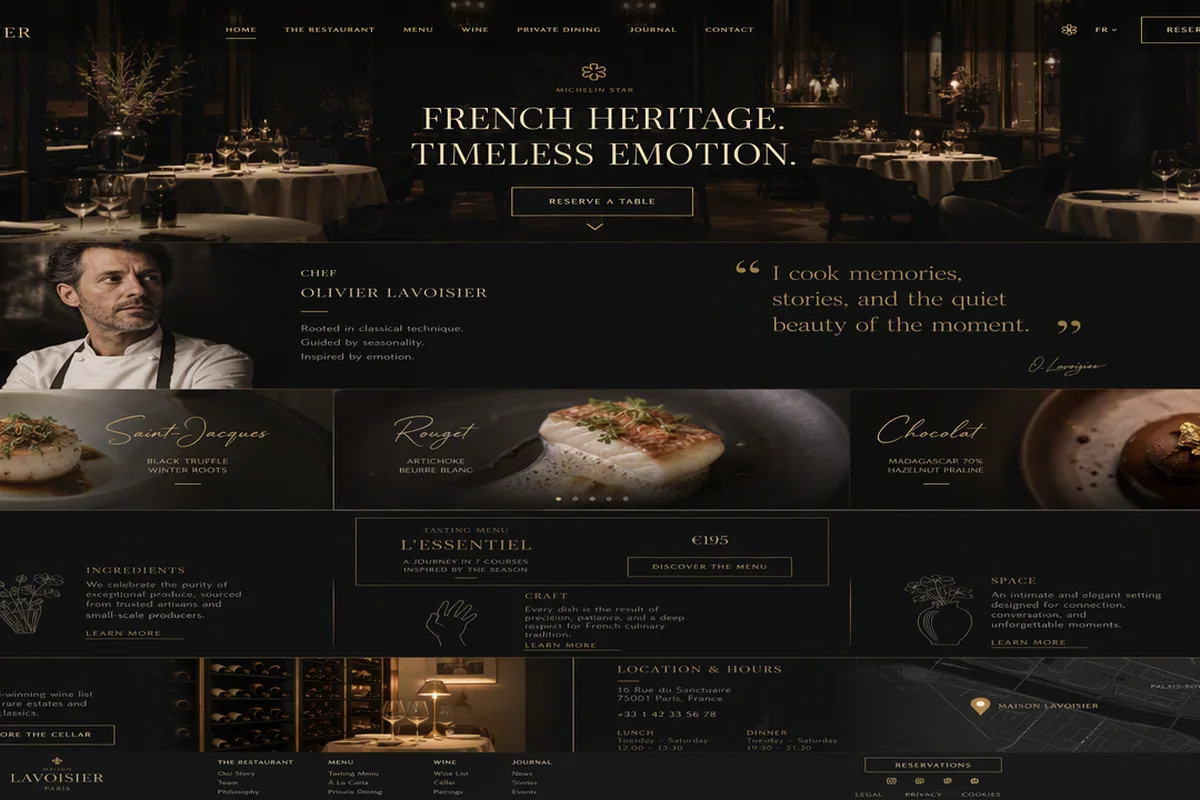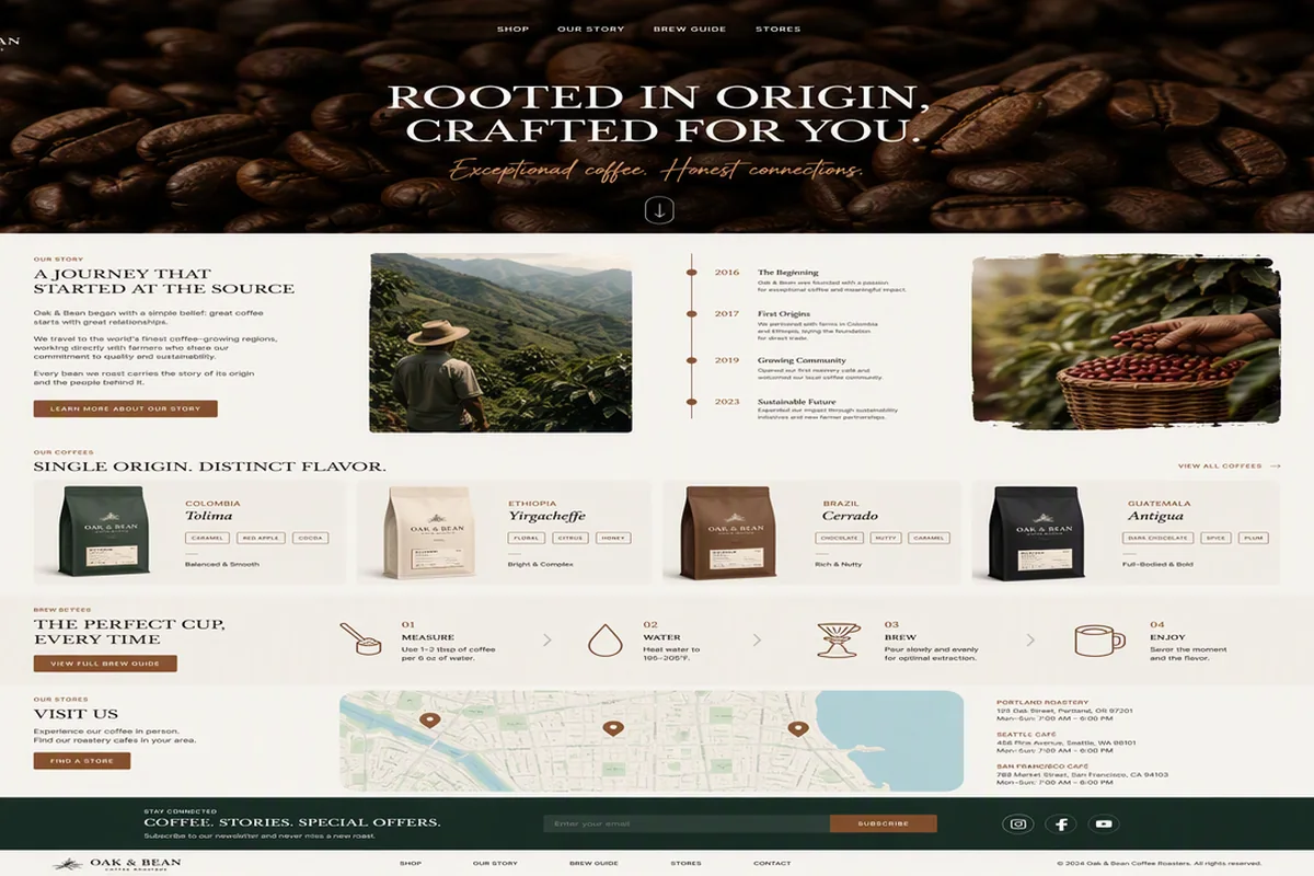

围绕数字身份、赛博空间与交互信号组织品牌首屏,适合身份认证和隐私科技产品。
Nival 网络身份首屏
效果案例

READY TO USE
直接开始使用
这条提示词无需补充变量,可查看并复制完整提示词。
复制后粘贴到任意 AI 平台即可直接使用
更新于 2026.10.14 · 持续复测
围绕数字身份、赛博空间与交互信号组织品牌首屏,适合身份认证和隐私科技产品。
查看完整提示词,复制后粘贴到任意 AI 平台使用。
Build a single standalone HTML file (no build step, no frameworks, no local
assets) for a landing page called "Nival — Cyberspace Identity". Everything —
CSS and JS — must be inline in one file. The signature feature is a
cursor-following SPOTLIGHT REVEAL that unmasks a second hero image through a
soft radial mask.

════════════════════════════════════════════════════════════════════
1. ASSET URLS (use these EXACT strings — note the TWO different hosts)
════════════════════════════════════════════════════════════════════
All are transparent-background PNGs. There is no video.

HERO_FRONT (white/silver android, 600×759, base layer):
https://d2ol7oe51mr4n9.cloudfront.net/user_38xzZboKViGWJOttwIXH07lWA1P/658f62c6-fdb2-41b9-aa0f-10837f9e72cb.png

HERO_BACK (heavy black/gunmetal armor variant, 1792×2240, reveal layer):
https://d8j0ntlcm91z4.cloudfront.net/user_38xzZboKViGWJOttwIXH07lWA1P/hf_20260914_123603_5ac5732a-900b-4919-9d9c-3c454194b0a5.png

MATERIAL thumbnail:
https://d2ol7oe51mr4n9.cloudfront.net/user_38xzZboKViGWJOttwIXH07lWA1P/96ef2bcd-ed69-4b7e-ab83-8a18d2129d99.png

AVATAR_URLS array (gallery, in order 1→5):
1 https://d2ol7oe51mr4n9.cloudfront.net/user_38xzZboKViGWJOttwIXH07lWA1P/caf08036-c63c-4d0c-9b81-43c5a7a49343.png
2 https://d2ol7oe51mr4n9.cloudfront.net/user_38xzZboKViGWJOttwIXH07lWA1P/599a5a28-c9f1-44f9-b01b-adb8b22e8c12.png
3 https://d2ol7oe51mr4n9.cloudfront.net/user_38xzZboKViGWJOttwIXH07lWA1P/fc804805-b23c-40ba-97b0-9ab2ba3efb5d.png
4 https://d2ol7oe51mr4n9.cloudfront.net/user_38xzZboKViGWJOttwIXH07lWA1P/0cb0c1f0-f84a-47bb-bfa1-43b6c7f1575d.png
5 https://d2ol7oe51mr4n9.cloudfront.net/user_38xzZboKViGWJOttwIXH07lWA1P/64e651b1-a8ba-44e8-8fbe-e85fcd6e5cf0.png

Set every <img src> from JS at runtime (leave src="" in the markup and use
data-attributes: data-hero, data-hero-front, data-hero-back, data-material,
data-av1…data-av5).

════════════════════════════════════════════════════════════════════
2. FONT + HEAD
════════════════════════════════════════════════════════════════════
<meta name="viewport" content="width=device-width,initial-scale=1,viewport-fit=cover">
<meta name="theme-color" content="#d6e6f5">
Title: "Nival — Cyberspace Identity"
Font: Inter weights 400;500;700 from Google Fonts, with preconnect to
fonts.googleapis.com and fonts.gstatic.com (crossorigin).
Stack: 'Inter','Helvetica Neue',Helvetica,Arial,sans-serif
Favicon: inline SVG data-URI, rounded square rx=9 filled #06192f with a light
#edf6fd "N" glyph.

CSS variables on :root:
--ink:#06192f; --muted:#77899c; --ice:#d6e6f5; --white:#fff; --blue:#1169dc

════════════════════════════════════════════════════════════════════
3. CORE LAYOUT MODEL — fixed design canvas, scaled to fit
════════════════════════════════════════════════════════════════════
This is NOT a flow layout. It is a fixed-size "stage" that is absolutely
positioned and CSS-transform-scaled to fit the viewport.

html,body: 100% w/h, margin 0, overflow hidden, background var(--ice).

.viewport — position:fixed; inset:0; overflow:hidden; isolation:isolate;
  background: radial-gradient(circle at 44% 28%,#e8f3fb 0 6%,#d9e9f6 30%,
              #d6e6f5 68%,#d4e5f4 100%)
.viewport:after — full-bleed grain overlay, opacity .13,
  mix-blend-mode:soft-light, using an inline SVG feTurbulence data-URI
  (fractalNoise, baseFrequency .82, numOctaves 3, stitchTiles stitch,
  180×180 tile, inner rect opacity .32), pointer-events:none.

.stage — container-type:inline-size; position:absolute; left:50%; top:50%;
  width:1536px; height:1024px; --fx:0px; transform-origin:center;
  overflow:hidden;
  background: radial-gradient(circle at 43% 35%,rgba(246,251,255,.74),
              transparent 31%),
              linear-gradient(112deg,#d6e6f5 0%,#d9e9f6 44%,#d4e5f4 100%)
.stage:before — sheen overlay, z-index 1, pointer-events none,
  linear-gradient(90deg,rgba(255,255,255,.08),transparent 35%,rgba(255,255,255,.04))
.stage.is-fit — background:transparent; and .stage.is-fit:before{display:none}

All children position:absolute and use left:calc(var(--fx) + Npx) so the
--fx offset shifts the whole composition when the stage is widened.

JS layout() function, run on load and on resize (passive):
  const PHONE = matchMedia('(max-width:520px) and (orientation:portrait)');
  If PHONE matches → remove is-mobile/is-fit, add is-phone + nav-compact,
    clear inline width/height/transform and remove --hf, return.
  Else remove is-phone, then:
    w=innerWidth, h=innerHeight, mobile = w/h < 1.05
    toggle .is-mobile = mobile
    bh = mobile ? 1366 : 1024
    ideal = Math.round(bh * w / h)
    lo = mobile ? 560 : 1060;  hi = mobile ? 1450 : 2600
    bw = Math.max(lo, Math.min(hi, ideal))
    s  = Math.min(w/bw, h/bh)
    set --hf = Math.min(79, 79*(bw-295)/965).toFixed(2)+'px'   ← headline size
    toggle .is-fit = Math.abs(ideal-bw) > 1
    compact = mobile || s < .52 ; toggle .nav-compact = compact
    if (!compact && menu open) close the menu
    stage.style.width=bw+'px'; height=bh+'px';
    stage.style.transform = `translate(-50%,-50%) scale(${s})`

════════════════════════════════════════════════════════════════════
4. DESKTOP ELEMENTS (exact values, 1536×1024 canvas)
════════════════════════════════════════════════════════════════════
.header — inset:0 0 auto 0; height:82px; z-index:20

.brand — left:calc(var(--fx)+46px); top:29px; 57×21. Inline SVG
  viewBox "0 0 58 21", fill var(--ink), path:
  M0 0h7v21H0zM21 0h7v21h-7zM0 0h12l16 21H16zM30 0h8l12 21h-8zM51 0h7v21h-7z

.menu (hamburger button) — left:calc(var(--fx)+136px); top:31px; 46×19;
  three spans 45×2px background var(--ink), tops 2px/8px/14px, transition .25s.
  When .stage.menu-open: span1 translateY(6px) rotate(38deg); span2 opacity 0;
  span3 translateY(-6px) rotate(-38deg).

.nav (glass pill) — left:calc(50% - 277px); top:20px; 524×40; padding 3px;
  display:grid; grid-template-columns:148px 125px 115px 130px;
  border:1px solid rgba(255,255,255,.5); border-radius:22px;
  background:rgba(245,249,255,.23);
  box-shadow:0 0 12px rgba(255,255,255,.7),inset 0 0 12px rgba(255,255,255,.42);
  backdrop-filter:blur(17px)
  Links: "Home page" (active), "Pricing", "About", "Contact"; height 32px,
  font-size 16px, border-radius 18px, transition .2s.
  .nav a.active → background rgba(255,255,255,.78);
    box-shadow 0 2px 12px rgba(26,48,78,.06)
  hover/focus-visible → background rgba(255,255,255,.58)

.join button — right:calc(var(--fx)+43px); top:17px; 205×46; radius 25px;
  background rgba(246,250,255,.38);
  box-shadow 0 0 18px rgba(255,255,255,.46),inset 0 0 10px rgba(255,255,255,.45);
  backdrop-filter blur(16px).
  .join-icon 42×42 circle, background rgba(255,255,255,.82), holds a 23×23
  person SVG (circle cx12 cy7 r4 + path "M4.5 21c.4-5 3.1-7.3 7.5-7.3s7.1 2.3 7.5 7.3"),
  stroke var(--ink), stroke-width 1.8, round caps/joins, fill none.
  .join-label 16px, margin-left 12px, color #5e7082, text "Join us".

.headline (h1, id="home") — left:calc(var(--fx)+45px); top:98px; width:960px;
  font-size:var(--hf,79px); line-height:.99; letter-spacing:-.019em;
  word-spacing:.0633em; font-weight:400; z-index:8
  Line 1: <span class="headline-line">Cyberspace — reality</span>
    (.headline-line{display:block;white-space:nowrap};
     .headline-line:first-child{letter-spacing:-.02975em})
  Line 2: <span class="headline-line headline-line2"> containing an inline
    "chain" SVG then <span>merge with the virtual</span>
    .headline-line2{display:flex;align-items:center;gap:.2658em;margin-top:2px}
    .chain{width:1.9114em;height:.6076em;flex:0 0 1.9114em;overflow:visible}
    .chain path{fill:var(--ink)}
    chain SVG viewBox "0 0 151 48", three interlinked ellipse-ring shapes
    (six arc subpaths) forming a horizontal chain of 3 links.

.features — right:calc(var(--fx)+44px); top:157px; width:190px; display:grid;
  gap:11px; z-index:10; font-size:20px; line-height:1.1; text-align:right
  Three .feature rows (display:flex;justify-content:flex-end;gap:18px;
  white-space:nowrap; b{font-weight:400}):
    "Web based /01", "Collaborative /02", "Real-time /03"

.creator — right:calc(var(--fx)+390px); top:311px; z-index:12; display:flex;
  align-items:flex-start; color:#77899b
  .verified 19×19 circle background var(--ink), margin-right 10px, margin-top
  1px, holding an 11×11 white checkmark (path "M2.2 6.2 4.7 8.5 9.8 3",
  stroke-width 2.2, fill none, round caps).
  .creator-copy 16px/1.25: "By Nival_02" + .series block (margin-top 9px,
  color #8496a8) "Identity series · 02"

.glass-card — left:calc(var(--fx)+46px); top:344px; 365×211;
  padding:9px 25px 18px 25px; border:1px solid rgba(255,255,255,.45);
  border-radius:24px; z-index:14;
  background:linear-gradient(135deg,rgba(255,255,255,.55),rgba(239,247,253,.42));
  box-shadow:inset 0 0 22px rgba(255,255,255,.32),0 7px 26px rgba(65,94,123,.045);
  backdrop-filter:blur(20px)
  .card-top height 60px, flex, space-between, align-items flex-start
    .count margin-left:-20px; padding:8px 21px 7px; border-radius:26px;
      color:white; background:linear-gradient(135deg,#0b2b50,#06192f);
      min-width:124px; text-align:center
      strong: block, 20px, line-height 19px, weight 500 → "+105"
      small: block, 12px, margin-top 3px → "kinds of avatars"
    .eye button 38×38, margin-right -6px, margin-top 10px, radius 50%,
      hover background rgba(255,255,255,.5); SVG 33×23 viewBox "0 0 32 22",
      eye outline path + circle cx16 cy11 r3.5, stroke var(--ink) 1.8, fill none
  .card-copy margin:15px 0 0; font-size:18px; line-height:1.32;
    letter-spacing:-.14px → "Explore digital identities, crafted<br>for a new
    kind of presence."
  .card-bottom position:absolute; left:25px; right:18px; bottom:15px;
    height:60px; flex; align-items:center
    .start 18px/18px → "Start<br><strong>creating</strong>" (strong 21px)
    .shuffle 42×42 circle, margin-left:auto; margin-right:26px; hover
      background rgba(255,255,255,.58); SVG 27×27 viewBox "0 0 30 30"
      shuffle-arrows path, stroke var(--ink) 1.5, fill none, round caps
    .play 58×58 circle background var(--ink), box-shadow 0 5px 14px
      rgba(8,26,46,.12), transition .25s; hover transform scale(1.05);
      SVG 24×26 white triangle (path "m3 2 19 12L3 26z"), margin-left 4px
      .play.active → box-shadow 0 0 0 7px rgba(17,105,220,.12),
                     0 0 32px rgba(17,105,220,.38)

Ghost typography (big translucent words behind the subject):
  .ghost{position:absolute;z-index:2;color:rgba(255,255,255,.43);
    font-weight:700;letter-spacing:-9px;line-height:.8;user-select:none}
  .ghost-one → left:calc(var(--fx)+31px); top:594px; font-size:189px;
    transform:scaleX(1.23); transform-origin:left center.
    Markup: R<i class="o-gap"></i>BO  (the <i> is a spacer where the avatar sits)
    .o-gap{display:inline-block;width:105px;font-style:normal}
  .ghost-two → left:calc(50% - 16px); top:745px; font-size:164px; text "FORM"

.robo-o-avatar (circular thumbnail that plays the "O" of ROBO) —
  left:calc(var(--fx)+174px); top:600px; 143×143;
  border:8px solid rgba(255,255,255,.56); border-radius:50%; overflow:hidden;
  background:rgba(146,178,209,.13); z-index:4; pointer-events:none
  img: absolute left:-4px; top:5px; 116×147; object-fit:contain;
  filter:drop-shadow(3px 5px 8px rgba(35,57,79,.12)); src = HERO_FRONT

.material — right:calc(var(--fx)+44px); top:413px; 345×140; z-index:13
  .material-pill absolute right:0; bottom:1px; 345×76; border-radius:41px;
    background var(--ink); display:flex; align-items:center; overflow:visible
  .material-thumb absolute left:0; bottom:1px; 141×180; overflow:hidden;
    border-radius:0 0 0 38px; z-index:2
    img absolute left:-25px; top:35px; 168×153; object-fit:contain
  .material-copy margin-left:146px; color:white; 17px/1.25; width:95px
    → "Adaptive<br>materials"
  .material-next margin-left:auto; margin-right:6px; 65×65 circle
    background #f5f9fc; SVG 30×30 viewBox "0 0 32 32" arrow
    (path "M7 8 24 25M12 25h12V13"), stroke var(--ink) 2.4, fill none

.gallery — right:calc(var(--fx)+43px); bottom:46px; 439×296; z-index:12
  .avatar buttons 138×138; border:8px solid rgba(247,251,255,.72);
    border-radius:50%; overflow:hidden; background:rgba(240,247,252,.56);
    padding 0; transition border-color .22s, box-shadow .22s
    hover/focus/active → border-color rgba(255,255,255,.97);
      box-shadow 0 0 0 2px rgba(17,105,220,.18),0 8px 20px rgba(46,74,101,.12)
    img width/height var(--iw,112%); object-fit:contain;
      transform:translate(var(--il,-6%),var(--it,-3%))
  Absolute positions (nth-child):
    1 left:160px top:1px | 2 left:312px top:0 | 3 left:0 top:158px
    4 left:155px top:157px | 5 left:310px top:158px
  Per-button inline vars + data attributes (drive hero tinting):
    1: --iw:112.3%;--il:-5.84%;--it:-3.65%;background:#1e3048  data-hue="2"  data-sat="1.2"   (starts .active)
    2: --iw:111.5%;--il:-8.82%;--it:-4.41%                      data-hue="0"  data-sat=".42"
    3: --iw:113.1%;--il:-4.35%;--it:-0.72%                      data-hue="6"  data-sat="1.3"
    4: --iw:108.2%;--il:-6.82%;--it:0.76%                       data-hue="0"  data-sat=".2"
    5: --iw:114.8%;--il:-10.71%;--it:-2.14%                     data-hue="0"  data-sat=".68"

.socials — left:calc(var(--fx)+46px); bottom:35px; display:flex; gap:17px;
  z-index:18. Three .social buttons 43×43 circle,
  background rgba(245,249,253,.55); backdrop-filter blur(8px);
  hover → background white; outline 2px solid rgba(17,105,220,.18)
  SVGs 24×24 fill var(--ink): Instagram (rounded-square + lens + dot),
  Facebook, Telegram. data-name = "Instagram" / "Facebook" / "Telegram".

.toast — left:50%; bottom:30px; z-index:40; transform:translate(-50%,18px);
  padding:11px 18px; border-radius:22px; color:white;
  background:rgba(6,25,47,.9); font-size:14px; opacity:0; pointer-events:none;
  transition:.24s. .toast.show → opacity:1; transform:translate(-50%,0)

.menu-panel (shown only when .nav-compact + .menu-open) —
  left:calc(var(--fx)+46px); top:86px; width:304px; padding:14px;
  display:grid; gap:6px; z-index:30; border:1px solid rgba(255,255,255,.6);
  border-radius:26px;
  background:linear-gradient(135deg,rgba(255,255,255,.94),rgba(237,246,253,.89));
  box-shadow:0 0 18px rgba(255,255,255,.5),inset 0 0 22px rgba(255,255,255,.5),
             0 14px 34px rgba(65,94,123,.13);
  backdrop-filter:blur(24px); visibility:hidden; opacity:0;
  transform:translateY(-12px);
  transition:opacity .22s ease,transform .25s ease,visibility .25s
  .stage.nav-compact.menu-open .menu-panel → visible, opacity 1, transform none
  Links height 60px, padding 0 20px, radius 20px, font-size 19px;
    .active → background rgba(214,230,245,.85); box-shadow 0 0 0 2px rgba(17,105,220,.18)
    hover → background rgba(214,230,245,.5)
  .menu-join full-width 64px pill, margin-top 8px, radius 32px, same glass
    styling as .join; its .join-icon is 48×48 with a 26×26 SVG; label 19px.
  .stage.nav-compact .nav, .stage.nav-compact .join { display:none }

════════════════════════════════════════════════════════════════════
5. ★ THE SPOTLIGHT REVEAL (the signature mechanic) ★
════════════════════════════════════════════════════════════════════
Markup:
  <div class="hero" id="hero">
    <div class="hero-stack">
      <img class="hero-front" data-hero-front alt="White and silver female android">
      <img class="hero-back"  data-hero-back aria-hidden="true">
      <canvas class="hero-mask-canvas" aria-hidden="true"></canvas>
    </div>
  </div>

CSS:
  .hero{position:absolute;left:calc(50% - 373px);top:265px;width:600px;
        height:759px;z-index:7;pointer-events:none}
  .hero img{width:100%;height:100%;object-fit:contain;display:block}
  .hero-stack{position:relative;width:100%;height:100%;pointer-events:auto}
  .hero-back,.hero-front{position:absolute;inset:0;width:100%;height:100%;
        object-fit:contain;display:block;pointer-events:none}
  .hero-front{z-index:1;
        filter:drop-shadow(12px 17px 24px rgba(35,57,79,.12))
               hue-rotate(var(--hero-hue,0deg)) saturate(var(--hero-sat,1));
        transition:filter .4s ease}
  .hero-back{z-index:2;mask-repeat:no-repeat;-webkit-mask-repeat:no-repeat;
        mask-size:100% 100%;-webkit-mask-size:100% 100%;mask-mode:alpha}
  .hero-mask-canvas{position:absolute;inset:0;pointer-events:none;display:none}

⚠ CRITICAL — the drop-shadow/hue-rotate/saturate filters MUST live on
.hero-front, NOT on the .hero parent. A filter on the parent applies
drop-shadow to the COMBINED alpha of both layers, so the revealed spotlight
blob casts a dark navy rgba(35,57,79) halo into the empty background. Keeping
the filter on the front image alone eliminates that artifact.

JS (IIFE):
  const stack=..., back=..., canvas=...;  const ctx=canvas.getContext('2d');
  const SPOTLIGHT_R = 185;
  const mouse={x:-9999,y:-9999}, smooth={x:-9999,y:-9999};
  resizeCanvas = () => { canvas.width=stack.offsetWidth;
                         canvas.height=stack.offsetHeight };
  call it once + on window resize.

  stack.addEventListener('pointermove', e => {
    const r = stack.getBoundingClientRect();
    const sx = stack.offsetWidth  / r.width;      // ⚠ see note below
    const sy = stack.offsetHeight / r.height;
    mouse.x = (e.clientX - r.left) * sx;
    mouse.y = (e.clientY - r.top ) * sy;
  });
  stack.addEventListener('pointerleave', () => { mouse.x=-9999; mouse.y=-9999 });

⚠ CRITICAL — the .stage ancestor is CSS-transform-scaled, so
getBoundingClientRect() returns RENDERED pixels while mask/canvas coordinates
are in the element's own UNSCALED 600×759 space. You must divide by the scale
(offsetWidth/rect.width) or the spotlight will track far away from the cursor.

  render(x,y):
    ctx.clearRect(0,0,canvas.width,canvas.height);
    const grad = ctx.createRadialGradient(x,y,0,x,y,SPOTLIGHT_R);
    grad.addColorStop(0,   'rgba(255,255,255,1)');
    grad.addColorStop(0.62,'rgba(255,255,255,1)');    // solid core
    grad.addColorStop(0.8, 'rgba(255,255,255,0.5)');  // soft falloff
    grad.addColorStop(1,   'rgba(255,255,255,0)');
    ctx.fillStyle = grad;
    ctx.beginPath(); ctx.arc(x,y,SPOTLIGHT_R,0,Math.PI*2); ctx.fill();
    const url = canvas.toDataURL();
    back.style.maskImage = `url(${url})`;
    back.style.webkitMaskImage = `url(${url})`;

  loop():  // continuous rAF with eased following
    smooth.x += (mouse.x - smooth.x) * 0.1;
    smooth.y += (mouse.y - smooth.y) * 0.1;
    render(smooth.x, smooth.y);
    requestAnimationFrame(loop);
  loop();

Behaviour: mask is pure ALPHA (white pixels, varying alpha) so it introduces
no colour. At rest the spotlight sits off-canvas at (-9999,-9999) so the arc
never touches the canvas → fully transparent mask → back layer completely
hidden, only the white android visible. On hover the dark armored variant is
revealed inside a soft-edged circle that eases toward the cursor at 10%/frame.

════════════════════════════════════════════════════════════════════
6. INTERACTIONS
════════════════════════════════════════════════════════════════════
toast helper: say(msg) sets .toast text, adds .show, clears after 1700ms.
- Nav links (both .nav a and .menu-panel a): preventDefault, sync .active
  across BOTH menus by matching textContent, close menu if open, toast the
  link label.
- Hamburger: toggles .menu-open on .stage, sets aria-expanded + panel
  aria-hidden; when opening in compact mode, rAF-focus the first panel link.
  Toast "Menu ready"/"Menu closed".
- Escape key closes the menu and returns focus to the burger.
- Capture-phase pointerdown outside panel+burger closes the menu.
- Join buttons (.join and .menu-join): toggle label between "Join us" and
  "Joined" on BOTH, toast "Welcome to Nival"/"See you soon".
- .play: toggles .active on itself and .awake on #hero, sets aria-pressed,
  toasts "Identity activated"/"Identity paused".
- .eye: toggles .awake on #hero, toasts "Previewing live identity"/"Preview paused".
- Avatar gallery: choose(i) wraps modulo 5, sets .active, and writes
  hero.style --hero-hue = data-hue + 'deg' and --hero-sat = data-sat, toasts
  `Identity 01`…`Identity 05` (2-digit padded). .shuffle and .material-next
  both call choose(current+1).
- Socials: toast `${data-name} selected`.

"Awake" breathing (must NOT put the coloured shadow on the parent):
  .hero.awake{animation:breathe 3.5s ease-in-out infinite}
  @keyframes breathe{50%{transform:translateY(-5px)}}
  .hero.awake .hero-front{animation:breatheGlow 3.5s ease-in-out infinite}
  @keyframes breatheGlow{50%{filter:drop-shadow(10px 15px 34px rgba(16,105,220,.2))
    hue-rotate(var(--hero-hue,0deg)) saturate(var(--hero-sat,1.08))}}

════════════════════════════════════════════════════════════════════
7. ENTRANCE ANIMATION (Web Animations API, runs once)
════════════════════════════════════════════════════════════════════
Blocking script in <head>: if prefers-reduced-motion is NOT reduce, add class
"intro" to <html>, plus a 5000ms safety timeout that removes it (so the page
can never stay hidden).

CSS pre-state:
  html.intro .headline-line{clip-path:inset(0 -.12em 100% -.12em)}
  html.intro .headline-line>*{transform:translateY(.9em)}
  html.intro .brand,.menu,.nav,.join,.feature,.hero,.ghost,.robo-o-avatar,
    .glass-card,.creator,.material,.avatar,.social{opacity:0}
  html.intro .hero{transform:translateY(22px) scale(.99)}
  html.intro .robo-o-avatar{transform:scale(.88)}
  html.intro .glass-card{transform:translateY(18px)}
  html.intro .creator{transform:translateY(10px)}
  html.intro .material-pill{transform:translateX(16px)}
  html.intro .avatar{transform:scale(.9)}
  .hl-rv{display:block}
  @media (prefers-reduced-motion:reduce){*{scroll-behavior:auto!important;
    animation:none!important;transition:none!important}}

Timeline script (bail out if no .intro or no Element.animate):
  First wrap line 1's bare text node in <span class="hl-rv"> so it can ride
  the mask.
  near = innerWidth<640 ? .6 : 1   (shorter travel on phones);
  px(v) = (v*near).toFixed(2)+'px'
  TYPE = cubic-bezier(.16,1,.3,1)   SOFT = cubic-bezier(.22,.61,.36,1)
  helper run(els, keyframes, durSec, atSec, staggerSec, easing) using
  element.animate({duration:dur*1000, delay:(at+i*stagger)*1000, fill:'both'})
  fade(from) = [{opacity:0,transform:from},{opacity:1,transform:'none'}]

  1. .brand fade(translateY(-10px)) .50s @ .04
     .menu  same .50s @ .09 | .nav .55s @ .13 | .join .55s @ .18
  2. each .headline-line at .22 + i*.11 :
       clipPath inset(0 -.12em 100% -.12em) → inset(-.34em -.12em -.34em -.12em),
       950ms, TYPE; and its children translateY(.9em)→none, .95s, TYPE
  3. .hero opacity 0 + translateY(px(22)) scale(.99) → none, 1.05s @ .48, TYPE
  4. .feature fade(translateX(px(12))) .55s @ .52, stagger .07
  5. .ghost opacity 0→1, .90s @ .62, stagger .09
     .robo-o-avatar fade(scale(.88)) .62s @ .80, TYPE
  6. .glass-card fade(translateY(px(18))) .78s @ .70, TYPE
     .creator fade(translateY(px(10))) .60s @ .82
  7. .material opacity 0→1 .72s @ .86
     .material-pill translateX(px(16))→none .72s @ .86, TYPE
     .avatar fade(scale(.9)) .55s @ .94, stagger .06, TYPE
     .social fade(translateY(px(9))) .50s @ 1.08, stagger .05
  Find the animation with the greatest delay+activeDuration; on its 'finish'
  remove the .intro class, cancel every animation, and empty the array so the
  page becomes completely static.

════════════════════════════════════════════════════════════════════
8. RESPONSIVE — THREE TIERS
════════════════════════════════════════════════════════════════════
TIER A — desktop/landscape: as specified above (1536×1024 scaled).

TIER B — .stage.is-mobile (portrait-ish, w/h < 1.05): canvas becomes
640×1366 with background radial-gradient(circle at 63% 38%,
rgba(249,253,255,.87),transparent 26%),linear-gradient(140deg,#d8e9f6,#d3e4f3)
  .header height 88px; .brand left 24 top 31 w56; .menu left 96 top 36 w42
    (spans 41px); .join right 16 top 23 w120, label 13px margin-left 7
  .headline left 24 top 112 width calc(100% - 48px) font-size 60px
    line-height 1.02 letter-spacing -1.8px word-spacing 1px;
    first line letter-spacing -2px; .headline-line2 margin-top 14 gap 14
    white-space normal; .chain 100×32; line2 > span display block
    width calc(100% - 116px)
  .features right 24 top 299 w194 font 16 gap 8 (.feature gap 13)
  .creator left 24 (right auto) top 322, copy 14px
  .ghost-one left 13 top 621 font 142px; .o-gap width 79px;
    .ghost-two left 364 top 804 font 104px
  .robo-o-avatar left 120 top 623 112×112 border 6px; img left -3 top 4 91×116
  .hero left calc(50% - 284px) top 339 568×719
  .material right 16 top 775 transform scale(.78) origin right center
  .gallery right 16 bottom 278 394×132 display flex gap 12;
    .avatar position relative!important inset auto!important 70×70
    border-width 5 flex 0 0 70px
  .glass-card left 24 top auto bottom 90 width calc(100% - 48px) height 214
    padding-left 27; .card-copy 17px max-width 340px; .count margin-left -22;
    .card-bottom left auto right 19 bottom 72 width 230; .start margin-right auto
  .socials left 24 bottom 28; .toast bottom 28
  Container query @container (min-width:900px) on the stage relaxes the mobile
  card/gallery: .glass-card width clamp(360px,45%,520px) with original padding,
  .card-copy max-width none, .card-bottom back to left 25/right 18/bottom 15
  width auto, .count margin-left -20, .gallery right 24 bottom 162 height 70
  align-items center.

TIER C — real phones, @media (max-width:520px) and (orientation:portrait):
abandon the scaled canvas entirely and use a natural scrolling CSS GRID.
  html,body{height:auto;min-height:100%;overflow-x:hidden;overflow-y:auto}
  .viewport{position:relative;inset:auto;min-height:100svh;overflow:visible}
  .stage.is-phone{position:relative;left:auto;top:auto;width:100%;height:auto;
    min-height:100svh;transform:none;background:transparent;
    --gf:clamp(56px,16.5vw,84px); --gm:clamp(112px,33vw,186px);
    display:grid;grid-template-columns:1fr auto;
    grid-template-areas:"head head" "title title" "creator features" "art art"
                        "mat mat" "gal gal" "card card" "soc soc";
    align-content:start;row-gap:clamp(14px,4vw,22px);column-gap:16px;
    padding:0 clamp(16px,5vw,24px) clamp(22px,6vw,32px)}
  .stage.is-phone>*{position:static;inset:auto;margin:0}  ← unpins everything
  .is-phone .header{grid-area:head;position:relative;height:auto;display:flex;
    align-items:center;justify-content:space-between;padding:clamp(14px,4vw,20px) 0 0}
  .is-phone .brand{position:static;width:clamp(56px,16vw,68px);height:auto;
    aspect-ratio:58/21}
  .is-phone .menu{position:relative;width:45px;height:19px}
    and .menu:after{content:"";position:absolute;inset:-13px -4px} (touch target)
  .is-phone .menu-panel{left:0;right:0;top:calc(100% + 12px);width:auto}
  .is-phone .headline{grid-area:title;width:auto;
    font-size:clamp(24px,7.3vw,38px);line-height:1.1;margin-top:clamp(4px,2vw,10px)}
    lines wrap normally; .headline-line2{display:block;gap:0;margin-top:.04em};
    .chain{display:inline-block;vertical-align:-.055em;margin-right:.2em}
  .is-phone .creator{grid-area:creator;align-self:start} (verified 17×17,
    copy 13px, series 12px margin-top 6px)
  .is-phone .features{grid-area:features;font-size:13px;gap:7px;
    justify-self:end;align-self:start} (.feature gap 12)
  Art layer — .hero, .ghost-one, .ghost-two, .robo-o-avatar ALL share
    grid-area:art and are positioned against each other with em units so they
    scale together off --gf:
      .hero{width:100%;height:auto;max-width:430px;justify-self:center}
        and .hero img{height:auto}
      .ghost{letter-spacing:-.0476em}; .o-gap{width:.5556em}
      .ghost-one{font-size:var(--gf);justify-self:start;align-self:start;
        margin-top:var(--gm)}
      .ghost-two{font-size:calc(var(--gf)*.87);justify-self:end;align-self:end;
        margin-bottom:clamp(24px,8vw,52px)}
      .robo-o-avatar{position:relative;font-size:var(--gf);justify-self:start;
        align-self:start;margin-top:calc(var(--gm) + .0317em);
        margin-left:.7566em;width:.7566em;height:.7566em;border-width:.0423em}
      .robo-o-avatar img{left:-.0212em;top:.0265em;width:.6138em;height:.7778em}
  .is-phone .material{grid-area:mat;width:100%;height:auto;
    margin-top:clamp(30px,10vw,56px)}
    .material-pill{position:relative;width:100%;height:clamp(64px,18vw,76px)}
    .material-thumb{width:clamp(96px,28vw,126px);height:clamp(122px,36vw,161px);
      bottom:0}  and its img{left:-17.7%;top:19.4%;width:119.1%;height:auto}
    .material-copy{margin-left:clamp(102px,30vw,134px);width:auto;
      font-size:clamp(14px,4vw,16px)}
    .material-next{width:clamp(48px,14vw,58px);height:same;margin-right:6px}
  .is-phone .gallery{grid-area:gal;width:100%;height:auto;display:flex;
    gap:clamp(6px,2.2vw,12px);justify-content:space-between}
    .avatar{position:static;width:auto;height:auto;flex:1 1 0;min-width:0;
      aspect-ratio:1;border-width:clamp(3px,1.2vw,5px)}
  .is-phone .glass-card{grid-area:card;width:auto;height:auto;
    padding:14px 20px 20px}
    .card-top{height:auto;align-items:center}; .count{margin-left:-14px;
    min-width:0;padding:8px 18px 7px}; .eye{width:40px;height:40px;margin:0}
    .card-copy{margin-top:clamp(12px,4vw,16px);font-size:clamp(14px,4.1vw,16px)}
    .card-bottom{position:static;height:auto;margin-top:clamp(14px,4.5vw,20px)}
    .start{font-size:clamp(13px,3.8vw,15px);line-height:1.2}
    .start strong{font-size:clamp(16px,4.6vw,19px)}
    .shuffle{width:40px;height:40px;margin-right:clamp(10px,4vw,18px)}
    .play{width:clamp(48px,14vw,56px);height:clamp(48px,14vw,56px)}
  .is-phone .socials{grid-area:soc;display:flex;gap:clamp(12px,4vw,17px)}
    .social{width:44px;height:44px}
  .is-phone .toast{position:absolute;left:50%;top:auto;bottom:clamp(18px,5vw,26px)}

════════════════════════════════════════════════════════════════════
9. ACCESSIBILITY
════════════════════════════════════════════════════════════════════
- <main class="viewport" aria-label="Nival cyberspace identity experience">
- aria-labels on every icon button; aria-expanded on the burger;
  aria-hidden on the menu panel toggled with state; aria-pressed on .play.
- .toast has role="status" aria-live="polite".
- Decorative nodes (ghost words, chain SVG, robo-o avatar, hero-back, canvas)
  get aria-hidden="true" and/or empty alt.
- Visible :focus-visible styles on nav links, avatars, socials, menu items.
- Full prefers-reduced-motion guard that disables all animation/transition.

Deliver ONE complete .html file. Do not reference any local file.
提示词已复制,选择一个常用平台继续。